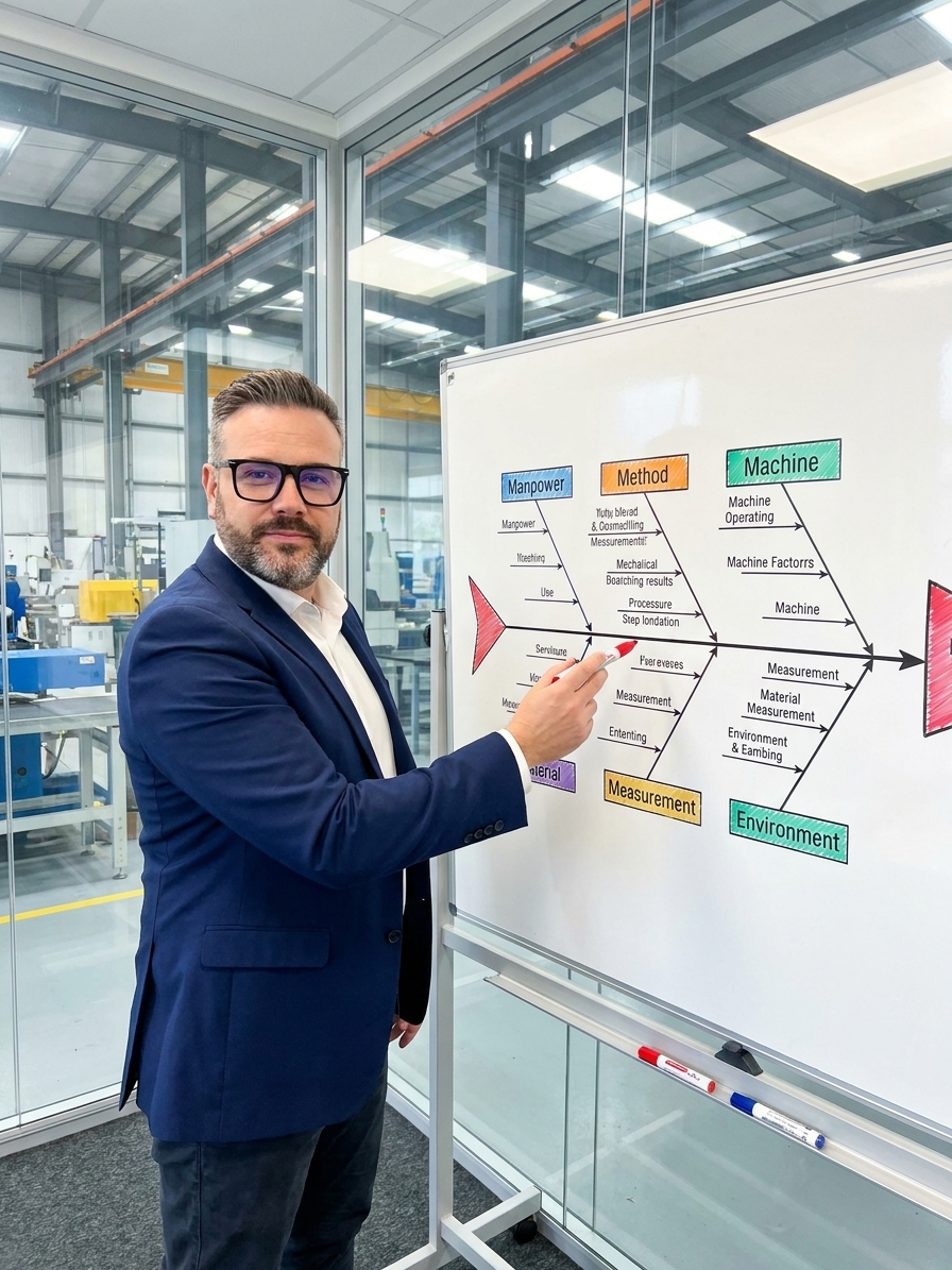
A defect rate spikes on the production line. By the morning meeting, the quality engineer is projecting a spreadsheet, the production supervisor is already defensive, and procurement is blaming the supplier. Everyone has a theory, everyone is certain, and everyone is reaching for the first plausible explanation instead of the correct one.
Three weeks later, after the supplier audit finds nothing and the new operators have been retrained, the defect rate remains unchanged. The real cause was ambient humidity in the storage area. Nobody thought to mention it because nobody asked a question that would make it visible. This is the failure mode of opinion-based problem solving.
Kaoru Ishikawa built a framework to stop this exact cycle. By mapping causes against defined categories, the Ishikawa diagram forces teams to look past their assumptions. It remains a foundational requirement of 8D methodology and a core tool for IATF 16949 and AS9100 compliance because it disciplines human reasoning.
The Problem Statement Defines the Investigation
Most organizations treat the Ishikawa diagram as a documentation exercise rather than an investigation tool. They write down what they already know, arrange it on a fishbone, and photograph it for the CAPA file. This misses the core function of the tool, which is to discover what you do not know.
The problem statement sits at the head of the diagram. It must be specific, measurable, and bounded. A statement like "scratch defects on housing assemblies increased from 0.3% to 2.1% between March 12 and March 25, affecting only the second shift" gives the team a precise target. "High defects" is a symptom, not a problem statement.
The major branches force systematic exploration. The classic manufacturing set is the 6M framework: Machine, Method, Material, Manpower, Measurement, and Mother Nature. Service environments often use the 8P framework. These categories are starting points, not constraints. If your operation requires branches for Software, Regulatory, or Management System decisions, you must add them.
Structuring an Effective Ishikawa Session
- 01Define the ProblemWrite a specific, measurable problem statement with defined boundaries and timeframe.
- 02Silent BrainstormingTeam members write potential causes independently to prevent consensus bias.
- 03Map to CategoriesCluster causes onto the 6M or custom branches systematically.
- 04Apply 5 WhysDrill down on each branch to move past surface-level symptoms.
- 05Mark for ValidationFlag each mapped cause as a hypothesis requiring data verification.
Machine and Method: The Technical Branches
The Machine branch catches immediate attention, which makes it highly susceptible to confirmation bias. Teams default to blaming the equipment. Look deeper than catastrophic breakdowns. Investigate tooling wear that exceeds useful life but evades replacement criteria based on time rather than condition. Check calibration drift on sensors that quietly move out of tolerance without triggering alarms.
Setup variation is a primary culprit. If the same machine yields different results depending on the operator, your setup procedure lacks robustness. Review preventive maintenance schedules optimized for cost instead of reliability. Examine PLC logic and firmware updates that altered parameters without formal change control.
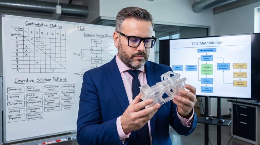
Method causes are the most under-investigated category. Teams assume the procedure is correct because engineering wrote it. Ambiguous work instructions demanding "sufficient force" or "visual inspection" generate uncontrolled variation. If a procedure was perfect when written but has not been updated through three engineering changes, it has been wrong longer than anyone will admit.
Material and Manpower: The Human and Supply Interfaces
The Material branch triggers the blame-the-supplier reflex. It is politically convenient and frequently wrong. Look for specification gaps where characteristics affecting your process are not defined in incoming material requirements. Investigate batch-to-batch inconsistency where material meets specification on average but varies enough to destabilize your process.
Shelf life degradation and handling damage are internal material failures. Material that met specification at receiving but degraded in an uncontrolled storage area is a systemic failure, not a supplier defect. Trace the material handling route from the dock to the point of use.
Manpower is the most sensitive category. The trap is blaming the operator for what the system created. If the same defect occurs across different operators, it is a system failure. If it occurs with only one operator, it may still be a system failure, specifically a failure to train, support, or design the process for human capability.
Assess cognitive load and fatigue. Human performance varies with shift patterns and task complexity. A shift handoff that loses critical information is a communication system failure, not a manpower failure. Treat morale and engagement as systemic variables. A team that stopped caring did so because their concerns were ignored, not because they lack competence.
The Ishikawa diagram is a cause-identification tool, not a cause-verification tool. It generates hypotheses for testing.
Measurement and Mother Nature: The Hidden Variables
Measurement System Analysis (MSA) is critical here. A gauge producing more variation than the manufacturing process renders all downstream data useless. Organizations that have never performed an MSA on their critical characteristics are building their quality decisions on assumptions. Check gauge capability before investigating process capability.
Look closely at inspection methods. Subjective visual inspection criteria generate inconsistent results. Verify that measurement points capture the actual critical characteristic. Data integrity fails when measurements are recorded accurately but represent the wrong parameter, or when sampling plans systematically miss the defect pattern.
Mother Nature, or Environment, is the category everyone forgets until it matters. Temperature and humidity swings in storage affect material properties. External vibration from adjacent processes destabilizes precision operations. Lighting changes at an inspection station after a facility rearrangement alter visual defect detection rates.
Environmental factors are typically the last category investigated, which makes them a frequent root cause. They exist in the spaces between organizational boundaries. Because no single department owns ambient humidity or floor vibration, they survive in the gaps of organizational attention until they force a production stop.
Common Failure Modes in Ishikawa Sessions
Root Cause Session Dynamics
What teams do
- Senior leader states a theory; the room aligns to it.
- Team fills the diagram to satisfy the CAPA file requirement.
- Investigation stops once the 6M categories have an entry.
- Session concludes in 30 minutes without data validation.
What works
- Silent brainstorming captures unbiased individual input first.
- Every branch requires supporting data or is marked as unvalidated.
- Categories are expanded beyond 6M to fit operational reality.
- Multiple sessions are scheduled to allow time for gemba verification.
I have audited plants that treat the fishbone diagram as a static deliverable. They photograph a completed whiteboard, attach it to an 8D report, and close the corrective action. Nobody validates the hypotheses. The diagram becomes the end of the investigation rather than the beginning. Require evidence for every branch. If data does not support a cause, it remains a hypothesis.
Forcing causes into the 6M framework when they do not fit distorts the analysis. "Management decision" is not one of the 6 Ms, but management decisions cause systemic quality failures. A decision to delay calibration to meet a monthly cost target is a root cause. Add the categories required to capture the truth of your organization.
Teams attempt to perform meaningful Ishikawa analysis in thirty minutes. A complex problem requires hours of structured exploration. You must schedule adequate time for data gathering between sessions. Treating the investigation as a cost to be minimized guarantees the problem will recur.
Verification and the Path to Prevention
Completing the diagram is the start of the investigation. You must verify every hypothesis. Use Pareto analysis to prioritize which causes to address based on frequency or severity. Apply correlation and regression to quantify relationships between suspected causes and the measured effect.
When multiple causes interact, simple linear investigation fails. Design of Experiments (DOE) is necessary to untangle confounded variables. If you lack the statistical evidence to verify a cause, the Ishikawa diagram cannot substitute for it. The tool structures thinking; it does not replace data.
Mature organizations reach a third level of Ishikawa application. Beyond solving the immediate defect, they use the framework to ask what systemic weaknesses allowed the failure to exist. They examine the conditions that made the system vulnerable. The diagram then becomes a tool for organizational self-awareness, preventing entire categories of future defects.
The most expensive problems are not the ones you cannot solve. They are the ones you believe you have already solved. The diagram forces the conversation beyond departmental boundaries and individual opinions, establishing a shared, verified model of reality.