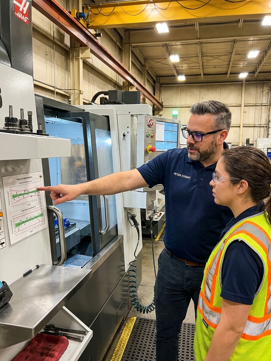
Statistical Process Control (SPC) remains one of the most powerful tools available for understanding and controlling manufacturing processes. Yet, in facilities across the automotive and aerospace sectors, it has been reduced to a decorative compliance exercise. I have audited plants where operators diligently plot dots on X-bar and R charts without understanding what the boundaries mean. They know the rule: if the dot crosses the line, call the manager.
This creates a damaging dependency loop. The quality manager becomes the sole brain of the operation, drowning in reactive firefighting and corrective action forms. The operators act merely as hands, plotting data they do not comprehend. The very tool designed to provide proactive insight instead ensures that nothing happens until a process has already drifted out of control and produced nonconforming parts.
The charts become wallpaper. They are statistically valid, beautifully colour-coded, and completely useless. To reclaim the proactive power of SPC, organisations must stop treating it as a compliance checklist and start fixing the structural failures that doom these systems from the start.
Confusing Control Limits with Specification Limits
Walter Shewhart invented the control chart at Western Electric in the 1920s to distinguish between two types of variation. Common cause variation is the natural noise inherent in any process. Special cause variation is a specific, identifiable signal that something in the process has changed. The control chart plots data over time with limits calculated at plus and minus three standard deviations from the mean.
These calculated limits are the voice of the process, telling you what it is capable of when running normally. They are strictly not specification limits, nor are they tolerances. Here is where organisations fundamentally break SPC: they confuse control limits with spec limits. They believe that being "in control" means producing good parts. It does not.
A process can be perfectly in statistical control and still produce garbage. It can be stable and entirely incapable of meeting the drawing tolerances. Control charts tell you whether your process is predictable, not whether it is acceptable. Acceptability requires a separate calculation: process capability (Cp, Cpk), which directly compares your process spread to your specification width.
The Chart Factory and Selecting CTQ Characteristics
The most common implementation dysfunction is the Chart Factory. A quality manager attends a brief training course and decides that every dimension of every part on every machine requires a control chart. Operators receive a crash course in plotting points, the quality team builds massive spreadsheets, and the system initially appears highly engaged.

Within months, reality sets in. Operators lose 15 to 20 minutes of every hour measuring, plotting, and calculating. The charts pile up. Out-of-control signals are ignored because there are simply too many of them, often triggered by over-sensitive charts on stable processes that never required SPC in the first place. The binders grow, the walls fill up, and the process never improves.
The solution is ruthless selectivity. Not every characteristic needs SPC. Apply your charts exclusively to critical-to-quality (CTQ) characteristics—the dimensions and parameters that genuinely matter to your customer or downstream operations. Pareto your defect data, identify the top contributors, and apply SPC strictly there. Ten charts that operators actually use will always outperform a hundred charts that nobody reads.
Subgrouping Errors and Inflated Variation
If you want to guarantee an SPC system fails, get the subgrouping wrong. Subgrouping is the logic behind how you group measurements. The fundamental statistical principle is strict: variation within a subgroup should represent common cause variation only. Special cause variation must show up between subgroups.
If you mix special causes into your subgroups, your control limits will calculate artificially wide. Your chart will become blind, incapable of detecting real process signals. I witnessed this at a plastics injection moulding plant producing bottle caps. They sampled five caps every hour and plotted an X-bar and R chart that showed the process safely in control, yet they were scrapping nearly 8% of their total production.
The failure was in their sampling logic. They were pulling caps from all four cavities of the mould into a single subgroup. Because Cavity 3 consistently ran 0.05mm smaller than the others, mixing the cavities inflated the within-subgroup variation. The fix was to subgroup by cavity and plot separate charts. Immediately, the real picture emerged: Cavity 3 was breaching the lower spec limit, while Cavity 1 ran centred but with excessive variation.
| Chart Signal | Pattern Description | Likely Process Cause |
|---|---|---|
| Rule 1 (Point beyond limit) | Single data point outside 3 sigma | New material batch, broken tooling |
| Rule 2 (Run) | Seven consecutive points on one side of the mean | Process mean has shifted, setup drift |
| Rule 3 (Trend) | Six consecutive points steadily increasing or decreasing | Progressive tool wear, temperature drift |
| Rule 4 (Hugging) | Points tightly clustered near the centre line | Data falsification or incorrect subgrouping |
The Reaction Trap and Operator Empowerment
Even technically functional SPC systems fall into the Reaction Trap. The charts are plotted, the signals are detected, but the entire response is purely reactive. An out-of-control point triggers a phone call, a quality investigation, and a corrective action. This is CAPA disguised as SPC. The true purpose of statistical control is prevention: detecting trends and shifts before they produce a defect.
Western Electric published run rules in the 1950s that remain entirely relevant today. A run of seven points on one side of the mean signals a process shift, even if no individual point has breached the limit. If operators only react to points outside the limits, they ignore half the information the chart provides.
When operators understand these run rules, they transition from data-entry clerks to process investigators. They identify a drifting process and adjust the offset at the next setup before a single nonconforming part is produced. This requires actual training—not just how to plot a dot, but how to read the story the process is telling them in real time.
An operator who can identify a trend and respond in real time is worth ten quality engineers reviewing charts after the fact.
Capability Confusion and Measurement System Analysis
Being in control means your process is stable and predictable. It does not mean your parts are within specification. Process capability indices compare your process performance to your specification limits. Cp measures the ratio of your spec width to your process spread. Cpk adjusts for how centred that process actually is.
A Cpk of 1.33 is the standard baseline for a capable process—it provides enough margin to absorb normal variation without producing defects. A Cpk below 1.0 means you are regularly producing nonconforming parts, even when your process is perfectly stable. If your process is unstable, your capability numbers are mathematically meaningless because they are based on a moving target.
Before calculating capability or plotting a single chart, you must verify the measurement system. A medical device company recently spent eighteen months trying to improve their Cpk on a critical seal dimension. They bought new equipment and ran design of experiments, all to no avail. Finally, a junior engineer pointed out their measurement system was contributing over half the total observed variation. They were fighting the gauge, not improving the process.
Interpreting Process Capability (Cpk)
Building a Functional SPC Culture
SPC is not a technical system; it is a cultural one. The mathematical calculations are the easy part. Building an organisation where operators pay attention to their process, understand variation, and feel empowered to respond without calling a manager is the actual challenge. SPC fails when one person acts as the brain and the rest of the shop floor acts as hands following a procedure.
To fix broken implementations, start with Measurement System Analysis (MSA). If your gauge R&R exceeds 30%, your SPC data is pure noise. Fix the measurement system first. Then, drastically reduce the number of charts to only those tracking critical-to-quality characteristics identified in your PFMEA.
Define hard response rules for operators. Tool wear trends trigger an offset adjustment. Sudden shifts trigger a material lot check. Increased variation triggers a machine condition assessment. Give operators the authority to stop the line when they see a signal, post the charts large at the machines, and watch the scrap rates drop as the culture shifts.