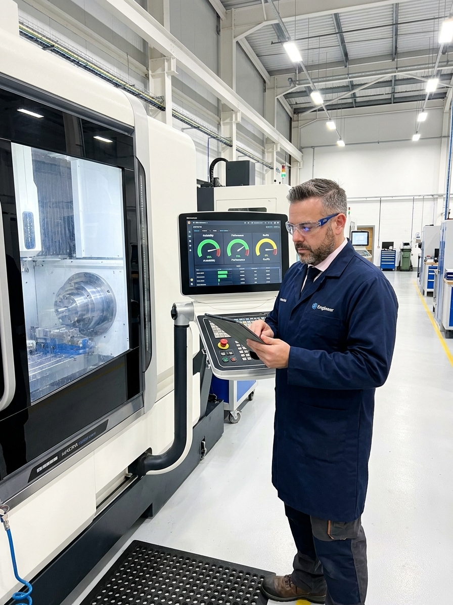
Ask any plant manager for their Overall Equipment Effectiveness (OEE) and you will get a confident number, usually between 65% and 85%. It is almost certainly wrong. The math behind OEE is not the problem; the inputs feeding that math are routinely fabricated.
Seiichi Nakajima formalized OEE within Total Productive Maintenance (TPM) during the 1960s. The framework decomposes equipment effectiveness into three dimensions: Availability, Performance, and Quality. Multiplying these three ratios gives a single percentage. It is an elegant, universally applicable calculation.
Over twenty years implementing quality management systems at companies like a major aerospace manufacturer and SNOP, I have watched the same failure pattern repeat across automotive, aerospace, and electronics plants. Organizations adopt OEE, build impressive dashboards, and quietly abandon the metric when the numbers stop correlating with actual business outcomes. The problem is never the formula. The problem is what people do to the inputs to protect the score.
The Availability Trap and Planned Downtime Manipulation
Availability measures the proportion of scheduled time that equipment actually runs. The most common manipulation happens here, in how organizations define planned downtime. Changeovers, preventive maintenance, and meetings can legitimately be categorized as planned. But when everything inconvenient gets reclassified as planned, the availability denominator shrinks and the ratio inflates artificially.
I once audited a tier-1 automotive supplier reporting 92% availability on their injection molding line. They had allocated forty-five minutes for shift handoffs, thirty minutes for meetings, and forty minutes for warm-up and stabilization out of an eight-hour shift. By excluding nearly two hours of gross available time, they distorted the metric. When I recalculated using the actual shift length, real availability dropped to 73%.
A subtler availability problem arises with micro-stops. A five-second jam cleared by an operator does not get logged in a manual system. Thirty such jams across a shift consume twenty-five minutes of lost production. These invisible losses accumulate silently. Equipment monitoring systems capture them, but only if sensor resolution and data collection logic are configured to register brief interruptions as downtime.

The Performance Illusion and Ideal Cycle Time
Performance captures speed losses. If a machine is designed to produce 100 parts per minute but averages 87, the performance rate is 87%. The friction arises when engineering and operations disagree on what constitutes the ideal cycle time. This baseline is often derived from theoretical machine specifications rather than validated production realities.
Machine specifications describe what equipment can do under perfect conditions with ideal material and no wear. Using the nameplate rate as the ideal cycle time guarantees that performance will always look deflated. This provides cover for supervisors who do not want to be held accountable for speed losses. The number simply accepts the gap as unavoidable engineering limitation.
Conversely, some organizations cherry-pick the best shift they ever had and use that as the standard. If a machine ran at 110 units per minute due to an unusually good material batch, that becomes the baseline. Every subsequent shift looks mediocre. The honest approach is to use the validated standard rate: the speed at which the process runs sustainably while producing conforming product, verified through time studies and process capability analysis (Cpk).
| OEE Factor | Loss Category | What It Captures |
|---|---|---|
| Availability | Equipment failure / Breakdowns | Unplanned downtime from mechanical, electrical, or control failures |
| Availability | Setup and adjustments | Changeover time, tooling changes, first-piece approval delays |
| Performance | Idling and minor stops | Brief interruptions not logged as downtime: jams, sensor trips |
| Performance | Reduced speed operating | Running below rated speed to manage quality or stability concerns |
| Quality | Process defects | Parts produced outside specification during steady-state operation |
| Quality | Reduced yield / Startup losses | Scrap and rework generated during ramp-up after changeovers |
Quality Confusion: Rework and Startup Scrap
Quality represents the ratio of good parts to total parts produced. Scrap is relatively easy to count: a part failed inspection and went to the bin. Rework is a dangerous gray zone. If a part has a cosmetic defect that gets buffed out and passes inspection, was it ever bad? Some systems count rework as a quality loss; others ignore it entirely. The resulting OEE changes significantly depending on which convention you adopt.
Startup scrap is another contested category. Parts produced while a process stabilizes after a changeover represent genuine material and energy waste. In high-mix environments where changeovers happen multiple times per shift, excluding startup scrap from the quality calculation hides a severe cost driver. OEE looks better, but the P&L suffers.
Different customers also apply different acceptance criteria. A part that fails a strict automotive PPAP requirement might pass a less rigorous commercial inspection. When production runs for multiple customers on the same line, the quality denominator must reflect the strictest applicable standard, not the average. Blurring these boundaries inflates the quality score and masks true process capability.
OEE Implementation: Gaming vs. Improving
Gaming the Metric
- Excluding changeovers and meetings from available time
- Using nameplate speed to make performance look acceptable
- Ignoring startup scrap to inflate the quality ratio
- Focusing on the composite percentage in monthly reviews
Recovering Losses
- Measuring availability against gross shift hours
- Validating ideal cycle time through engineering studies
- Counting all scrap and rework as quality losses
- Attacking the top three specific loss categories weekly
Connecting OEE to Financial Impact
CFOs complain that OEE improvements do not show up in the P&L. This happens when OEE is treated as a standalone metric disconnected from operational and financial levers. Every percentage point of OEE improvement represents recovered capacity, but what that capacity is worth depends entirely on the constraint environment.
If the improved equipment is the system bottleneck, each OEE point translates directly to additional throughput. The financial value equals the contribution margin of those additional units. If the equipment is not the bottleneck, OEE improvement reduces operating costs through lower energy consumption per unit and decreased scrap, but it does not increase total output until the actual bottleneck shifts.
Organizations that successfully connect OEE to financial outcomes prioritise loss reduction on the constraint equipment, not the worst-performing machine.
Successful plants identify the constraint operation using value stream analysis, not OEE ranking. They prioritise loss reduction on that specific constraint equipment because that is where improvement has the highest financial leverage. They translate loss hours into dollars using contribution margin or conversion cost per hour, making the cost of each hour of downtime visible and actionable to the floor.
Designing a Trustworthy Data Collection System
Automated data collection is non-negotiable. Manual OEE tracking, where operators record downtime reasons on paper or in spreadsheets, is fundamentally unreliable. Operators focused on running equipment cannot simultaneously serve as accurate data entry clerks. Recalled downtime data captures perhaps 60% of actual loss events, and the categorization is almost always wrong.
Machine monitoring systems, PLC integration, and IoT sensors have become affordable enough that there is no excuse for manual collection. However, the system architecture must be kept deliberately simple. Over-engineering the calculation engine with dozens of loss categories and complex custom software ensures that by the time it goes live, the data quality is poor and operators do not understand the rules.
Loss categorization must be standardized and granular, but not by operator discretion. 'Machine down' is not a root cause. Downtime events should be categorized into mechanical failure, electrical failure, material shortage, tooling change, quality hold, or operator unavailable. The taxonomy should be enforced through the data collection system to ensure the baseline data driving your 8D root cause analyses is accurate.
Realistic OEE Improvement Targets
Structuring OEE Reviews for Action
OEE must be reported with its components, never as a single composite number. A dashboard showing only the aggregate percentage is useless for improvement. Operators, supervisors, and engineers need to see Availability, Performance, and Quality separately, along with the top loss reasons for each dimension. The composite number is strictly for executive communication.
Targets must be realistic, bottom-up, and product-specific. Imposing a blanket 85% target across all equipment creates immediate pressure to game the numbers. Some complex CNC machining cells will naturally run at 60% OEE due to product variability, while automated lines might sustain 90%. Targets must emerge from a baseline assessment and improve incrementally, typically by two to three percentage points per quarter.
Tracking OEE without acting on it is the most common terminal failure. An organization implements monitoring, reviews dashboards in monthly meetings, and never converts insight into action. OEE data without a structured improvement process is just expensive reporting. The metric has value only when each review meeting generates specific, assigned action items with deadlines, verified through a formal 8D or corrective action system.
Metrics do not improve factories. Actions triggered by metrics improve factories. If your current OEE system feels like theater, abandon the software and go back to basics. Verify your ideal cycle times, audit your downtime categories against direct floor observations, and map your losses to the Six Big Losses framework. Ensure every review produces a concrete improvement action with an owner and a deadline.