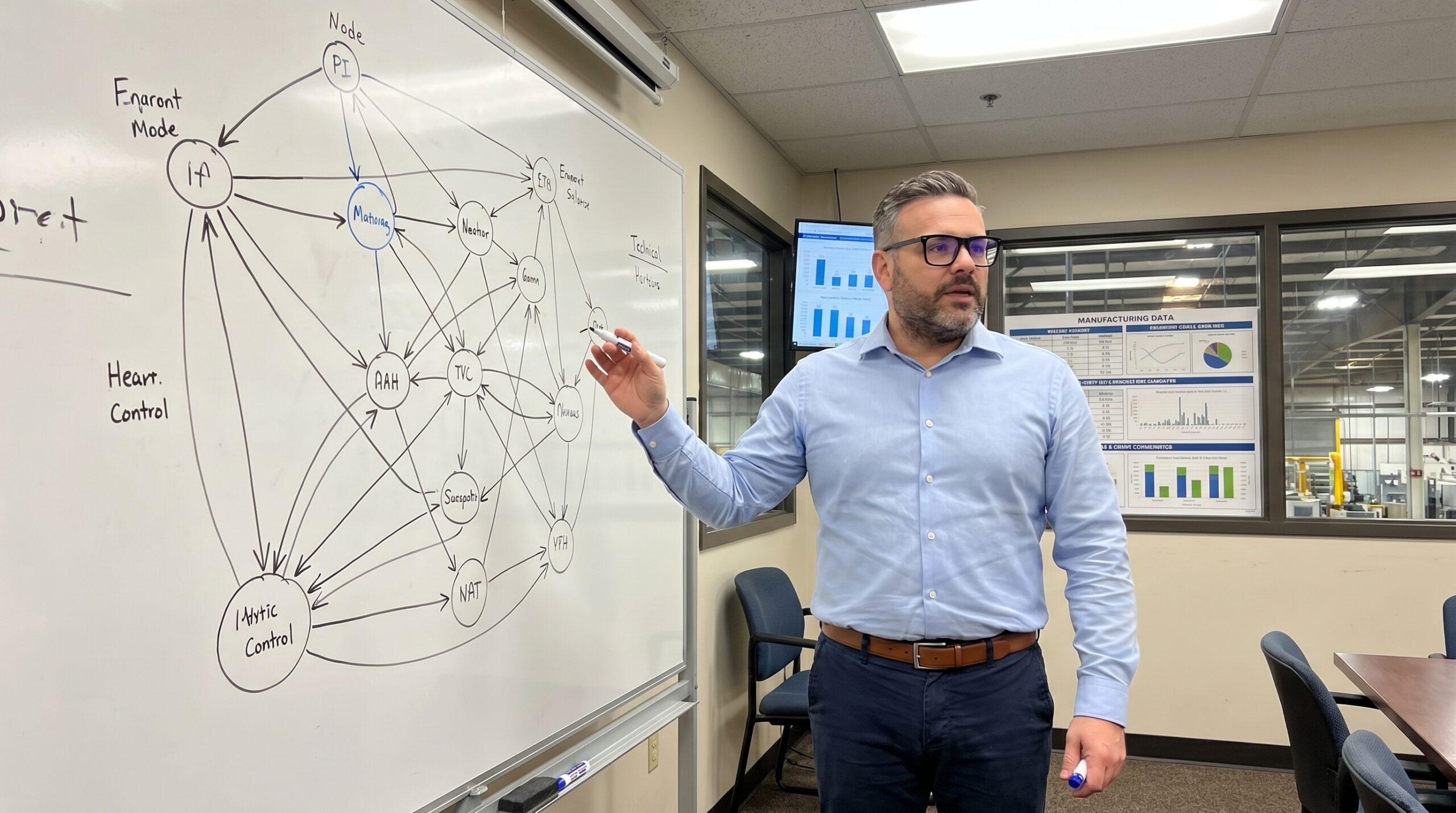
Cross-functional teams generate comprehensive lists of quality failures every day. Customer complaints rise, scrap rates climb, supplier delivery misses target, and the corrective action backlog grows. The team applies a quick Pareto exercise, prioritizes by severity, and feels productive. Then nothing changes. The team attacked the symptoms while the actual drivers sat quietly in the background.
The failure mode is structural. A list implies independence: item one, item two, item three, each waiting to be solved in sequence. In a manufacturing environment, your problems are a web. Customer complaints connect to scrap, scrap connects to machine downtime, downtime connects to training gaps, and training connects back to scrap. You cannot solve a web with a list.
You need a map. The interrelationship digraph (ID), sometimes called a relations diagram, is one of the Seven Management and Planning Tools developed by Japanese quality pioneers. It maps cause-and-effect relationships among a set of issues. The word digraph comes from directed graph: arrows point from causes to effects. Most Western organizations still have not adopted it. That needs to change.
What the Digraph Reveals That Lists Cannot
You start with a set of items generated from an affinity diagram, brainstorming session, or problem decomposition. These items become nodes arranged in a circle on a large surface. The team then systematically examines every pair and asks a simple question: does item A influence item B, or does item B influence item A? If the answer is yes, you draw an arrow from cause to effect.
You repeat this for every pair. The visual map that emerges exposes four structural patterns. Root causes disguised as ordinary items: nodes with arrows pointing outward but almost none pointing inward. Effects masquerading as root causes: nodes with arrows pouring in but barely any going out. Feedback loops: circular chains where A drives B, B drives C, and C drives A.
It also reveals clusters of tightly interconnected issues that function as a single system. Picking one off in isolation tightens the rest of the knot. This is diagnostic power that a Pareto chart or priority matrix simply cannot provide.
Node Classification by Arrow Count
Building a Digraph That Actually Works
Start with a clear, focused question. Do not ask what is wrong with quality. Ask what factors are driving the increase in customer returns over the past six months. Ask why First Pass Yield on Assembly Line 2 is below 92%. The question frames the boundary of your analysis. Go too narrow and you miss systemic connections. Go too broad and you drown.
Generate your items using whatever ideation method works. Aim for 8 to 20 items. Fewer than 8 does not add value beyond common sense. More than 20 makes pairwise comparison exhausting: 20 items means 380 pairs. Write each item on a card. Use precise language. Write training gaps, not we need more training. Write gauge calibration frequency insufficient, not metrology issues.

Facilitation discipline matters during arrow drawing. Not every pair has a relationship. If you are unsure, do not draw. Uncertain arrows are noise. Two things may rise and fall together without one causing the other. Demand causal logic, not statistical coincidence. The senior manager's opinion on causality does not override physics. A good ID for 15 items takes 60 to 90 minutes.
Once all arrows are drawn, count the incoming and outgoing arrows for each node. High out and low in identifies a driver. High in and low out identifies an outcome. High on both identifies a leverage point sitting in the middle of causal chains. Low on both identifies an isolated issue. Follow the arrows from drivers to outcomes to find the critical paths.
When the Driver Is a Management Decision
I worked with a Tier 1 automotive supplier manufacturing precision-machined housings. For three consecutive months, their customer found assembly-interfering burrs on a critical bore. The parts passed internal inspection but caused failures at the customer's assembly plant. The initial reaction was predictable: tighten inspection, add a second visual check, increase audit frequency. The escape rate plateaued.
We convened a team and built an interrelationship digraph. The items included burr formation at Operation 30, tool wear monitoring gaps, coolant concentration inconsistency, operator rotation frequency, inspection method limitations, incoming material hardness variation, setup verification completeness, and production pressure to meet output targets.
After pairwise analysis, the pattern was striking. Production pressure had the highest out-arrow count by far. It drove operator rotation, which drove setup verification shortcuts, which drove burr formation. It drove reduced time for tool wear checks, which drove burr formation. It drove rushing through inspection, which drove escapes.
You cannot inspect your way out of a capacity planning problem.
The root cause was a capacity planning decision made six months earlier that loaded Line 2 at 97% utilization. This left zero margin for anything except raw output. The burrs were a symptom. The escapes were a symptom of a symptom. The driver was a management decision invisible on any process control chart.
The solution was rebalancing the production plan: reducing planned utilization to 85%, accepting lower output per shift, and regaining time for proper setup, tool monitoring, and inspection. Within six weeks, customer complaints dropped to zero. Scrap decreased too, because the same time pressure creating burrs was creating untracked dimensional variation.
Application Scope and Limitations
The interrelationship digraph excels in specific situations. Use it when you face a complex, multi-factor problem where everything seems connected. Use it when previous improvement efforts have failed or produced only temporary results. Use it when your team debates which problem to tackle first and the debate goes in circles.
Do not use it when the problem is simple and the root cause is obvious. A 5 Why or fishbone diagram is faster and sufficient. Do not use it with fewer than seven relevant factors. If your team does not understand the process well enough to judge causal relationships, go to the gemba first. Proper ID construction takes hours, not minutes.
Common Failure Modes in Digraph Construction
What teams do wrong
- Draw arrows too freely, creating a plate of spaghetti with no discrimination.
- Confuse correlation with causation when two metrics trend together.
- Allow authority figures to dictate causal logic without evidence.
- Treat the diagram as an academic exercise and delay action.
What actually works
- Demand the specific causal mechanism before drawing any arrow.
- Identify the strongest, most direct relationships, not theoretical links.
- Encourage dissent and challenge confirmation bias.
- Set a strict time limit, build the best map possible, then act.
Integrating the Digraph Into Your Quality System
The interrelationship digraph does not exist in isolation. It connects to established tools in your IATF 16949 or AS9100 quality toolkit. An affinity diagram groups brainstormed ideas. The ID maps how those groups relate causally. Once you identify key drivers, a tree diagram breaks them down into specific actionable countermeasures.
The causal understanding from an ID enriches your PFMEA. It helps identify failure causes you might otherwise miss, strengthening the link between your process controls and actual risk. In Hoshin Kanri strategic planning, an ID maps interdependencies among strategic objectives, ensuring your deployment plan addresses root drivers.
An ID captures causal relationships at a point in time. Systems evolve. The diagram you built in January may not reflect reality in July, especially after implementing changes. Revisit and update it periodically after significant process modifications or equipment installations.
The Discipline of Structured Patience
The interrelationship digraph demands humility. It forces you to admit that your problems are more complex than your instincts suggest. The first answer is rarely the right answer. The loudest complaint is rarely the most important problem. The tool replaces gut feelings with structured thinking and arguments with evidence-based understanding.
I have seen organizations waste months attacking symptoms that an afternoon with a whiteboard and disciplined pairwise analysis would have exposed. They tightened inspection when they needed to rebalance capacity. They retrained operators when they needed to fix tool wear monitoring. The pressure to just do something is constant. Disciplined patience is a competitive advantage.
Your problems are connected. Your solutions should be too. Map the web before you swing at it.