
A plant manager called me on a Friday afternoon. Defect rates on a parking-sensor assembly line had hit 4.7% against a 0.3% specification. The customer's procurement team was sending escalating warnings in red text. The line manager was working overtime to find the cause, arriving at a different theory every single day.
They had swapped the plastic connector supplier. No improvement. They adjusted the injection moulding pressure. No change. They rotated operators on station three. The defect rate remained identical. The team was working hard, changing variables simultaneously, and hunting blind.
This is the exact scenario where the Ishikawa diagram earns its place in the quality toolkit. Developed by Kaoru Ishikawa in the 1950s, the cause-and-effect diagram—universally recognised as the fishbone—forces a cross-functional team to map every potential cause before changing a single parameter. It replaces reactive trial-and-error with structural root cause analysis.
Structuring Cause Analysis: 6M vs 4P
The visual structure of the diagram is intentional. The problem statement sits in the head of the fish. A horizontal spine connects to major bones representing categories. Branching off these major bones are the specific causes and sub-causes. This visual mapping allows a team to view the entire problem space simultaneously, rather than fixating on a single dimension.
Manufacturing environments standardise on the 6M framework: Man, Machine, Material, Method, Measurement, and Mother Nature. This structure ensures the team evaluates operator competence alongside machine calibration, material specifications, and environmental factors like humidity. Skipping a category is the most common reason teams miss the actual root cause.
Administrative and service processes require a different lens. The 4P framework—Policies, Procedures, People, and Plant/Technology—maps better to transactional environments. If you run an aerospace supply chain, your Ishikawa might use 8P to incorporate regulations and project management variables. The specific acronym matters less than the requirement that the categories cover every relevant dimension of your operational system.
Reactive Troubleshooting vs Structured Ishikawa Analysis
What teams do under pressure
- Change process parameters blindly to see what sticks
- Blame the newest operator or the latest material batch
- Arrive at a different root cause theory every day
- Ignore operator feedback that seems irrelevant
What structured analysis achieves
- Map all variables systematically using 6M categories
- Force evidence-based verification of each hypothesis
- Apply 5 Why drilling to expose systemic maintenance gaps
- Isolate the true cause before implementing countermeasures
Executing the Fishbone: From Flipchart to Verification
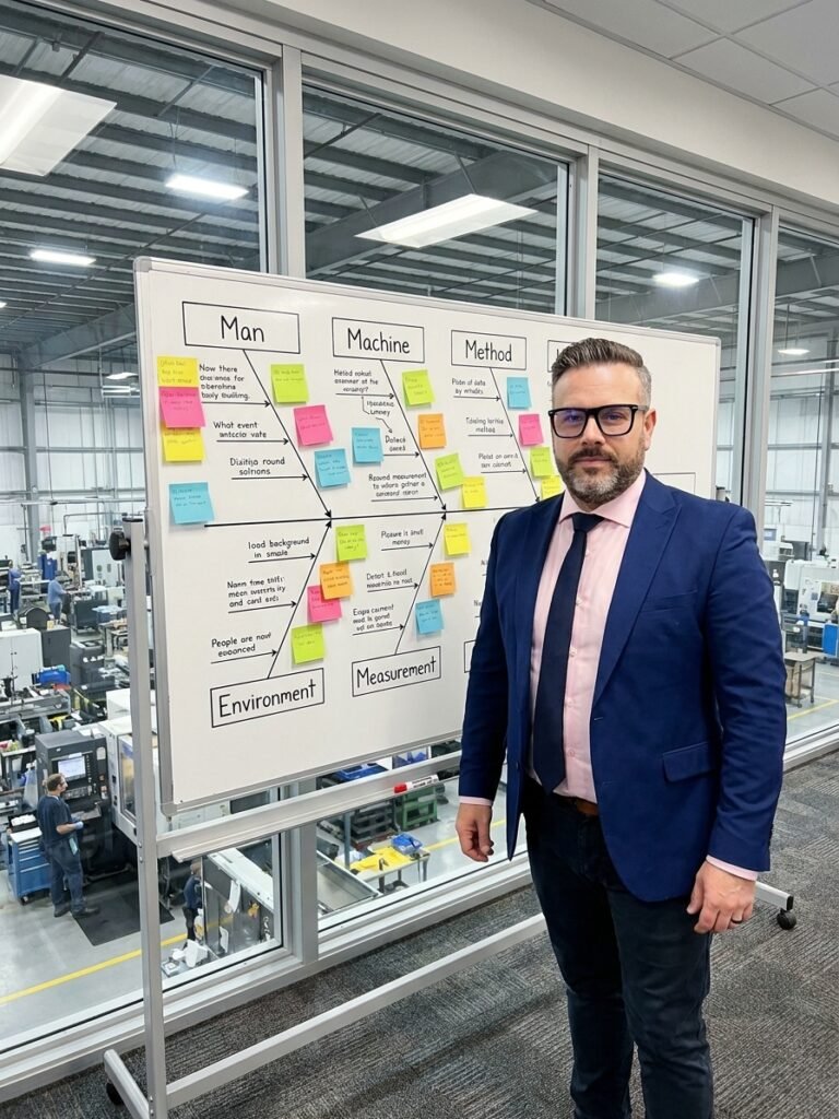
Precision in the problem statement dictates the success of the exercise. Writing 'high defect rate' on a whiteboard yields vague causes. Writing '4.7% defect rate on parking sensor line: failed crimp on connector C-47' channels the team's focus. Once the head of the fish is defined, draw the spine and the 6M diagonal lines to establish the framework.
The brainstorming phase requires strict discipline. Gather operators, maintenance technicians, and quality engineers. The fundamental rule is no filtering. Every idea is recorded on a sticky note and placed in a category. Evaluating or dismissing ideas during brainstorming destroys the psychological safety required to surface marginalised process observations.
Once the diagram is populated, apply the 5 Why methodology to the most probable branches. For each cause listed under Machine or Method, ask why it occurs. Document the sub-causes as smaller branches. The goal is to drill past the symptom—'incorrect crimping force'—down to the systemic gap: 'the preventive maintenance plan lacks a replacement interval for this specific seal.'
A fishbone diagram without data verification is merely a hypothesis. Prioritise the identified causes by likelihood, impact, and controllability. Pull historical OEE data, review calibration logs, and check SPC charts. Focus your verification resources on the causes that score high in both impact and controllability.
The Parking Sensor Case: A Breakdown in Preventive Maintenance
In the parking sensor case, I gathered the team—operators from both shifts, a maintenance technician, and the quality engineer. We mapped the problem over forty-five minutes. We generated thirty-four potential causes across the 6M categories. Under Machine, an operator casually mentioned that the pressure cylinder on station three occasionally sounded like it was catching.
I asked how often. The operator said once per shift. When asked if it had been reported, the answer was no; it did not seem important. That observation was the breakthrough. We installed a pressure transducer with a data logger on the cylinder. Over an eight-hour shift, we captured fifteen pressure anomalies—brief drops below the minimum crimping force threshold. They matched the operator's auditory observations exactly.
The cylinder seal was micro-damaged. The preventive maintenance schedule dictated seal replacement every twelve months. The cylinder had been running for fourteen months without a change. The Ishikawa diagram did not solve the problem by itself, but it provided the structural framework that allowed an operator's minor observation to connect with a systemic maintenance failure.
An Ishikawa diagram without 5 Why drilling is just decoration on a office wall.
Common Failure Modes in Cause Mapping
Over twenty years implementing quality systems at a major aerospace manufacturer and WITTE Automotive, I have seen hundreds of fishbone diagrams. The same failures recur. The most damaging is brainstorming without line operators. The most valuable process data lives on the shop floor, not in the engineering office. Excluding the people who experience the defect daily sacrifices critical context.
The second failure is stopping at the first level of cause. Teams list 'incorrect pressure' under Machine and close the file. Without drilling into why the pressure was incorrect, the analysis produces a superficial corrective action. The diagram becomes a bureaucratic exercise rather than an investigative tool.
Finally, teams often treat the completed diagram as the deliverable. The Ishikawa is a means to an end. If it does not trigger data collection, an 8D corrective action, or a PFMEA update, it has failed. The artifact belongs in a controlled document, but only after it has driven a verified engineering change.
Integration with Industry 4.0 and IATF 16949 Systems
Digital twins, IoT sensors, and real-time MES data have transformed how we verify Ishikawa hypotheses. When machines stream performance data continuously, validating a suspected cause takes hours instead of weeks. You can overlay defect timestamps against temperature fluctuations or vibration data instantly.
However, technology does not replace the methodology. An algorithm can flag a pressure drop, but it cannot contextualise the sound the machine makes. The tacit knowledge held by experienced operators remains essential. The Ishikawa diagram forces a meeting point between quantitative IoT data and qualitative human observation.
Within an IATF 16949 or AS9100 quality management system, this integration is critical. Use the Ishikawa diagram during the Design FMEA phase to anticipate potential failure modes in new processes. Use it as the primary analytical tool during 8D Step D4 (Root Cause Analysis). Embedding the fishbone into your core quality procedures builds systemic thinking across the organisation.
Key Parameters Tracked in the Parking Sensor Case
Operationalising the Tool in Your Plant
If your facility does not use Ishikawa diagrams systematically, start with one recurring problem. Select a chronic issue—something that generates a weekly 8D but never truly disappears. Gather five to eight cross-functional team members. Block out ninety minutes on the calendar.
Use a physical whiteboard if possible. Digital tools like Miro work well for distributed teams, but a physical board encourages different engagement dynamics. Operators are more likely to walk up, grab a marker, and add a branch when the barrier to entry is low.
Drive the team to ask 'why' at least three times for every major cause identified. Assign a verification owner and a deadline to each high-priority cause. The workshop is not finished when the diagram is drawn; it is finished when data proves or disproves the hypotheses. This discipline is what separates effective quality engineering from compliant paperwork.