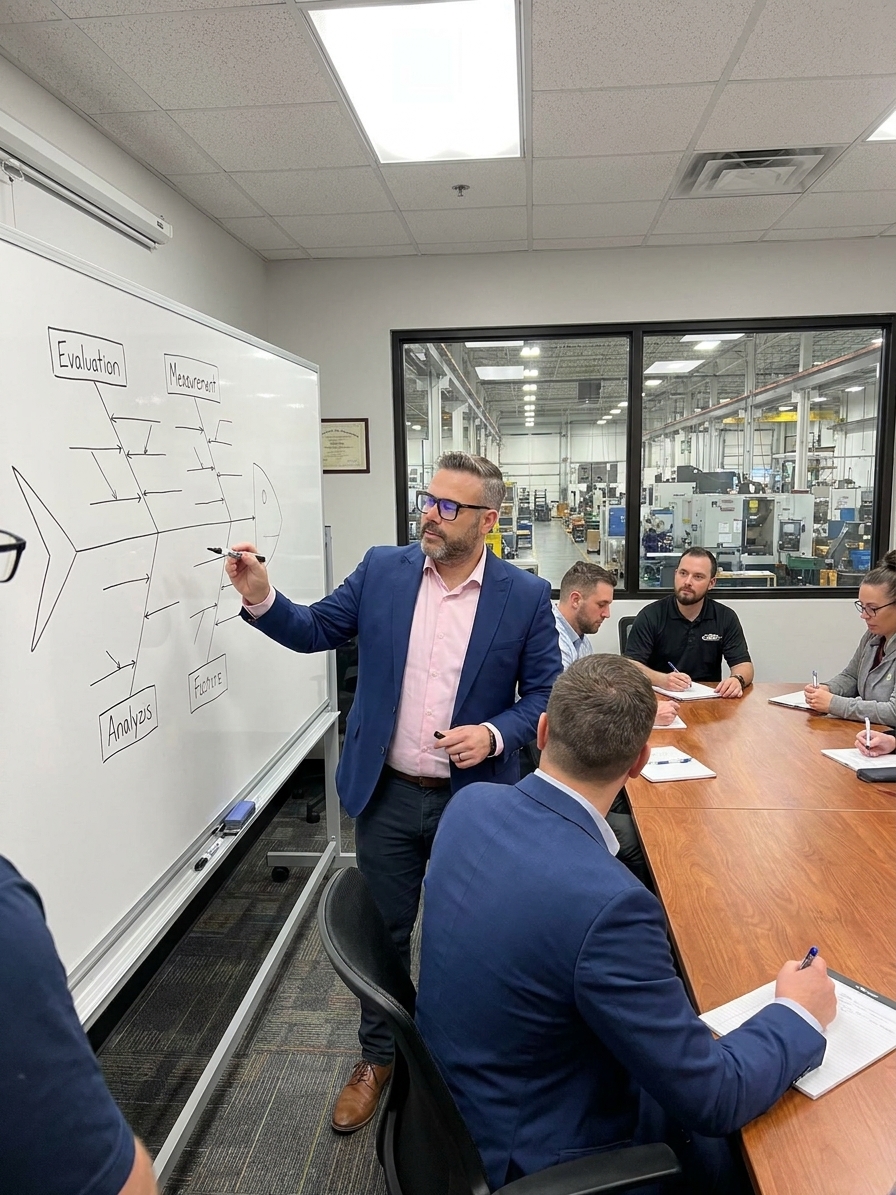
A problem appears on the line. The quality manager calls a meeting, the whiteboard comes out, and the fishbone skeleton gets drawn. The spine connects to a problem statement, and the six branches reach outward: Man, Machine, Method, Material, Measurement, Environment.
People call out causes. The facilitator writes them on Post-its and slaps them on the appropriate branch. Within thirty minutes, the diagram is full. Everyone steps back, takes a photo for the 8D or CAPA record, and goes back to work.
The fishbone is comprehensive and utterly useless. Nobody verified a single cause on that diagram. Nobody tested a hypothesis, collected data, or followed the trail from possible cause to confirmed root cause. The team generated a list, labelled it as analysis, and filed it away. When the problem recurs in three months, nobody returns to the fishbone because it never identified the root cause.
What the Diagram Was Built to Do
When Kaoru Ishikawa introduced the cause-and-effect diagram in the 1950s, he was solving a genuine problem. Post-war Japanese manufacturing needed a structured way to investigate quality defects that went beyond guessing. The diagram provided a visual framework that forced teams to think systematically about categories of causes rather than jumping to the first available explanation.
The genius of the tool is its structure. By organising potential causes into categories — originally the 4Ms, later expanded to 5M+1E — Ishikawa ensured that teams would not fixate on operator error as the default. If the first instinct is to blame the operator, the fishbone forces consideration of whether the machine is capable, whether the method is defined, whether the material is consistent, and whether the measurement system is reliable.
That forced breadth is genuinely valuable. The framework is not the problem. The problem is what happens to it the moment it leaves the training room and meets a deadline-driven CAPA process.
The Post-it Ceremony
I have audited plants across automotive and aerospace suppliers where the fishbone session operates the same way. A team gathers in a conference room. The facilitator draws the diagram. Everyone gets Post-its. The rules are no wrong answers and no arguing. Thirty minutes later there are forty Post-its on the wall. The team feels accomplished, the CAPA form gets a photo attached, and the meeting ends.
What is missing is validation. Not a single Post-it was tested against process data. The team generated a comprehensive list of possible causes and called it root cause analysis. It is the investigative equivalent of listing every person who could have committed a crime and closing the case without checking alibis.
The 6M categories worsen this. They were designed to prompt broad thinking but in practice they become pigeonholes. Someone says the operator was not trained and it goes under Man. But if the training program itself is flawed, that is a Method problem. If the work instructions are outdated, that is Material. The categories are starting points, not filing systems, but teams treat them as buckets.
The Interaction Problem and the Facilitator Gap
A well-run fishbone session generates thirty or forty potential causes. Most of them probably do contribute something. Real manufacturing problems are multicausal. A yield drop is rarely one thing. It is a combination of tool wear, material variation, and environmental humidity interacting in ways that no single branch can capture.
The fishbone format encourages linear thinking. Each cause sits on its own branch, implying that fixing it will solve the problem. The diagram has no mechanism for showing interactions, dependencies, or feedback loops. When teams look at forty Post-its, they either try to fix everything and fix nothing, or pick the easy ones and miss the driver.
The session is only as good as the person running it. A skilled facilitator pushes deeper by asking for data, lots, and timestamps. An unskilled facilitator writes down what people say and moves on. Most sessions I have observed are run by someone focused on completing the CAPA form before the audit deadline, turning an investigation into a documentation exercise.
Brainstorming vs. Investigation
What teams do
- Generate forty causes and photograph the wall for the 8D
- Treat every Post-it as equally valid
- Assign 'retrain operators' as the default action
- Close the investigation when the diagram is full
What works
- Pull data before the session to eliminate dead branches
- Assign an owner to test each hypothesis against evidence
- Use 5 Whys on the two or three causes that survive validation
- Return to the diagram after corrective action to confirm elimination
The Data Gap: Where Sessions Go to Die
This is the fatal flaw. The fishbone identifies potential causes. To convert a potential cause into a confirmed root cause, you need data. You need to show that when the supposed cause is present, the problem occurs, and when it is absent, the problem does not. You need correlation, and ideally you need experimental confirmation.
Almost nobody does this. They leave the fishbone session with a wall full of hypotheses and then address one obvious item before declaring the root cause found. They almost never design experiments to test the top five causes or pull data on the remaining seven to check for correlation. The fishbone becomes the endpoint when it was designed as the starting point.
The fishbone is a hypothesis-generation tool. It is not a root cause finder.
I once observed a quality engineer at a precision machining shop run a fishbone session that actually worked. The problem was not defined as parts out of spec. It was defined as feature X on part Y running at 1.2% nonconforming for six weeks, up from 0.3%, specifically on second shift. That specificity eliminated half the branches before the team started. HVAC logs showed no change. Material COAs were identical. Those branches were crossed out immediately.
Building a Validated Investigation
The team filled the remaining branches with hypotheses: tool wear on second shift, machine capability, operator technique, measurement variation. Then the engineer pulled data. Tool change logs showed no relationship with the nonconformance rate. An MSA on both shifts' gauges revealed that second shift's equipment was reading 15% low. The root cause was on the Measurement branch. The parts had likely been scrapped based on faulty data.
From Post-it to Confirmed Cause
- 01Define narrowlySpecify part, feature, shift, and magnitude before drawing the diagram.
- 02Pull data firstBring control charts, maintenance logs, and COAs to eliminate dead branches.
- 03Timebox brainstormingGenerate hypotheses for thirty minutes maximum, then stop.
- 04Assign ownersEach cause gets a name, a due date, and a mandate to confirm or eliminate it.
- 05Validate and drillRun MSA, correlation, or 5 Whys on surviving causes to reach the root.
That is how the tool is supposed to function. The fishbone generated the hypothesis that measurement variation might be a factor. The data confirmed it. The difference between listing a cause and proving a cause is the entire value of the investigation.
Structural Limitations to Plan Around
Even when used correctly, the fishbone has constraints. It assumes linear causation: each cause on each branch implies a direct line to the effect. But manufacturing processes are systems. Tool wear combined with material hardness combined with coolant temperature can produce a defect that none of those factors would trigger alone. The diagram cannot represent interactions.
The tool is only as good as the knowledge in the room. If nobody knows the coolant temperature has been fluctuating, that cause will not appear. The fishbone captures what the team already knows. It does not discover what they do not.
It is also biased toward actionable causes. Teams naturally prefer factors they can address. Retraining operators feels productive. Acknowledging a Cpk of 0.8 and recommending capital expenditure feels threatening. The fishbone tends to be populated with causes that are comfortable to address, not causes that are actually driving the defect.
Finally, the diagram does not prioritise. Forty Post-its all look equally important. There is no weighting, no scoring, no mechanism for distinguishing the main driver from minor contributors. Without data to filter the list, the team is left with a wall and no decision criteria.
Closing the Loop
Kaoru Ishikawa was part of the quality movement that emphasised gemba-based investigation, data-driven decisions, and rigorous problem-solving. The diagram he created was meant to be one step in a structured process: organising thinking before diving into data collection and hypothesis testing. Organisations have turned it into the entire process.
If you use fishbone diagrams, ask when a session last identified a root cause that permanently eliminated a problem. If the answer involves an auditor's expectation or a CAPA deadline, the tool is functioning as documentation, not analysis. The problems will recur because the causes were never confirmed.
Define the problem precisely. Pull data before the meeting. Assign owners to confirm or eliminate every cause with evidence. Use 5 Whys on the survivors. Go back to the diagram after corrective action and verify the problem is gone. The fishbone is not broken. The work that follows it is where the investigation actually happens.