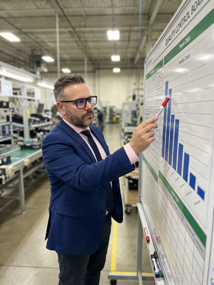
The Pareto chart is the simplest quality tool in existence. Tally defects by type, sort by frequency, draw bars, and allocate resources to the tallest ones. It requires no statistical software and no cross-functional meetings. Yet in factory after factory, the Pareto chart has devolved from a prioritization weapon into a decorative report attachment.
I have audited plants where the monthly quality report features a beautiful Pareto chart, and the corrective action log completely ignores it. The tallest bars remain unchanged for six consecutive months. The organization acknowledges its biggest problems on a slide, then promptly spreads its improvement budget across a dozen minor inconveniences.
This failure is rarely malicious. It happens because teams confuse building the chart with doing the work. A Pareto chart is not an end product. It is the ignition sequence for focused problem-solving. If it does not trigger a targeted 8D or CAPA investigation, it is wasting the paper it is printed on.
The Frequency Trap and the Cost Blind Spot
Most Pareto charts are built on defect frequency because count data is the easiest to pull from an ERP or quality management system. Frequency is rarely the most useful dimension for prioritization. It treats a catastrophic functional failure and a minor cosmetic scratch with the same mathematical weight.
Consider a plant tracking two defect types. Defect A occurs 500 times a month and costs two euros per occurrence. Defect B occurs 50 times a month but costs two hundred euros per unit to rework or scrap. A frequency-based Pareto chart forces the team to focus on Defect A, which represents a thousand-euro monthly loss, while totally ignoring the ten-thousand-euro drain of Defect B.
This is the frequency trap. Optimizing for the number of occurrences rather than financial impact leads engineering teams to spend months chasing high-volume noise. The Pareto Principle still holds true here, but only if you measure the right variable. Building your chart on scrap cost, labour hours, or customer-reported severity instantly realigns priorities with business survival.
The best quality departments maintain overlapping Pareto charts. One tracks pure volume, another tracks warranty claims, and a third tracks internal rework hours. When the cost-based chart and the frequency-based chart disagree, the resulting debate is exactly the kind of resource prioritization discussion management needs to be having.

Category Dilution and the Unreadable Chart
A Pareto chart is only as useful as its underlying categorization scheme. If defect codes are too broad, the chart produces massive, unactionable bars like dimensional failure or surface defect. If the categories are too granular, assigning every individual part number its own bar, the chart turns into an unreadable forest of tiny columns that obscures any recognizable pattern.
The goal is to aggregate defect data at the level where a single corrective action can address the root cause. A category like burr on edge A of housing is too narrow. A category like deburring defects across all housing variants groups the data perfectly. It tells the engineering team exactly which process to investigate.
Many organizations inherit classification schemes designed for fast data entry on the shop floor, not for strategic analysis. Operators select generic codes to keep the line moving, and the quality team inherits garbage data. When the Pareto chart looks like a flat horizontal line with no dominant bars, the categorization scheme is the first thing that needs an overhaul.
| Defect Characteristic | Volume-Based Priority | Cost-Based Priority |
|---|---|---|
| High frequency, low cost (e.g. minor flash) | Top of chart, immediate focus | Bottom of chart, accepted waste |
| Low frequency, high cost (e.g. core failure) | Bottom of chart, ignored | Top of chart, urgent project |
| Result on overall scrap rate | Minimal reduction | Significant financial recovery |
The Chart as Organizational Confession
The most common failure mode in manufacturing quality is the static Pareto chart. It is generated monthly, emailed to management, and ignored. The same defect categories appear in the exact same descending order quarter after quarter. Nobody asks why the chart looks identical, because nobody is using it to drive improvement projects.
When a chart has shown the same top three defects for six consecutive months and no corresponding 8D investigations have been opened, the chart is no longer an analytical tool. It is an organizational confession. It proves that the company knows exactly what is bleeding its margin and has made a deliberate choice to tolerate it.
In these environments, improvement resources are allocated by noise. The loudest customer complaint or the most recent executive observation dictates the agenda. The quality team jumps from fire to fire, closing corrective actions and logging hours, while the systemic root causes identified in the monthly Pareto review continue to pump out scrap unchecked.
A Pareto chart that does not dictate the next CAPA project is just a monument to wasted effort.
Applying Recursive Pareto Analysis
Organizations that actually use Pareto analysis effectively understand that the tool is recursive. The initial chart identifies the dominant symptom. The team then takes that single top bar, isolates the data, and builds a second-level Pareto chart breaking that specific defect down by root cause, machine, shift, or supplier.
If the top-level chart identifies welding defects as the primary issue, the second-level chart breaks those defects down into porosity, undercut, or spatter. A third-level chart might break the porosity down by specific robot cell or gas supplier. The 80/20 asymmetry applies at every level, leading the team directly to an actionable root cause rather than a broad symptom.
The Recursive Pareto Drill-Down
- 01Level 1: Defect CategoryIdentify the highest cost or frequency category across the entire plant.
- 02Level 2: Failure ModeIsolate the chosen category and chart the specific failure modes (e.g. porosity vs. undercut).
- 03Level 3: Process VariableChart the dominant failure mode against process variables like machine, shift, or material lot.
- 04Level 4: Targeted ActionLaunch a focused CAPA against the specific variable driving the majority of the defect.
Many organizations stop drilling after level one. They launch a massive, unstructured project to eliminate welding defects, assign a broad cross-functional team, and waste months. A recursive approach isolates the exact robot cell producing eighty percent of the porosity, turning a vague quality initiative into a sharp engineering task.
Rebuilding the Discipline on the Shop Floor
If your Pareto charts have become reporting wallpaper, the path back to relevance is direct. Pull the raw defect data for the last six months and build the chart based on financial impact, not raw count. Do not delegate this task. Quality leadership must engage directly with the data to understand the disconnect between current efforts and actual losses.
Compare the newly constructed chart against your active portfolio of improvement projects. If your top two defect bars have no corresponding green-belt projects or 8D investigations running against them, your prioritization system is fundamentally broken. Stop the low-impact projects immediately and redirect those engineering hours.
Take the tallest bar on the cost-based chart, assign a dedicated team, set a measurable scrap reduction target, and track it weekly. Rebuild the Pareto chart every thirty days. If the intervention is working, the tall bar must shrink. If the bars never change shape, your corrective actions are failing to address the true root cause.
Every quality system standard, from ISO 9001 to IATF 16949, demands data-driven continuous improvement. The Pareto chart is the purest distillation of that requirement. It exposes the asymmetry of your manufacturing problems and hands you the blueprint for where to deploy your limited resources for maximum return.
Ultimately, Pareto analysis is a test of management discipline. The data clearly illuminates the vital few problems that require your attention. The chart can identify where the losses are, but the organization must commit to the uncomfortable work of fixing them. No spreadsheet can substitute for the will to act.