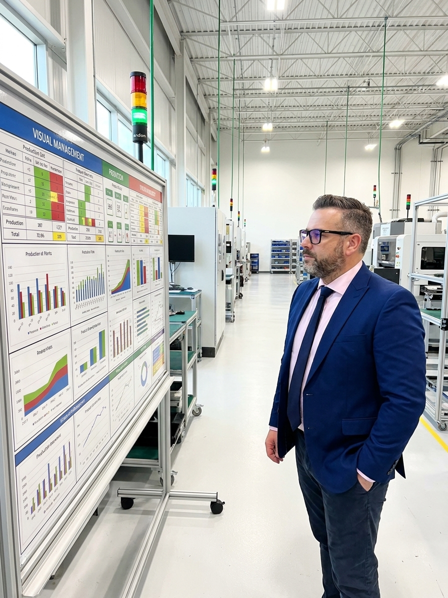
Walk into a factory operating on mature lean principles and the environment communicates operational status without a single word being spoken. Production counts, active quality holds, and Andon statuses are built into the physical workspace. A visitor can read the current state of operations in under ninety seconds because the data is colour-coded, displayed at the point of use, and updated in real time. This is visual management functioning as designed.
Most organisations misunderstand this concept entirely. They treat visual management as a decorating exercise, mounting a few faded performance charts in the breakroom or installing a digital dashboard that nobody looks at. This approach wastes resources and actively trains the workforce to ignore the physical environment. True visual management is the practice of making critical operational information immediately accessible through visual displays, signals, and controls.
If a process standard is locked in a filing cabinet or buried in a shared drive, it cannot be followed. If a known defect is only understood by the quality engineer, it cannot be prevented by the machine operator. Visual management short-circuits this information latency. It puts the right data where it is needed, when it is needed, in a form that can be understood instantly without requiring a meeting or an email.
The Spectrum from Display to Guarantee
Visual management operates across a spectrum of increasing control. At the lowest level, visual display simply shows information. Status boards and metric charts let you see what is happening, but they rely entirely on the observer to interpret the data and decide on an action. Most manufacturers stop here, congratulate themselves on achieving transparency, and wonder why defect rates remain unchanged.
The next step is visual control. Information is shown and it actively guides behaviour. Andon lights that turn red when a station hits a threshold, Kanban cards that signal exact replenishment times, and colour-coded floor zones that dictate where materials belong. The operator does not need to analyse the situation; the environment has already framed the response.
The highest level is visual guarantee. At this stage, the environment physically prevents errors. Poka-yoke devices, fixture designs that only accept correct orientation, and interlocked safety gates ensure that doing it wrong is physically impossible. When you reach visual guarantee, you have removed the human element from the specific failure mode entirely.
The Three Levels of Visual Management
- Visual GuaranteePhysical prevention. Poka-yoke and hard tooling make defects impossible to create.
- Visual ControlBehavioural guidance. Andon systems and Kanban trigger immediate, predefined responses.
- Visual DisplayPassive transparency. Whiteboards and charts show status but require manual action.
Consider a CNC machining center producing out-of-tolerance parts. In a plant limited to visual display, the operator runs the batch, fills out an inspection sheet, and hands it to quality control at the end of the shift. Quality discovers the deviation the next morning. By then, two hundred defective parts have been produced. The root cause is cold because the machine's thermal drift pattern can no longer be correlated with the exact time the deviation started.
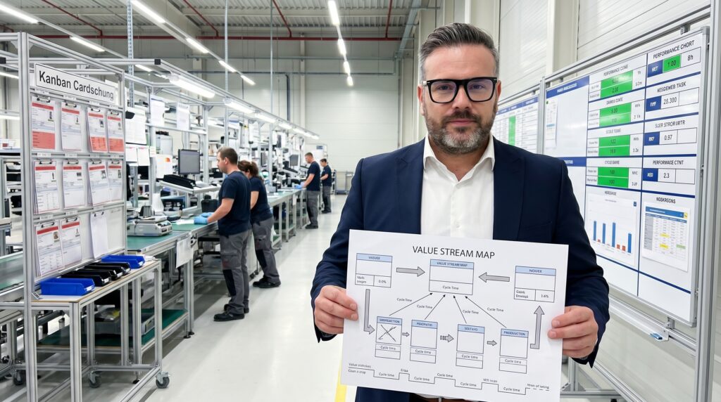
In a plant operating with visual control, the same CNC center has a digital display showing real-time Statistical Process Control (SPC) data next to the machine. The operator sees the control chart trending toward the limit. They stop, investigate, find that the coolant temperature has drifted, adjust the parameter, and resume. Zero defective parts produced. The process, the equipment, and the operator are identical. The only difference is the architecture of the information.
Designing Rules That Drive Action
After implementing ISO 9001 and IATF 16949 systems across automotive and aerospace plants, I have identified specific rules that separate functional visual environments from wall art. The most common mistake is displaying information because it is available rather than because it is needed. I have audited factories with massive display boards showing forty metrics. The signal-to-noise ratio is so low that the human brain simply stops processing the information.
Effective visual management starts with a single question: what does the person standing in this specific spot need to know right now to do their job correctly? The machine operator needs to know if the process is in control and what the current Cpk target is. The line supervisor needs to know about open quality holds and bottleneck status. The plant manager needs trend data and escalation status. Each audience gets exactly what they need, placed where they will encounter it naturally.
The guiding principle is that abnormal must be instantly distinguishable from normal. Think about a traffic light. You do not need to analyse the bulb or read a number. Green means go, red means stop. Your factory metrics should operate identically. If a metric is within target, it is green. If it is approaching a limit, it is yellow. If it is outside specification, it is red. No gradients, no nuance. The moment an operator has to think about whether something is acceptable, the visual system has failed.
Every visual control must have a defined response, or the display is just decoration.
Ownership and the Half-Life of Information
Information has a strict half-life. A quality dashboard in the manager's office is useless to the operator on the floor. A daily report distributed by email is already historical by the time anyone reads it. The information needs to live where the work happens. SPC charts belong at the machine. Work instructions belong at eye level at the station. When information is embedded in the environment, compliance rises because the right action becomes the easiest action.
Every visual element must have an assigned owner. A chart that has not been updated in three weeks is worse than no chart at all. Stale data teaches the workforce that management does not care about the information on the walls. I have conducted AS9100 and VDA 6.3 process audits where the production metrics on display boards were from the previous quarter. The team had stopped updating them because nobody looked at them. The visual management system, through sheer neglect, communicated that quality metrics did not matter.
Ownership means someone physically updates the board every shift. Someone acts on the red indicators within hours, not days. If a metric turns red, there must be a predefined protocol. Red means a specific person takes a specific action within a specific timeframe. If your organisation is not willing to assign and enforce this maintenance, do not install the boards. You are only creating visual clutter.
Architecting the Layers of Visibility
Building a visual factory is an architectural exercise, not a printing job. It requires structuring an information environment across five distinct layers, each serving a specific audience. Skipping layers or scrambling their hierarchy results in conflicting signals and operator confusion. The framework moves from the physical floor up to high-level strategic metrics, ensuring everyone interacts with the correct data.
The Five Layers of a Visual Factory Architecture
- 01Floor and SpacePainted zones and tape lines define material flow and safety areas. Missing items are instantly obvious.
- 02Equipment and StationsAndon lights and digital displays broadcast machine status, quality holds, and run rates.
- 03Work InstructionsCurrent standards are posted at eye level. One page, highly visual, updated with the latest engineering change.
- 04Team BoardsCell-level command centres tracking shift targets, open 8D actions, and top scrap reasons.
- 05Plant DisplaysStrategic overviews for management showing overall OEE, on-time delivery, and major systemic trends.
At the floor level, you define work areas and inventory locations using markings and painted zones. When everything has a designated place, an item where it should not be is immediately visible. At the equipment level, every machine must broadcast its heartbeat. A station waiting for material looks different from a station running normally. Andon systems and status lights make the flow of production visible from across the hall.
Work instructions and current standards must sit at the point of use. Not in a binder on a shelf, and not in a PDF on a distant intranet. The operator must be able to verify the correct torque sequence or assembly step without taking a single step away from the fixture. Finally, team boards serve as the daily huddle point, tracking real-time performance against target. Plant-level displays sit at the top, providing the ten-thousand-foot view without enabling micromanagement.
The Cultural Requirement for Transparency
Visual management is as much a cultural practice as a technical framework. When you make scrap rates, OEE, and customer complaints visible to everyone on the floor, you are explicitly stating that quality performance is not a management secret. You are stating that problems exist to be surfaced and solved, not hidden behind aggregated end-of-month reports. This level of transparency is profoundly uncomfortable for organisations built on information asymmetry.
I have seen visual management implementations fail because the charts went up, the problems became obvious, and the immediate management reaction was to take the charts down rather than fix the problems. Department heads who built their careers on hiding internal failures will actively resist real-time visibility. If your organisational culture punishes the discovery of defects, visual management will expose that toxic dynamic within weeks.
Successful implementation requires a culture where surfacing a problem is rewarded. The goal is an environment where information flows freely, defects get caught at the source, and standards are enforced by visibility rather than constant supervision. You do not need more data. You need the data you already collect to be visible to the people who can actually act on it.
Avoiding the Museum and Dashboard Traps
The most frequent failure mode is the Museum Effect. Beautiful displays are set up during a lean transformation, showcased to visiting executives, and never updated again. They become historical artifacts rather than operational tools. A close second is the Dashboard Trap, where engineers spend weeks building automated digital dashboards that nobody looks at because the screens are positioned where nobody stands.
Digital is not automatically better. A simple whiteboard updated every shift by the team leader, tracking the top three scrap causes and current Cpk, is often more effective than a plasma screen showing live data that workers walk past. Metric overload is another killer. If your board has forty metrics, you are effectively tracking zero. The human brain can track about five to seven things actively. Limit your displays to the critical few.
Finally, avoid the aesthetic obsession. Spending weeks perfecting fonts and corporate colour schemes while neglecting the content defeats the purpose. Visual management is a process control, not a graphic design exercise. An ugly chart drawn with a marker that is accurate, timely, and acted upon will always beat a beautifully designed chart that is outdated and ignored.