I once asked a production manager how long a single unit took to travel from raw material inbound to finished goods outbound across his twenty-two-station line. He answered with confidence: forty-five minutes of cycle time. The standard work instructions were posted at every position, cycle times were tracked on the digital dashboard, and OEE numbers looked respectable enough for the quarterly review.
When I asked how long a unit actually spent in the system, the number changed. Including waiting between stations, sitting in buffers, queuing for inspection, and staging for shipment, the answer was eleven days. Forty-five minutes of value creation buried inside eleven days of process time.
That ratio is not unusual. It is generous compared to what most organisations discover when they map their value streams for the first time. I have audited plants where the ratio was five minutes of actual work in thirty days of flow. The gap between processing time and lead time is where your profit goes to die, and the reason nobody notices is simple: nobody ever draws the map.
What Value Stream Mapping Actually Reveals
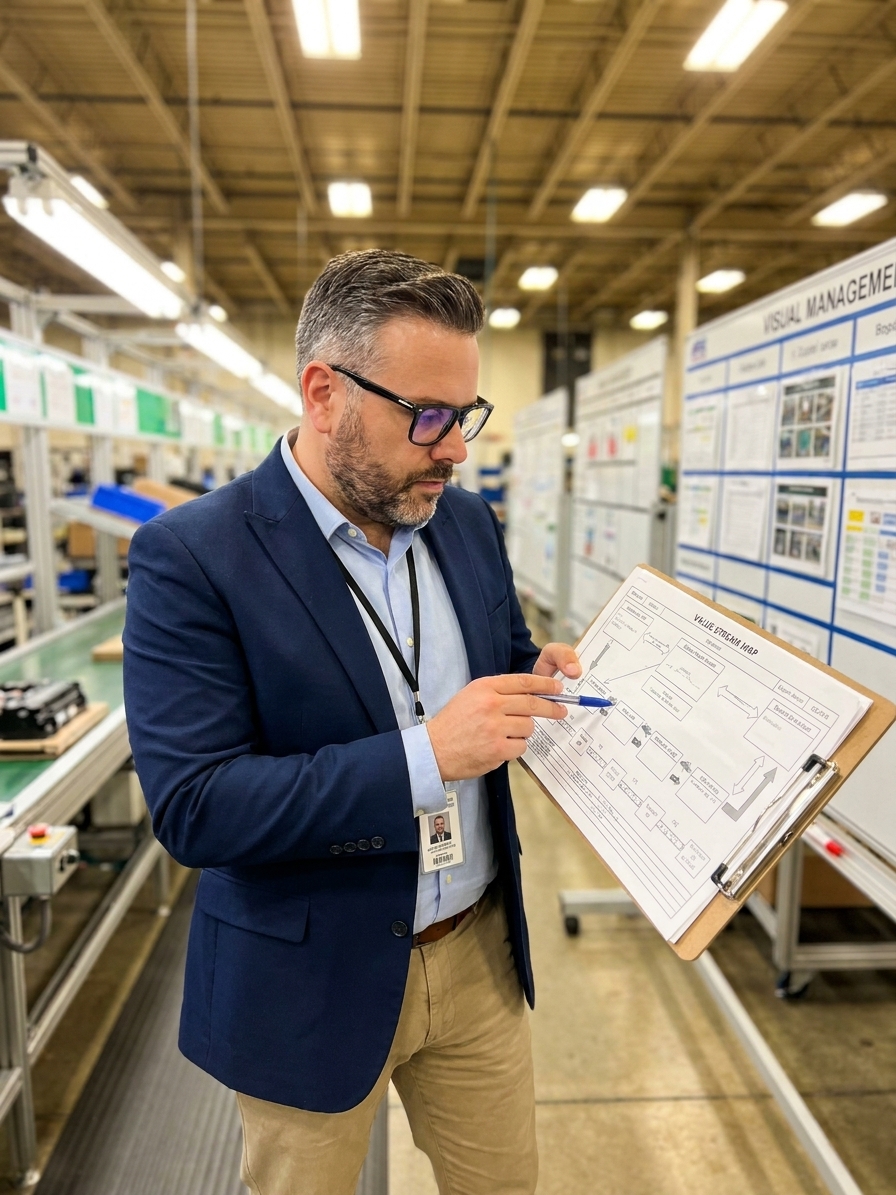
Value Stream Mapping (VSM) is a lean methodology that visualises the complete flow of material and information required to deliver a product from origin to customer. Formalised by Mike Rother and John Shook in Learning to See, it grew directly from Toyota's material and information flow mapping. Unlike a standard ISO 9001 process flowchart, a VSM does not show what should happen. It shows what actually happens on the floor.
The map forces you to categorise every step into one of three buckets. Value-adding activities physically transform the product in a way the customer pays for, such as machining a dimension to a Cpk of 1.33 or welding a structural joint. Necessary non-value-adding activities are steps required by your current system or regulatory framework, such as PPAP submissions, EASA-mandated inspections, or internal quality approvals.
The third category is pure waste. This includes waiting, searching for tools, reworking defects, and holding meetings about other meetings. When you colour-code your value stream map with these three categories, the visual is devastating. Most organisations discover that value-adding activities constitute between five and fifteen percent of their total lead time. The remainder is structural, systematically embedded waste that has been there so long nobody sees it.
The Cost of Ignoring Batch Accumulation
I worked with a medical device manufacturer that produced sterile surgical kits. They had twelve assembly stations, two inspection points, a sterilisation batch process, and a packaging line. Their customer required four-week lead times, and the plant consistently delivered in three and a half weeks. Management considered this a competitive advantage.

When we mapped the value stream, the picture changed. Total lead time was 24.5 days. Total processing time was 3.2 hours. For every hour of value-adding work, there were roughly 326 hours of non-value-adding activity. The kit spent more time waiting for sterilisation batch accumulation than it spent in every other process step combined.
The sterilisation chamber could process 500 units per cycle, but daily demand was only 120 units. The factory accumulated units for four to five days before running a batch because running the chamber daily was considered inefficient from a per-unit cost perspective. Nobody had calculated the cost of holding work-in-process inventory, the floor space expense, or the cost of scrapping defective units discovered only after a full week of accumulated batch time.
We reorganised into smaller, daily sterilisation runs and pulled assembly directly from customer orders rather than pushing to a forecast. Lead time dropped from 24.5 days to 4 days. We added no stations, bought no equipment, and hired no one. We simply saw the waste and eliminated it.
Why Organisations Resist Mapping Their Streams
The resistance to VSM is predictable. People confuse activity with productivity. A busy factory looks productive, and a department where everyone is working looks efficient. The map strips away the illusion and shows that most activity is motion, not progress. This is deeply uncomfortable for the managers who optimised that activity.
The map also reveals problems that belong to multiple departments. Waste rarely lives neatly within one team's boundaries. The queue between assembly and sterilisation in the medical device plant was partly a scheduling problem, partly a capacity problem, partly a planning failure, and partly a cost accounting error. No single department owned it, which meant no single department had ever fixed it.
Finally, the map threatens existing power structures. Showing that an entire department is a non-value-adding step implicitly questions why that department exists. Quality inspection departments are particularly vulnerable to this, especially when the map proves the inspection exists only because the upstream process is not capable of producing conforming output in the first place.
Building a Map That Drives Action
Creating a functional value stream map requires going to the gemba. You cannot map a process from an office or from documented SOPs. You have to walk the floor, time the actual waits, count the physical inventory buffers, and talk to the operators. The gap between documented process and actual process is where your biggest insights live.
Start with the customer and map backward to raw material. This forces you to see the process from the outside in. For every step, record three data layers: process data (cycle time, changeover time, uptime, batch size), inventory data (queue sizes before and after the step), and information flow (how each step knows what to produce, when, and how much).
The VSM Data Collection Sequence
- 01Define Customer DemandEstablish the takt time and required shipment frequency before touching the floor.
- 02Walk the Physical ProcessTime actual waits, count WIP inventory, and document real handoffs between stations.
- 03Record Process and Inventory DataCapture cycle times, changeovers, uptime, batch sizes, and buffer volumes at each step.
- 04Trace the Information FlowIdentify how production signals move—kanban, MRP, forecast, or tribal knowledge.
- 05Calculate the TimelineGraph processing time against total lead time to expose the efficiency gap.
At the bottom of the map, draw a timeline with two levels. The upper level shows processing time at each step. The lower level shows wait time between steps. When you add them up, the ratio of processing time to total lead time is your efficiency. It will almost certainly be a single-digit percentage.
Identify the pacemaker process. This is the single point in the value stream where you set the production pace. Everything downstream of the pacemaker should flow. Everything upstream should pull. Most organisations lack a clearly defined pacemaker, meaning production pace is set by whoever is loudest, not by what the customer actually needs.
A map that doesn't drive action is decoration, not improvement.
Designing the Future State
The current state map shows where you are. The future state map shows where you need to go. The gap between them is your improvement roadmap. Building the future state requires answering specific questions about flow, pull, and levelling, then tying those answers to measurable execution targets.
Determine where you can establish continuous flow to eliminate batches and queues. Where flow is not yet possible, define supermarket pull systems to control inventory. Pinpoint the pacemaker process and establish how you will level the production mix to avoid large, unresponsive batches of a single product variant.
The future state map is not a wish list. It is a specific, time-bound plan. Every kaizen event on the map should eliminate a specific non-value-adding step you identified in the current state. Every equipment purchase should enable flow where batch processing currently creates delays. Every process improvement should tie back directly to a structural waste.
Define the implementation plan with clear timelines and owners. Without assigned accountability, the future state map becomes another piece of engineering documentation that operators never see. The goal is operational transformation, not theoretical compliance.
The Measurement That Forces Redesign
After mapping the value stream and implementing improvements, one metric tells you whether you are making progress: Process Cycle Efficiency (PCE). You calculate it by dividing value-adding time by total lead time and multiplying by one hundred. World-class organisations achieve PCE of twenty to twenty-five percent. Most manufacturing companies operate at one to five percent.
Process Cycle Efficiency Benchmarks
If your PCE is two percent, you do not have a productivity problem. You have a structural problem. Your people are working hard within a system designed to waste ninety-eight percent of their effort. No amount of motivational leadership, performance management, or individual productivity improvement will fix that. You have to redesign the system.
Before VSM, organisations think in terms of departments. Quality handles quality. Production handles production. Each department optimises its own metrics while the total system underperforms because the handoffs are where waste accumulates. After VSM, people think in terms of flow. They realise the unit of improvement is the stream, not the department.
When the production manager, the quality engineer, the logistics coordinator, and the finance controller all stand in front of the same map and see the same waste, you create something no policy document can produce: collective clarity about what needs to change. Value stream mapping is how you see the system. You cannot fix what you cannot see.