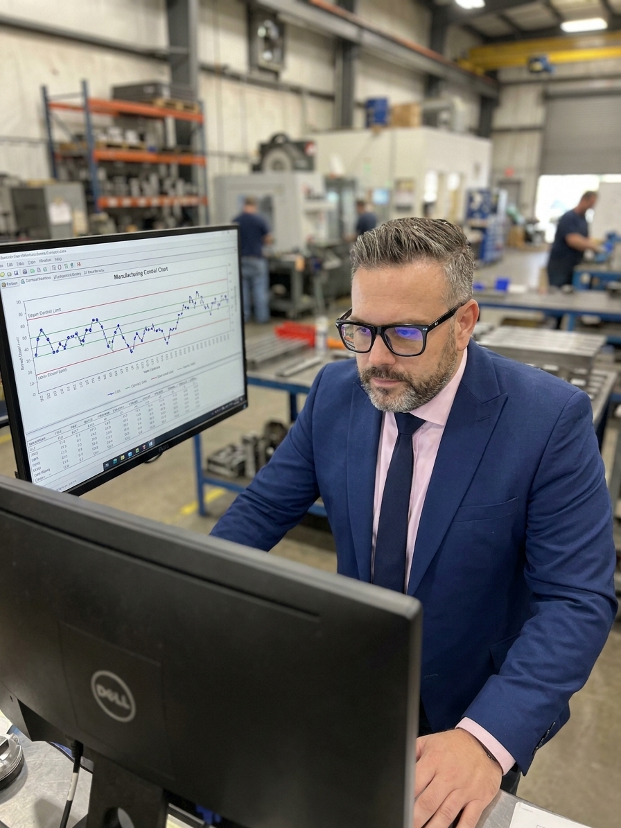
Walk into most manufacturing plants and you will find control charts decorating the walls like museum pieces. The charts look serene. Dots dance neatly between the upper and lower control limits. Occasionally, a spike is dismissed in the margins as a special cause that has already been investigated. The quality manager beams. The IATF 16949 auditor nods. Everyone agrees the process is in statistical control.
Meanwhile, on the production floor, the process is shifting. Not dramatically enough to trigger an immediate halt, but quietly. The drift hides comfortably inside the calculated limits. It waits until the monthly capability study reveals that your Cpk has dropped from 1.67 to 1.12. By the time that report circulates, you have already shipped suspect product, and nobody can explain the degradation.
This is the operational reality of Statistical Process Control in modern manufacturing. The diagnostic tool designed to give engineers x-ray vision into their processes has degenerated into a lullaby. It puts vigilance to sleep. When implemented poorly, SPC does not prevent defects; it simply provides a statistical alibi for management after the defects have already occurred.
The Degeneration from Enthusiasm to Theatre
Walter Shewhart invented the control chart at Bell Labs in the 1920s to distinguish between common cause variation and special cause variation. The logic was elegant. Calculate control limits from short-term process data, plot your measurements, and react only when a point falls outside the limits or forms a non-random pattern. It prevents overreaction to natural noise while ensuring real shifts are caught early.
What starts as a genuine drive for data-driven quality inevitably degrades through four distinct phases. First comes enthusiasm: software is purchased, critical dimensions are mapped, and operators are trained. Next comes compliance: customers and auditors demand the charts, so plotting points becomes a daily ritual rather than an analytical exercise.
The third phase is theatre. An out-of-control point appears, and the operator is asked to explain it. The explanation goes into a form, attributed to material variation, and filed away without corrective action. The final phase is irrelevance. When a genuine quality crisis hits, nobody reaches for the control chart. They call an emergency meeting, because everyone subconsciously knows the chart is just compliance wallpaper.
The Lifecycle of SPC Degeneration
- 01EnthusiasmSoftware is purchased and charts are deployed for critical dimensions.
- 02CompliancePlotting points becomes a daily ritual to satisfy customer audits.
- 03TheatreOut-of-control points are explained away on forms without real corrective action.
- 04IrrelevanceManagement ignores the charts during actual crises, relying on emergency meetings instead.
Measuring the Wrong Variables and Freezing the Limits

The most sophisticated control chart is worthless if it tracks a characteristic that does not correlate to product performance. I have audited plants where every critical dimension per the print had a chart, but the actual failure modes driving customer complaints were entirely different. The failures were linked to surface finish or material hardness, characteristics nobody was charting because they were not easy to measure with a standard gauge.
The discipline lies in charting the vital few, not the trivial many. Right means the variables that most directly affect function, fit, and customer experience. Furthermore, control limits are supposed to be living parameters. They must be recalculated when the process fundamentally changes. New tooling, a new material lot, or adjusted machine parameters all require a new baseline.
Instead, quality engineers routinely calculate limits once during the initial PPAP study and freeze them indefinitely. The process evolves and tooling wears, but the limits remain static. Eventually, the chart shows everything as in control because the limits are artificially wide, or it shows constant chaos because the process centre has shifted. Both scenarios render the chart mathematically useless and operationally dangerous.
Ignoring Patterns and Hiding Behind Sampling
The rules of SPC are not limited to points breaching control limits. Western Electric rules and Nelson rules identify non-random patterns that signal process shifts even when every point remains technically in control. Runs of seven points above the mean, trends of six consecutive decreasing points, or two out of three points beyond two sigma are all critical early warnings.
These patterns house the real predictive power of SPC. A gradual upward trend within the limits indicates tool wear or thermal drift. Catch it early and you adjust the process before defects occur. Ignore it, and by the time a point finally breaches the limit, you have already produced hundreds of non-conforming parts. Most organizations ignore every pattern that does not trigger a hard stop, effectively utilizing only a fraction of SPC's capability.
A control chart is only as truthful as its sampling plan. A common trap is sampling at the exact same time every shift, from the same machine cavity, with the same operator. The chart will display beautiful, tight control because the methodology has standardized the variation out of the equation. You will miss the defects produced during the afternoon heat, the startup lag after shift changes, and the drift in the furthest mould cavity.
Tampering and Disconnected Response Plans
Deming's funnel experiment proved that adjusting a stable process in response to random variation always increases total variation. Yet operators constantly tamper with machine settings. A point drifts toward the upper control limit but remains well within it, and the operator nudges the offset down to centre the next point. The result is a process that oscillates far more widely than if they had simply left it alone.
The control chart detected the signal. The organization lost it at reception.
This tampering creates a statistical illusion. The control chart shows a tighter cluster around the mean, which looks like an improvement to the untrained eye, but the actual part-to-part variation has increased. It is a self-inflicted wound. Compounding this issue is the reality that a control chart without a documented response plan is just a graph. When a point goes out of control, containment should be automatic.
In most facilities, the response to an out-of-control signal is to tell the supervisor. What the supervisor does next is entirely dependent on their workload, experience, and mood. There is no standard escalation protocol, no structured 8D investigation trigger, and no verification loop. The chart successfully detected the anomaly, but the organizational bureaucracy immediately dropped the ball.
Tampering vs. Process Control
Reactive Tampering
- Operators adjust offsets when points drift toward limits
- Increases total process variation despite visual improvement
- Masks the true capability of the equipment
- Creates an oscillating, unstable baseline over time
Disciplined Control
- Intervene only on statistically valid out-of-control signals
- Reduces variation by isolating true special causes
- Provides accurate data for Cpk capability studies
- Establishes a predictable, stable process baseline
The Capability Trap and Contextual Blindness
SPC and process capability analysis are deeply intertwined, and both suffer from the same degradation. A customer requires an initial Cpk of 1.67. You run a study and achieve 1.73. The paperwork is filed and the production run begins. But the study was likely based on fifty consecutive parts from a single setup, run on a Tuesday morning with a fresh tool and a single material lot.
That reported Cpk represents the capability of your process under absolutely ideal conditions, a state that represents a fraction of your actual production time. Real capability includes the Monday morning startup scrap, the Friday afternoon operator fatigue, the material from the alternate supplier, and the worn tool that should have been changed two hours prior.
The gap between reported capability and actual capability is one of the largest unacknowledged risks in manufacturing. SPC, when implemented as a compliance exercise, does not close this gap. It actively disguises it. Control charts are a diagnostic tool, not a therapeutic one. They tell you when something has changed, but they do not tell you why. Without deep process knowledge, the chart is just an alarm without a fire department.
Rebuilding SPC as a Learning System
If your SPC program has fallen into these failure modes, the fix is not to abandon it. The fix is to shrink the system down to what you can manage with absolute discipline and grow from there. Pick the three most critical process characteristics, the variables that drive the vast majority of your quality escapes and field failures.
Set up control charts with properly calculated, dynamic limits. Train operators rigorously on pattern recognition, not just limit violations. Write standard work for every type of signal, outlining clear containment, root cause investigation, and verification steps. Then, actually follow the protocols. Every time, for six months.
Connect the data to the broader organization. When a chart shows a shift, the investigation must immediately pull maintenance records, engineering change logs, and procurement data. SPC must become a cross-functional diagnostic tool, not a standalone quality department scoreboard. If you do this with just three characteristics, you will learn more about your process than five years of passive charting ever taught you.