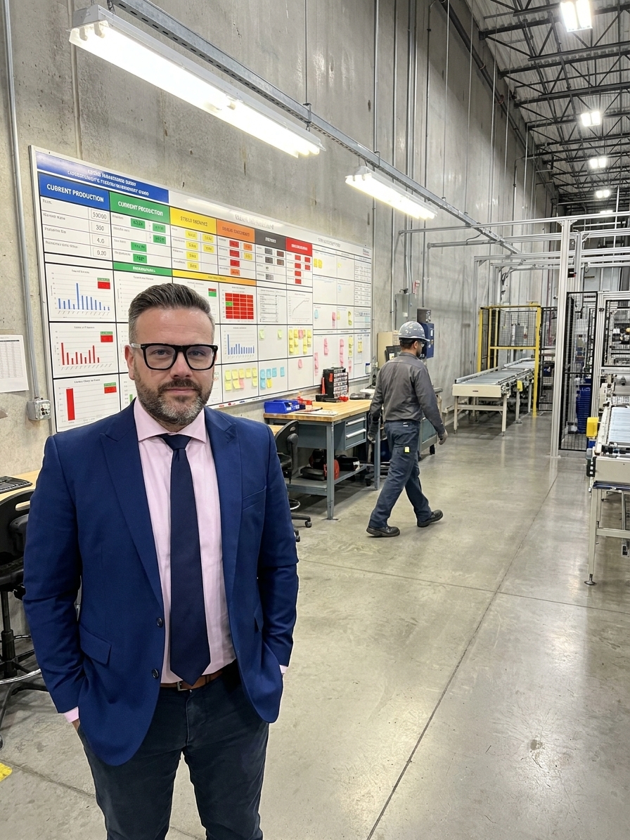
Walk onto any factory floor that has been through a lean transformation in the last decade and you will see them: the boards. Andon boards, production trackers, quality dashboards, safety cross displays, 5S audit scoreboards, and Tier meeting boards with their hierarchical cascade of metrics from cell level to plant level.
The intent behind visual management is sound. Make the workplace transparent. Make problems visible instantly. Reduce the information asymmetry between operators and managers. When visual management works, it transforms communication. People do not need meetings to know where things stand. The board tells them.
But here is what actually happened in most organisations. They built the boards, filled them with metrics, and mounted them in prominent locations. Then, gradually, the boards became furniture. Having audited plants across automotive and aerospace, I have seen the same lifecycle play out repeatedly. The visual management system decays because the organisation confuses display with communication.
The Lifecycle of a Visual Management Board
Visual management boards follow a predictable arc in most organisations, and mapping this arc is the first step to changing the outcome. It begins with Phase One: Enthusiasm. The board goes up during a kaizen event. Everyone participates in designing it. The operators feel heard because they helped decide what metrics matter. The board is updated religiously for the first six weeks. People gather around it, discussions happen, and problems get flagged.
Then comes Phase Two: Drift. The consultant leaves. The daily stand-up meeting in front of the board starts getting shorter, then later, then optional. The board updates become perfunctory. Someone scribbles numbers on it because the standard work says to, not because anyone is using the numbers. The colour coding that was supposed to trigger immediate action when a metric went red now sits red for weeks without anyone responding.
Phase Three is Atrophy. The board is now a fixture. People walk past it the way they walk past fire extinguishers. The numbers are either stale, suspiciously perfect, or so formulaic that they communicate nothing. The board has become what every visual management board eventually becomes when it is not actively used for decision-making: wallpaper.
Phase Four is the Revival Attempt. A new manager arrives, or an IATF 16949 audit is coming. Someone notices the boards look neglected. A directive goes out to update all boards by Friday. They get fresh paper and fresh markers. The auditor photographs them as evidence of best practice. Then Phase Two begins again.
The Four-Phase Decay of an Andon Board
- Phase 4: Revival AttemptDriven by audit pressure; aesthetic refresh only.
- Phase 3: AtrophyBoard becomes invisible furniture; data is stale.
- Phase 2: DriftUpdates become perfunctory; red metrics are ignored.
- Phase 1: EnthusiasmHigh engagement; daily problem-solving occurs.
Confusing Display With Communication
The fundamental failure mode is the assumption that putting information on a wall is the same as communicating it. A board full of metrics that nobody discusses, nobody questions, and nobody acts on is not communication. It is display. The difference between display and communication is response.
If the board shows that defect rates spiked on the morning shift and nobody asks why, that is not visual management. That is decoration with charts. Communication requires a sender, a receiver, and shared understanding. The board is only the medium. Without the human interaction around the board, it is just a sign that nobody reads.
At WITTE Automotive, I observed plants where operators could immediately tell you the status of their cell because the board was positioned at the point of use. But in plants where the board was positioned in a hallway for manager walks, the operators ignored it. The location and the resulting behaviour determined whether the board functioned as a communication tool or a decorative placard.
Metrics Without Meaning
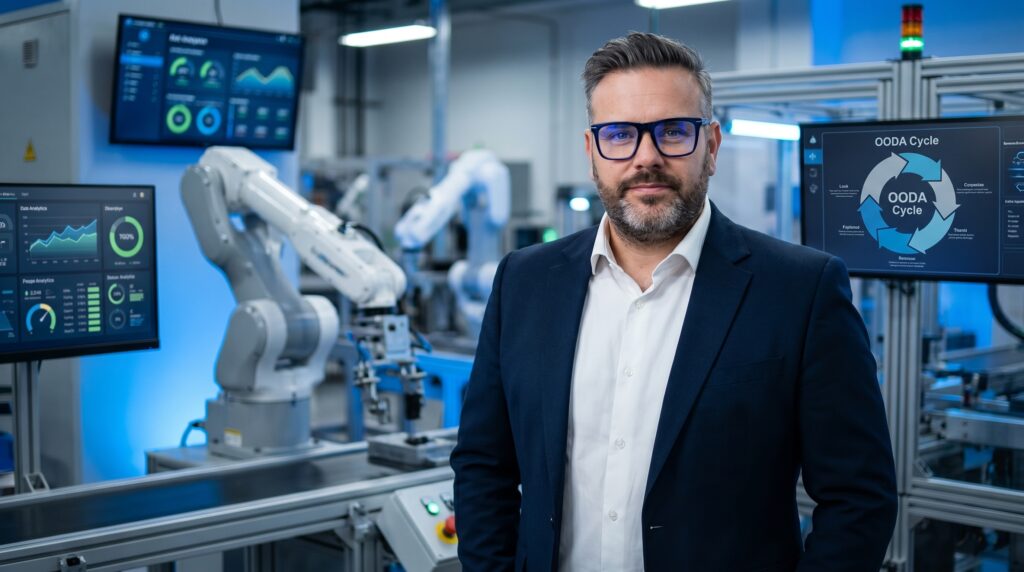
Many visual management boards fail because they display metrics chosen for their measurability rather than their relevance. The board shows Overall Equipment Effectiveness (OEE), scrap rate, on-time delivery, safety incidents, and attendance. These are standard metrics, chosen because they are easy to measure and standardise across a corporation.
But they are rarely the metrics that the operators on a specific cell need to manage their work. The question that organisations rarely ask is: what information does the person standing in front of this board need to make a better decision in the next ten minutes? If the board does not answer that question for the operator, the board is not for them.
If the board only serves a manager who walks through once a week, it is not visual management. It is a remote monitoring station dressed up as empowerment. A metric that the team can directly influence creates accountability. A metric that depends on decisions made three management levels above them creates resignation.
The Update Trap and the Action Gap
Visual management boards require maintenance. Organisations have a tendency to add metrics over time. Each audit, each new initiative, each reorganization adds another section. The board that started as a simple production tracker—good parts, bad parts, downtime reasons—becomes a comprehensive dashboard with twenty-seven metrics, trend graphs, and action item logs.
The person responsible for updating the board is now spending twenty minutes every shift transcribing data from the ERP system and the quality database onto a piece of paper. They are doing manual data entry for a display that exists in parallel with the digital systems that already contain the information. A reasonable person will eventually ask why they are copying data from a computer onto a wall.
This leads directly to the action gap, which is the deepest failure of visual management. A defect rate goes red. The operator notices. The supervisor notices. They discuss it at the Tier meeting. An action item is assigned to investigate the root cause. The investigation is added to someone's overloaded task list. Two weeks later, the due date has passed, the defect rate is still red, and the action item is still open.
Making inaction visible is only useful if someone with authority sees it and does something about it.
The board has done its job. It made the problem visible. It made the assignment visible. It is now making the inaction visible. But if the inaction sits on the board for weeks without escalation, the board is not driving improvement. It is documenting decline.
Physical Boards vs. Digital Dashboards
What teams do
- Replace physical boards with cycling digital screens
- Create the illusion of sophistication
- Remove the human interaction of manual updates
- Allow passive consumption of data
What works
- Keep physical boards for daily Tier meetings
- Maintain social accountability
- Force active engagement with the data
- Use digital to supplement, not replace
The Digital Illusion
Many organisations replace physical boards with digital displays mounted on factory walls, pulling real-time dashboards from MES or ERP platforms. This seems like progress. The data is always current. No one has to manually update it. Dashboards can be customised and drilled into. But digital displays solve only one problem: data freshness.
They do not solve the behaviour problem. In fact, they often make it worse. Digital displays create the illusion of sophistication while removing the human interaction that makes visual management work. A physical board forces someone to walk up to it, stand in front of it, and engage with it. The act of updating a physical board is an act of engagement.
A digital display on a wall that cycles through screens automatically does none of this. People glance at it the way they glance at a clock. There is no reason to stand in front of it or discuss it. The digital display, despite being technologically superior, often produces less engagement than a piece of paper and a marker. If the choice is between a physical board that people actively use and a digital display that people passively consume, choose the physical board.
Practical Steps to Rescue Failed Boards
If your organisation has boards that have drifted into decoration, the path back to effectiveness is not a redesign of the boards. It is a redesign of the behaviours around the boards. Audit your boards by observing behaviour, not content. Spend one hour watching what people actually do with each board. Does anyone discuss it? If the answer is no, the board is dead.
Kill boards that nobody uses. Every dead board sends a message: we put things on walls and then ignore them. That message undermines the boards that are still alive. Remove the dead ones. Fewer, living boards are infinitely more powerful than many dead ones. Relocate remaining boards to where the work happens, next to the machine.
Establish and enforce the red-means-respond rule. Make it non-negotiable. If a metric goes red and no one responds within the defined time frame, that is a management failure, not an operational one. Hold the management accountable for responding to signals, not just for displaying them. Every metric on a visual management board must have a clear, predetermined response associated with its deviation.
Simplify relentlessly. If you cannot explain why each metric is there and what action it should trigger, it should not be there. Furthermore, boards must evolve. When a metric has been green for three months, it is no longer providing actionable information. Effective teams retire stable metrics and replace them with new priorities. The board should always point at the next problem, not celebrate the last one.
The Red-Means-Respond Escalation Sequence
- 01Signal detectionMetric crosses the predefined threshold and turns red on the board.
- 02Immediate triageTeam acknowledges the deviation during the shift, not the next day.
- 03Containment actionOperator and supervisor implement an immediate fix to stop the bleed.
- 04Root cause analysisAssigned owner initiates formal problem-solving (8D, 5-Why).
- 05VerificationManagement confirms the action was effective and updates the board.
Behaviour Over Information
Visual management is not about information. It is about behaviour. The information is the input; the behaviour is the output. Organisations that understand this invest in the behaviour: the daily stand-ups, the escalation rules, the problem-solving discipline, and the accountability for action.
The result of investing in display without behaviour is that the organisation has beautiful boards that document its performance while that performance steadily declines. The board on your wall is not your visual management system. The conversations, decisions, and actions that happen because of that board are your visual management system.
If the trigger does not fire, the most meticulously maintained board in the world is just a large piece of paper that nobody reads. Align the board to the team, enforce the escalation, and strip away the metrics that do not drive an immediate operational decision. That is how you turn wallpaper back into a working tool.