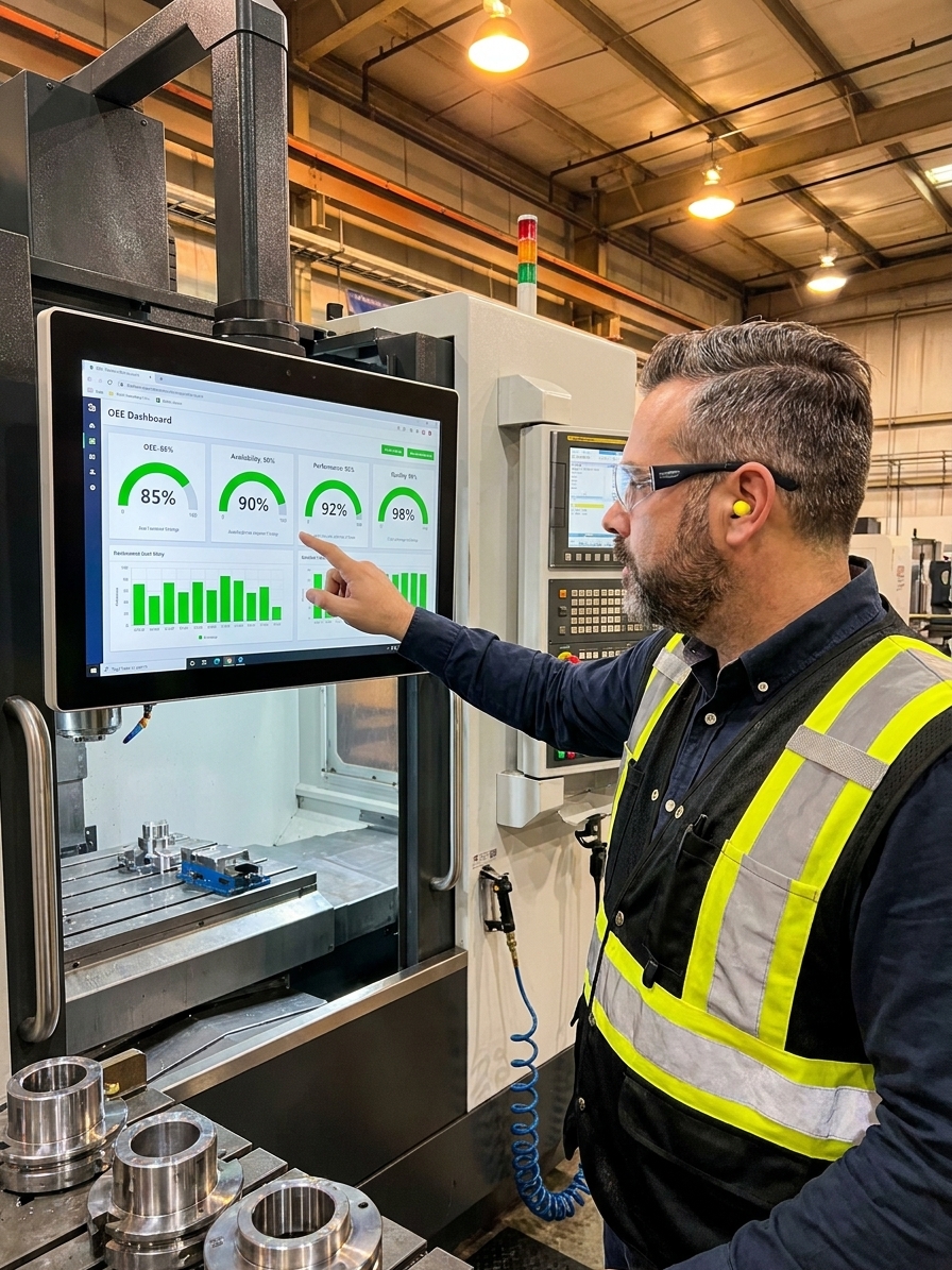
Overall Equipment Effectiveness (OEE) is simultaneously the most widely adopted manufacturing metric of the last twenty years and the most consistently misused. Walk into any factory and ask the plant manager what their OEE is. They will give you a number. Ask them how they calculated it. Watch the conversation shift from confidence to vagueness in under thirty seconds.
Seiichi Nakajima conceived OEE in the 1960s as the central diagnostic pillar of Total Productive Maintenance. The formula is elegant: Availability multiplied by Performance multiplied by Quality. Three ratios, each capturing a distinct dimension of equipment effectiveness, produce a single percentage showing how well a machine is used compared to its theoretical maximum.
The formula is mathematically sound. The problem is what happens when a metric this powerful becomes a reporting obligation rather than a diagnostic instrument. Organisations do not fail at OEE because the math is hard. They fail because every human involved in the calculation has an incentive to inflate, smooth, or manipulate one of the three components.
The Three Components and Where the Manipulation Starts
Availability is the ratio of actual run time to planned production time. You take the scheduled time, subtract downtime, and divide by the scheduled time. In practice, nobody agrees on what counts as planned downtime, whether preventive maintenance windows should be included, or whether the fifteen minutes an operator spent looking for a fixture is a downtime event.
Availability is the most manipulated component because it is the most visible. Plant managers are judged on machine uptime. When the number looks bad, the response is rarely to investigate root causes. The response is to reclassify downtime. The thirty-minute meeting next to the machine becomes a quality discussion. The two hours waiting for raw materials becomes a supply chain issue.
Performance measures whether the machine is running at its designed speed, but ideal cycle time is the most contested number in any factory. Engineering says the machine should run at 120 parts per minute based on the OEM specification. The operator runs it at 95 because at 120 the machine jams, which hurts Availability. The production manager informally agrees to run at 100, but the OEE calculation still uses 120. Performance looks fine while the process silently degrades.
The deeper problem with Performance is that it rewards running a machine faster than the process can sustainably handle. If you push cycle times to maximise the Performance ratio, you produce more scrap, hurting Quality. Or you increase tooling wear, which increases unplanned downtime next week, hurting Availability. The three components are coupled, and the multiplication obscures this.
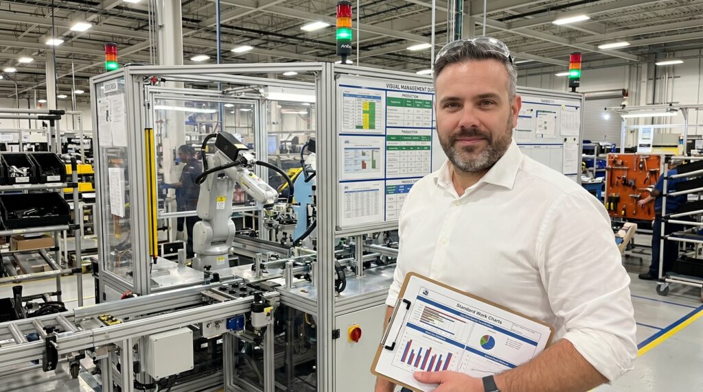
The Multiplication Problem and Mathematical Illusions
When you multiply three percentages together, the result is always lower than the lowest individual component. An Availability of 90%, Performance of 95%, and Quality of 98% — all respectable individually — produce an OEE of 83.8%. This is not a bug. Nakajima designed it this way because he wanted a metric that would refuse to let organisations hide behind one good dimension.
But the multiplication creates a perverse incentive. Because the final number is dominated by the weakest component, improving your worst area produces the largest OEE gain. This should drive focus toward the biggest loss. Instead, it drives organisations to argue about whether the calculation methodology needs revising.
You hear it constantly: our Availability is only 72% because we count changeover time against it. If we excluded changeovers, Availability would be 89% and OEE would jump from 62% to 76%. The intent behind the argument reveals everything. The goal is not to reduce changeover time through SMED methodology. The goal is to produce a number that looks better without changing anything on the shop floor.
Connecting OEE to the Six Big Losses Framework
Nakajima did not propose OEE as a standalone number. He proposed it as the entry point to the Six Big Losses — a structured taxonomy of why equipment effectiveness degrades. Equipment failure and setup losses reduce Availability. Idling, minor stoppages, and reduced speed reduce Performance. Process defects and startup yield losses reduce Quality.
If you measure OEE but do not track and attack the Six Big Losses, you have a score without a game. You know the number is bad, but you have no systematic way to improve it. Most organisations fail here. They implement OEE as a dashboard metric — a number displayed on a screen that goes up or down each month.
They do not connect the number to the loss taxonomy. They do not assign owners to each loss category. They do not set reduction targets for specific losses. They just watch the number and hope it improves, and when it does not, they adjust the calculation parameters.
From OEE Metric to Loss Elimination
- 01Measure OEE ComponentsCapture Availability, Performance, and Quality separately to expose the weakest dimension.
- 02Decompose into Loss CategoriesMap the data to the Six Big Losses taxonomy to isolate the specific failure mode.
- 03Assign Loss OwnershipAllocate the dominant loss to a cross-functional team with a mandate to investigate.
- 04Execute Targeted CountermeasuresDeploy specific methodologies like SMED or TPM to address the identified root cause.
- 05Verify OEE ShiftConfirm the targeted loss reduction directly improved the baseline OEE calculation.
The Automation Trap in Data Collection
The OEE software market is substantial. Vendors sell systems that automatically collect machine data, calculate OEE in real time, and display dashboards throughout the factory. These systems are marketed as the solution to manual data collection, and they can be — when implemented correctly.
But automation introduces its own failure mode. When operators manually recorded downtime reasons on paper logs, they had to think about each stoppage, categorise it, and write it down. The process was tedious, but it forced engagement with the loss. When a machine is connected to an IoT gateway that records downtime based on PLC signals, nobody needs to think about anything.
The system generates data. The data generates dashboards. The dashboards generate meetings. The meetings generate requests for IT to adjust the classification rules. The improvement cycle never starts because everyone is busy debating the accuracy of the measurement instead of addressing the losses the measurement was supposed to reveal.
A machine that stopped for twenty minutes is data. A machine that stopped because a supplier changed a raw material surface finish is knowledge.
The most effective implementations use a hybrid approach: automated data collection for raw numbers combined with mandatory human input for downtime reason codes. The human input drives improvement because it forces the team to diagnose each event. The first goes on a dashboard. The second drives a supplier corrective action request.
Setting Realistic Targets Instead of Chasing 85 Percent
Nakajima's 85% benchmark has become the default target organisations set for themselves regardless of starting point, industry, equipment age, or product mix. This is destructive. For organisations starting at 50% OEE — typical for a factory that has never systematically measured equipment effectiveness — the 85% target is so distant that nobody takes it seriously.
For organisations stuck at 68%, the 85% target creates pressure to manipulate the calculation rather than acknowledge that some equipment may never reach world-class performance due to age or complexity. The honest approach is to set targets based on the current baseline and the rate of improvement, not a benchmark derived from a different era.
Nakajima's World-Class OEE Baseline
Building a Diagnostic Culture on the Shop Floor
Organisations with a genuine improvement culture use OEE as a flashlight. They publish the raw data, decompose it into the Six Big Losses, assign cross-functional teams to attack the largest loss, and measure the result. Their numbers may not be world-class, but they are improving, and everyone understands why.
Organisations with a compliance culture use OEE as a report. The number is generated because headquarters requires it. It trends slightly upward over time because the calculation methodology is quietly revised each year. The jams, the setup overruns, and the deliberate slow running continue unaddressed while the dashboard glows green in the conference room.
If you are rescuing an implementation that has degraded into reporting theatre, start with one critical line. Define your terms in writing before you collect data. Get production, engineering, and quality to agree on what counts as planned downtime and how scrap is classified. Every future argument about the number will trace back to an ambiguity you failed to resolve here.
The ultimate test is whether operators can tell you, without looking at a dashboard, what their biggest loss category is and what they are doing about it. If they can, OEE is working as a diagnostic tool. If they cannot, no software or methodology refinement will fix it. Only leadership that refuses to manipulate the calculation can.