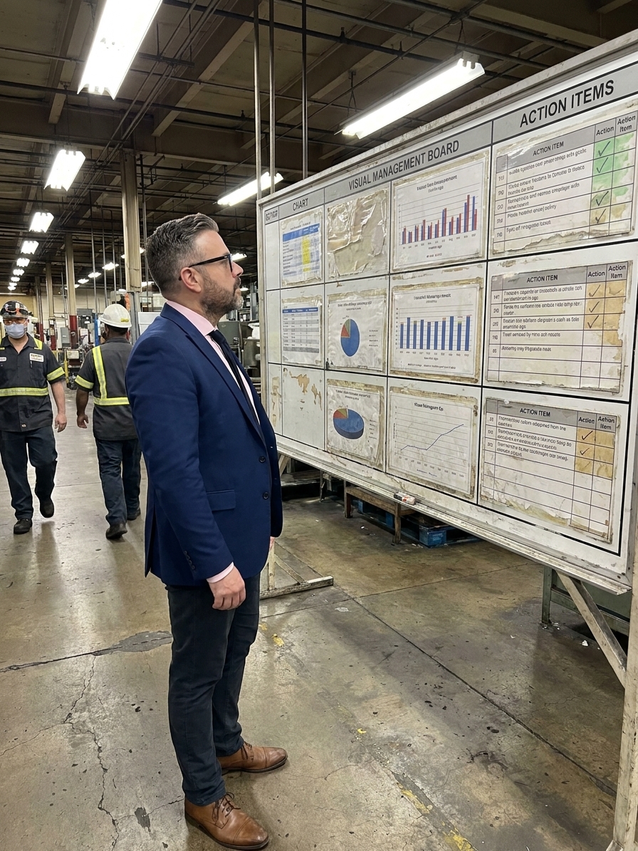
Walk onto any production floor and you will find it: the visual management board. It sits near the entrance, laid out with colour-coded sections, printed charts, and laminated headers. Safety metrics, production targets, quality trends, and OEE numbers fill the spaces. A section for action items lists names and dates printed neatly below. It looks impressive.
It was impressive — the day it was installed. That was eighteen months ago. Half the charts still show data from Q2 of last year. The action items all have checkmarks, but nobody can remember what was actually done. The OEE number says 87 percent, which everyone on the floor knows is fiction. The safety calendar has not been updated since the last customer audit was announced.
Nobody looks at it. Not the operators, not the supervisors, and not the plant manager, who walks past it twice a day without a glance. This is how visual management dies. Not with a bang, but with the slow erosion of meaning — one outdated chart at a time, one unchecked action item at a time — until the system becomes decoration.
I have audited plants where the visual management system actively damages quality culture. A stale board does not just fail to communicate; it trains the entire organisation to walk past data without seeing it. The remedy is not a redesign. It is establishing the discipline, ownership, and response protocols that turn displays into decisions.
The mechanics of visual theatre
The most common failure mode is visual theatre. A company invests heavily in boards, displays, and signage. Consultants design the layout. The plant looks immaculate for the opening day, executives tour and nod approvingly, and photos are taken for the company newsletter. Then the updates stop.
The board becomes a frozen snapshot that grows less relevant each day. Production data scheduled for update every shift gets updated weekly, then monthly, then whenever someone remembers. The charts intended to drive discussion become background noise. Action items become checkboxes marked complete without verification of any actual corrective action.
A visual management board that has lost meaning is worse than no board at all. It teaches people to ignore information. It creates visual noise that desensitises operators and supervisors to the signals that actually matter. When real abnormalities occur, they are dismissed as just another element of the ignored display.

Metrics without meaning
The second failure mode is displaying data that nobody understands, uses, or trusts. These are the boards with sixteen metrics crammed onto a single surface. Each metric has its own chart, each updated by a different person, and each requiring specialised knowledge to interpret. The display turns into wallpaper.
Scrap rate by machine by shift by defect type. Mean time between failures across twelve work cells. First pass yield trending over thirteen months with rolling averages and control limits. Each metric might be valuable when analysed by the right engineer at the right time. Plastered on a board where nobody has the time or context to interpret them, they are useless.
The test for any visual display is simple. Can the people who walk past it every day tell you what it says and what it means? If the answer is no, the display is failing. It does not matter how sophisticated the data is or how colourful the charts are. If the audience cannot read it instantly, it is decoration, not communication.
Core thresholds for functional visual management
The accountability gap
The most insidious failure mode is lack of ownership. Visual management boards are installed as part of a lean initiative, but nobody is assigned to maintain them. Or someone is assigned, but it is added to their already overloaded job description without removing anything else. The person who championed the boards gets promoted or leaves.
Without clear ownership, visual management decays predictably. Nobody decides to let the boards go stale. It happens because updating a board is never urgent. It is never the task that someone is calling about. And so it slips — once, then again, then permanently. The accountability gap extends to the response side as well.
Visual management only works when the information it displays drives immediate action. When a metric turns red, someone must respond. When an abnormality is highlighted, someone must investigate. When an action item is assigned, someone must follow up. Too often, the boards display problems that everyone already knows about and nobody is fixing.
The visual system becomes a monument to inaction. It serves as a daily reminder of all the things that are broken and all the things that nobody is doing anything about. This actively undermines the ISO 9001 or IATF 16949 intent of corrective and preventive action, replacing it with passive observation.
Audit-driven visual systems
The most damaging pattern emerges when visual management exists primarily to satisfy auditors and customers. The ISO 9001 auditor wants evidence of management review, so a board goes up. The automotive customer wants to see layered process audits, so a display is created. The corporate quality team wants continuous improvement activity, so a section is added.
Each audit-driven addition is made with the auditor in mind, not the workforce. The language is formal and technical. The layout follows the standard, not the shop floor. The data is selected to look good, not to reveal problems. The entire system is refreshed in the week before the audit and ignored the other fifty-one weeks of the year.
Instead of making problems visible so they can be solved, audit-driven systems hide problems so they can be survived.
Everyone plays along. The plant team maintains the fiction, the auditors accept the fiction, and the problems continue unabated behind the laminated surfaces. This is the ultimate betrayal of visual management's purpose. It replaces genuine VDA 6.3 process audit readiness with a façade that collapses under real production pressure.
Closing the behavioural loop
- 01Detect the abnormalityThe visual signal (red light, missed target) must be instantly recognisable without analysis.
- 02Assign immediate ownerA specific, named individual takes responsibility for the signal within minutes.
- 03Execute response protocolThe pre-defined containment action is triggered at the point of use.
- 04Verify on the boardThe containment and corrective actions are documented visibly on the display.
- 05Confirm return to greenThe team leader validates that the process is back to standard before clearing the alert.
Designing for layered relevance
Real visual management starts with knowing the user. A board designed for operators looks different from a board designed for executives. Operators need to know if they are on schedule, if there are quality issues, and what they need to do differently right now. Executives need to know if trends are moving correctly and where to focus resources.
Trying to serve both audiences with the same display fails. The operators find it too complex. The executives find it too detailed. The solution is layered visual management: tiered boards at different organisational levels, each designed for its specific audience, each feeding into the next level up.
A team-level board at the production line is updated by the team leader every shift, showing the metrics that matter to that team. A value-stream board in the department office is updated daily, showing flow across teams. A plant-level board in the management area is updated weekly, showing performance across value streams. Each board tells its story to its audience.
The second design principle is making problems impossible to miss. Normal and abnormal states must be visually distinct. Green and red. Filled and empty. In-place and missing. The distinction should be immediate. A shadow board where every tool has an outline makes a missing tool visible from across the room. An andon light makes a downtime event impossible to ignore.
Sustaining the system through leadership
Visual management cannot be delegated to the quality department and left to run on its own. It requires active, visible engagement from leadership as a daily practice. The most effective systems share a common characteristic: leaders actually use them. The plant manager walks the boards every morning. The production supervisor starts each shift at the team board.
This leader behaviour does two things. First, it ensures the system stays current, because when leadership reviews the board every morning, the board gets updated every morning. Second, it signals to the entire organisation that the information matters. When the boss makes decisions based on what is on the board, people start paying attention to what goes on it.
Conversely, when leaders ignore the visual system, everyone else ignores it too. The message is clear: if the person who supposedly cares most about performance does not look at the performance board, why should anyone else? The hardest part of visual management is not the design or the rollout. It is sustaining it past the eighteen-month mark.
Sustainability requires ownership, simplicity, and relevance. Ownership means specific, named individuals are responsible for specific elements, and this responsibility is part of their performance evaluation. Simplicity means the system is easy to maintain. If updating the board takes more than five minutes, it will not get done consistently.
Relevance means the information on the board is information people actually use. Conduct periodic reviews of the visual system every quarter. Ask what is actually being used, what is missing, and what has become stale. Visual management is not a permanent installation. It is a living system that must evolve as the organisation's needs change.
When visual management fails, the cost is not just the money spent on displays. The real cost is the cynicism it creates. When people have been through multiple cycles of rollout, decline, and abandonment, they develop deep scepticism toward any new initiative. The organisation's capacity for change is eroded by each failed attempt.
Before you install the next board, ask if you are ready to maintain it, look at it daily, and act on what it tells you. The power was never in the board. It was always in the behaviour the board enforces.