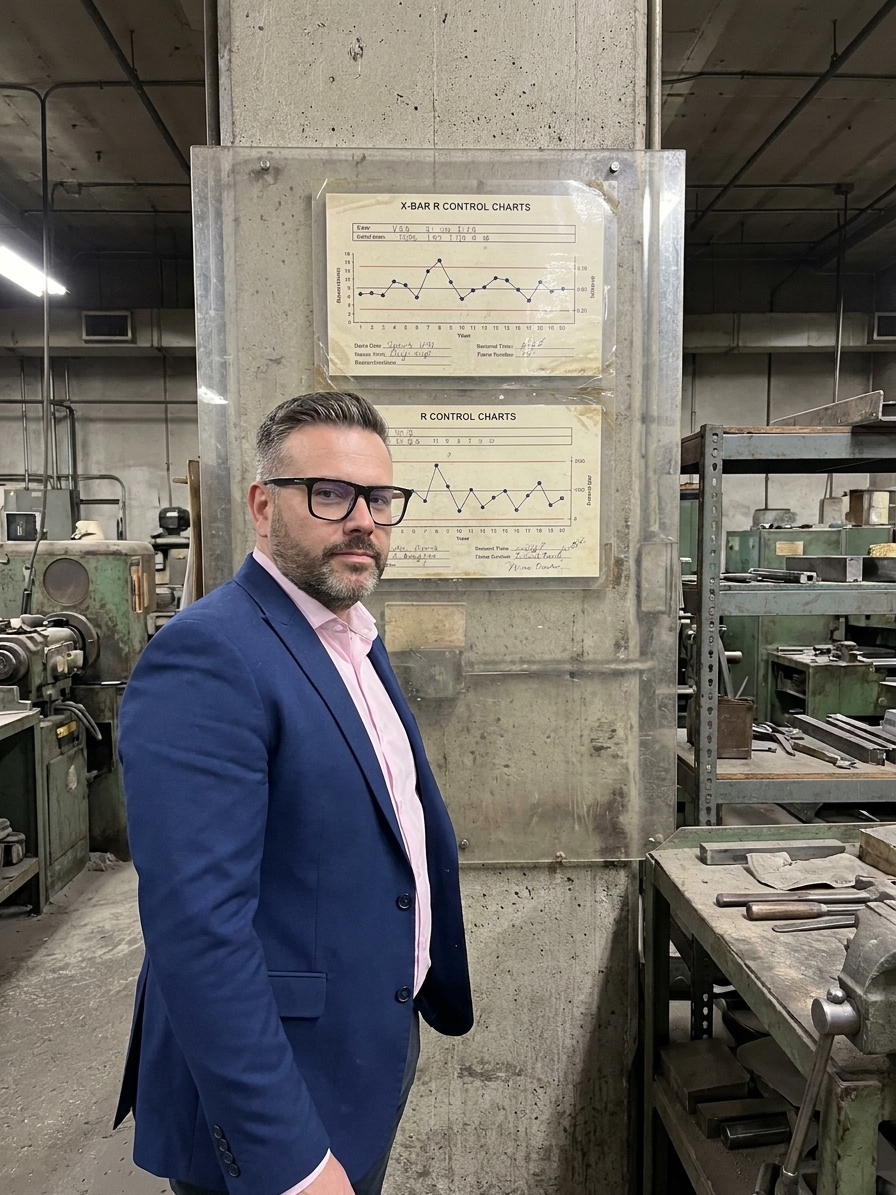
Walk into any manufacturing facility certified to IATF 16949 or AS9100 and look for Statistical Process Control (SPC) charts. You will find them laminated at workstations, mounted behind plexiglass, or displayed on overhead monitors. Look closer at the actual data. The points usually stop three weeks ago. The control limits were calculated during the initial PPAP capability study, back when the process was new and someone cared.
Ask the operator working the line what happens when a point crosses the upper control limit. Most will tell you their supervisor instructed them to initial the chart every two hours. They cannot explain what the calculated limits signify. This is the reality of SPC in most plants: it has devolved into statistical process documentation, maintained solely to pass customer and regulatory audits.
Walter Shewhart developed control charts at Western Electric in the 1920s to distinguish between common cause variation inherent in any process and abnormal special cause variation signalling a shift. When implemented correctly, SPC functions as the real-time nervous system of a production line, triggering targeted intervention before defects reach the customer.
Charting Data Without Driving Action
The most common failure mode in quality management is also the simplest: data gets recorded but no action follows. An operator measures five parts, plots the averages on an X-bar chart, and initials the box. A point lands outside the control limit. Nobody stops the line. Nobody investigates. The supervisor walks past, glances at the violation, and moves on. The next data point lands safely inside the limits, and the out-of-control event is forgotten.
This operational pattern teaches operators that the chart is administrative paperwork, not a process control mechanism. It trains them that out-of-control points are normal background noise. I have audited plants where operators admitted they fill in the SPC chart at the end of the shift from memory. They were never empowered to stop production, and the chart existed only because a customer audit required it.
Once the cultural interpretation of a chart shifts from "process alarm" to "compliance task," the SPC system is functionally dead. The process could be actively producing defective parts at that very moment. The statistical alarm bell designed to ring sits silent on the wall, covered in dust, while end-of-line final inspection absorbs the fallout.
Frozen Limits and Invisible Drift
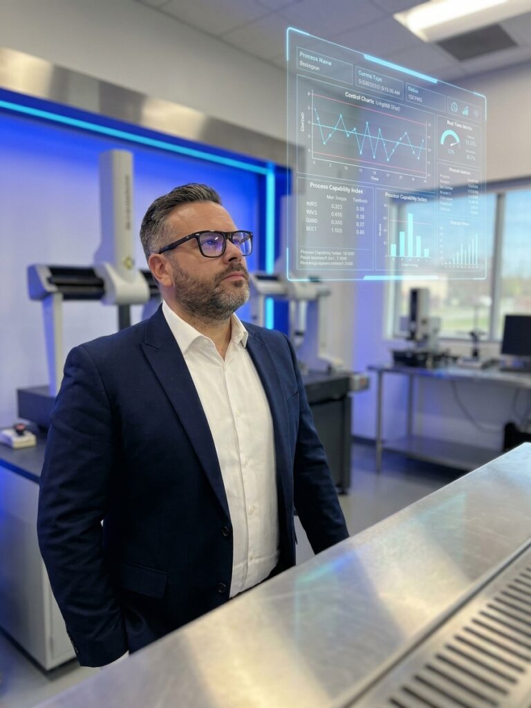
Control limits are not permanent commandments. They reflect the statistical behaviour of a process at a specific point in time under specific conditions. When a process improves through equipment upgrades or engineering fixes, the limits must be recalculated. When a process degrades, the limits should trigger an 8D investigation before the customer feels the impact.
In practice, organizations set their control limits once during initial process qualification and never touch them again. The process shifts and drifts. New operators bring different techniques. Tooling wears out and gets replaced. Raw material suppliers change. But the limits on the wall remain frozen, representing a manufacturing configuration that no longer exists.
This creates a dangerous illusion of stability. Operators see points landing within the artificially wide limits and assume everything is fine. An out-of-control condition can hide entirely inside limits calculated years ago for a different machine, material, and personnel setup. The chart indicates compliance while the process produces marginal parts.
Compliance SPC vs. Functional SPC
Compliance-driven SPC
- Limits calculated once during PPAP, never updated
- Operators initial charts without understanding rules
- Out-of-control points trigger no line stoppage
- Data filed in quality office, disconnected from floor
Functional SPC
- Limits recalculated after known process changes
- Operators empowered to stop line on special cause
- Reaction plans dictate immediate containment
- Data drives Cpk studies and PFMEA updates
Applying the Wrong Chart to the Process
Selecting the appropriate control chart requires understanding both the data type and the underlying statistical distribution. Variables data—measurements like diameter, weight, or temperature—calls for X-bar and R charts, or Individuals and Moving Range charts when sampling one part at a time. Attribute data requires p-charts, np-charts, c-charts, or u-charts depending on sample size and whether you are tracking defects or defectives.
Applying normal distribution-based X-bar charts to heavily skewed data—like cycle times with a natural floor at zero—generates false mathematical conclusions. The calculated control limits become invalid. This leads directly to excessive false alarms, which erode operator confidence, or missed signals, which allow nonconforming product to escape. Applying a p-chart to a sample size of three breaks the statistical assumptions completely.
Wrong charts produce wrong signals, and wrong signals produce wrong actions. An operator who receives a false alarm six times per shift will inevitably start ignoring all alarms, including the genuine ones. An engineer who never sees a signal because the chart is mathematically insensitive will conclude the process is stable when it is actually producing scrap.
The Audit Performance Trap
A major customer includes SPC requirements in their Supplier Quality Assurance Manual. They send a VDA 6.3 auditor who checks for control charts at workstations, reviews a sample of recent entries, and verifies that operators can explain the basic concept. The supplier passes the audit. Everyone shakes hands. Internally, there is zero commitment to using the collected data for defect prevention.
Charts are generated by a quality technician in a back office, printed, and distributed to the floor for display. Operators do not plot anything. Engineers do not review trends. Nobody calculates Cpk or Ppk indices from the collected data to prioritize continuous improvement efforts. The SPC system operates as a performance—a compliance show put on for auditors.
A chart updated once per shift in a back office is statistically useless compared to one updated every fifteen minutes at the workstation.
This approach creates systemic risk. The customer believes their supplier is monitoring processes proactively. The supplier believes they are meeting quality requirements. But the actual process management relies entirely on end-of-line sorting. The SPC data—which could have prevented the defects—sits untouched in a binder.
Operational Mechanisms for Functional SPC
Restoring SPC to its intended purpose requires structural changes in how the organization reacts to variation. Every operator working on a charted process must understand the Western Electric rules. They need to know exactly what action to take when a point exceeds a limit, when a run of seven points appears on one side of the centreline, and when a trend signals a gradual shift.
Every control chart must have a concrete, documented reaction plan attached to the control plan. Not a vague instruction to "notify supervision," but a strict sequence: stop the process, call the team leader, investigate using a defined 8D checklist, document findings, and restart only when the root cause is addressed. Without this, operators will react inconsistently to statistical signals.
SPC Out-of-Control Reaction Sequence
- 01Detect SignalOperator identifies a point outside limits or a violating trend on the chart.
- 02Stop and ContainProduction halts immediately; in-progress material is quarantined.
- 03InvestigateTeam leader reviews the process against the documented 8D checklist.
- 04Document and RestartRoot cause recorded on chart; line restarts only after corrective action.
Control limits must be reviewed on a defined schedule—at minimum monthly for critical safety characteristics, quarterly for others. When a known process change occurs (new equipment, material, or method), limits must be recalculated immediately using new baseline data. Old limits should be archived in the quality system, creating a documented history of process understanding.
Finally, the accumulated SPC data must drive tangible engineering decisions. It should feed into capability studies, PFMEA updates, and the validation of process changes. When an engineering team implements a fix, the control chart must show the improvement—a tighter distribution or a stabilized mean. If the chart looks identical after the fix, the intervention failed, and the data proves it.
Auditing Your Floor Honestly
Keeping non-functional SPC charts on the wall carries hidden costs beyond wasted administrative effort. Managers walk the floor, see charts at every station, and conclude that processes are under statistical control. They are not—they are merely being charted. A manager who believes SPC is functioning will allocate improvement resources elsewhere, missing the opportunity to catch process shifts before they escalate into customer escapes.
Non-functional charts also erode the credibility of the entire quality management system. When operators see that SPC rules are ignored, they begin to question other critical requirements. If the chart on the wall is just for show, operators will reasonably assume the torque specification is a suggestion, and that material certifications do not really matter. Cultural decay starts with one ignored system.
If your SPC system has degraded, the path to recovery starts with an honest floor audit. Pick ten control charts at random. Ask the nearest operator to explain the last out-of-control point and the action taken. If you cannot get clear, confident answers, your SPC system is not protecting your production. It is decorating your walls while defects pass by undetected.