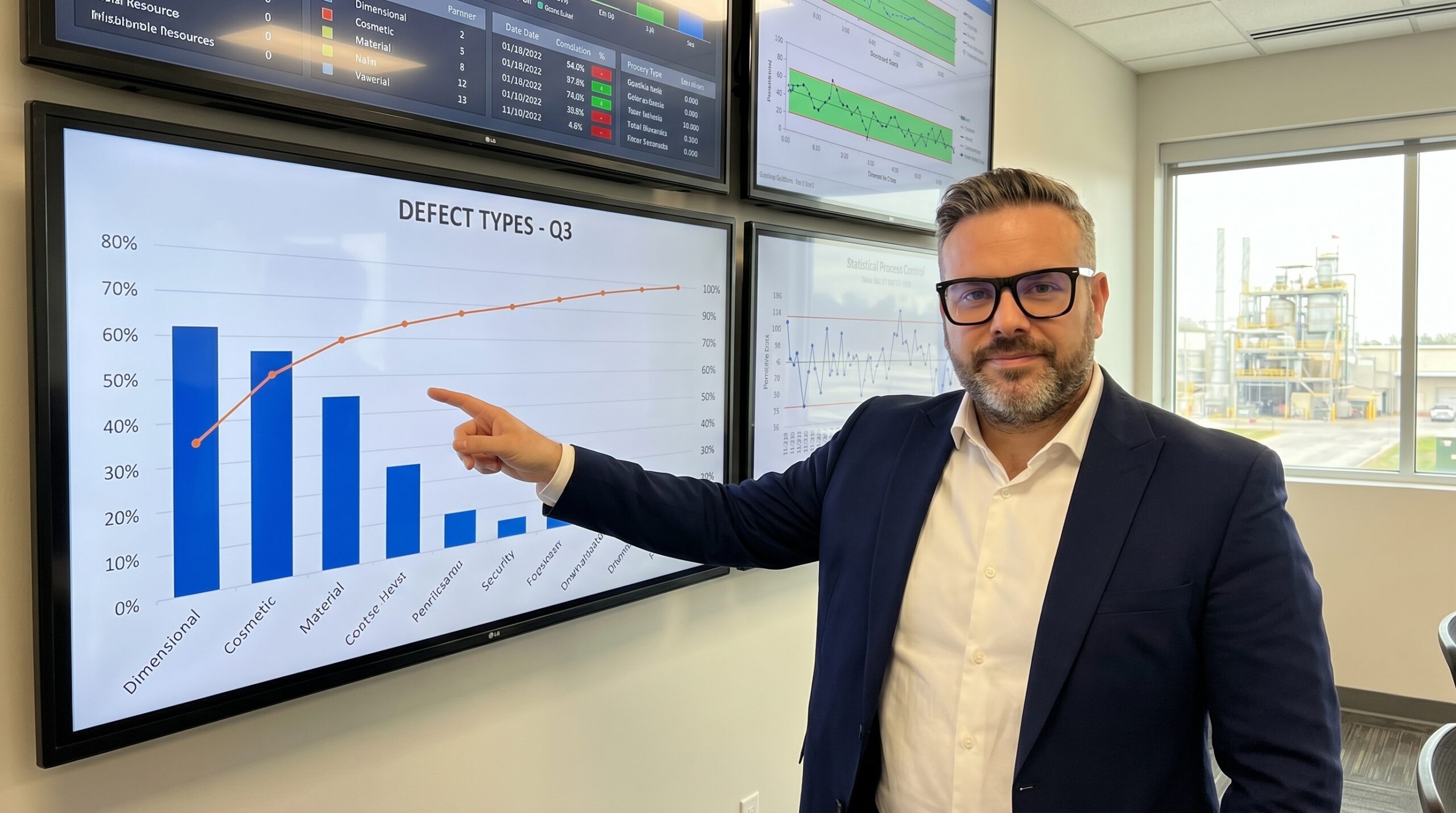
A production director called me on a Friday evening, exhausted and facing a customer escalation. His mid-tier automotive plant had accumulated 337 open nonconformance reports (NCRs) in a single quarter. Thirteen of these were critical, and the customer was threatening to halt deliveries. His quality engineers were jumping from one defect to the next without a structured plan, burning hours without reducing the total backlog.
This firefighting mode is standard in plants lacking prioritisation mechanisms. When you face hundreds of deviations, human nature drives you toward the most visible or recent issues, not the most statistically significant ones. The team had spent the previous month aggressively addressing a parts labelling issue, only to find it accounted for 14 of the 337 total cases. They were applying maximum effort to trivial problems.
The solution was not more resources or longer shifts. It was a Pareto analysis. By the following Monday, we had categorised every NCR, calculated cumulative frequencies, and mapped the distribution. Within two hours, the team realised that addressing just three defect categories would eliminate over 60 percent of their quality issues. This is the core mechanism of the Pareto principle: isolating the vital few causes from the trivial many.
The Mechanics of the 80/20 Principle in Quality Management
In 1896, economist Vilfredo Pareto observed that 80 percent of the land in Italy was owned by 20 percent of the population. Joseph Juran, a pioneer of modern quality management, adapted this observation into the principle of the 'vital few and trivial many' during the 1950s. He recognised that in manufacturing, a small fraction of root causes is universally responsible for the vast majority of defects, delays, and costs.
Pareto analysis is a visual and statistical tool that forces a team to direct their finite engineering hours at the highest-yield targets. Instead of treating every deviation as an isolated event requiring an immediate 8D, it groups failures by category. This reveals the baseline distribution of your process failures, exposing the systemic gaps that generate the most scrap, rework, and customer complaints.
The output is a bar chart where categories are ordered by frequency descending, coupled with a cumulative percentage line. The intersection where the cumulative line flattens marks the boundary between the problems you must solve immediately and the background noise you can manage through standard operational controls.
Building a Defect Categorisation Framework
Effective Pareto analysis demands rigorous data collection and precise categorisation. You must pull records systematically from your QMS, including NCRs, scrap logs, 8D reports, audit findings, and customer complaints. Every record must map to one, and only one, category. If your 'Other' bucket dominates the chart, your categorisation criteria are too broad and useless for engineering analysis.
Selecting the correct timeframe is equally critical. Analysing a single week of data will reflect daily noise rather than systemic issues. Conversely, pooling six months of data might blur the lines between different process changes or product lifecycles. A rolling 90-day window usually provides the best balance between capturing meaningful trends and maintaining relevance to current operations.
For the automotive supplier, we broke the 337 NCRs into eight distinct categories based on failure mode. We calculated the raw count, the relative percentage, and the cumulative impact. The restructuring immediately highlighted where their quality resources needed to go.
| Defect Category | Count | Cumulative % |
|---|---|---|
| Corner weld aperture | 82 | 24.3% |
| Dimension out of tolerance | 71 | 45.4% |
| Surface contamination | 54 | 61.4% |
| Missing documentation | 48 | 75.7% |
| Handling damage | 33 | 85.5% |
| Incorrect material | 19 | 91.1% |
| Labelling error | 14 | 95.2% |
| Other | 16 | 100.0% |
Step-by-Step Execution of the Pareto Method
Building the chart is only half the exercise. The real value emerges when you establish a structured workflow around the data. Once the Pareto chart highlights the vital few, you must deploy your engineering teams to conduct root cause analysis using tools like Ishikawa diagrams or 5 Whys. The objective is to transition rapidly from data observation to process verification.
Targeted Defect Resolution Workflow
- 01Categorise failuresMap all NCRs over the baseline period to distinct failure modes.
- 02Calculate cumulative impactRank categories to find where the 80% threshold is crossed.
- 03Assign engineering teamsDeploy root cause analysis (Ishikawa, 5 Whys) exclusively to the top categories.
- 04Implement corrective actionsExecute process or design changes and monitor the QMS for recurrence.
- 05Verify and update Control PlanLock in the improvements via PFMEA and Control Plan updates.
In the supplier's case, we established three dedicated project teams to attack the top three categories: weld apertures, dimensional deviations, and surface contamination. The remaining five categories were assigned to the continuous improvement backlog. We were not ignoring the smaller issues; we were simply refusing to let them dilute the engineering effort required to fix the major systemic failures.
Frequency Versus Financial Impact
Standard frequency Pareto charts treat all defects equally, but a cosmetic scratch does not carry the same business weight as a structural failure. When I audit plants, I frequently find that the highest-frequency defect has a low financial impact, while a rare failure mode drives massive scrap costs or warranty claims. If you only measure frequency, you will optimise the wrong metrics.
Pareto tells you which fire is burning hottest; it does not tell you what started it.
To resolve this, you must run a cost-weighted Pareto analysis. Multiply the frequency of each failure mode by its associated scrap, rework, or warranty cost. Instead of counts, use financial values for your vertical axis. A category with only five incidents but a cost of 5,000 euros per unit will instantly jump to the top of the chart, correctly redirecting engineering focus toward the highest financial risk.
Weighted Pareto analysis takes this a step further by incorporating severity levels, such as those used in FMEA Risk Priority Numbers (RPN). A defect that causes a line stoppage receives a higher multiplier than one requiring minor rework. This ensures that your prioritisation reflects operational disruption, not just raw volume or direct part cost.
Common Failures in Pareto Application
The most frequent mistake I see is mixing data from unrelated production lines. If you pool NCRs from a highly automated CNC cell with data from a manual assembly station, the Pareto chart will provide a meaningless average. It will hide the specific constraints of each process. You must segment your data by production line, product family, or shift to find actionable trends.
Another critical error is treating Pareto as a one-time exercise. Quality dynamics change. A supplier introduces a bad batch of raw material, a tool wears down, or a new operator joins the line. If your 'vital few' categories remain exactly the same six months down the line, your corrective actions have failed. A rolling Pareto chart functions as a health monitor for your entire quality management system.
Standard vs. Advanced Pareto Application
What teams usually do
- Count total NCRs and rank by raw frequency only.
- Mix data across multiple product lines or shifts.
- Run the analysis once during a major audit or escalation.
- Jump straight to 8D root cause analysis on the top item.
What actually works
- Weight defects by scrap cost, severity, or line stoppage time.
- Segment data strictly by process, machine, or cell.
- Update dynamically within the QMS on a rolling 30-90 day basis.
- Feed the top categories directly into PFMEA and Control Plan updates.
Integrating Pareto with the Quality Toolkit
Pareto analysis is the start of the diagnostic process, not the end. Once the chart identifies that weld aperture issues are your biggest leak, you must transition to Ishikawa diagrams to map the potential causes—machine, method, material, measurement, environment, and manpower. From there, 5 Whys drives down to the specific root cause, such as an unstable shielding gas supply on two of your five welding stations.
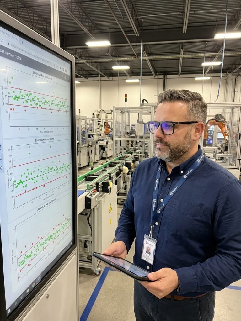
This root cause must then flow directly into your PFMEA and Control Plan. If a specific failure mode is generating the majority of your deviations, your current controls are insufficient. You must update the Control Plan to include higher frequency audits, enhanced in-process checks, or revised Statistical Process Control (SPC) limits specifically targeting that characteristic.
By integrating Pareto data into Industry 4.0 dashboards, whether via Power BI, Minitab, or your native ERP system, this prioritisation becomes automated. Engineers no longer need to manually pull reports to see where the next fire will start. The system flags the deviation automatically, allowing quality leaders to allocate resources to the vital few before they result in a customer escalation.