
Most plants know they have a flow problem. Ask where it is, and you will get a wave of the hand toward the warehouse, or a vague complaint about material delays. What they lack is specificity. A spaghetti diagram — sometimes called a flow map or material flow chart — is a visualisation tool used in lean manufacturing to capture the actual movement of people, material, and information across a workspace.
It requires no software, no digital twin, and no consultancy license. It requires a pencil, a scaled floor plan, and direct observation. When you trace every route an operator or a part takes during a complete production cycle onto a single sheet of paper, the result looks like a plate of spaghetti. That chaotic visual is the exact reason the tool works.
Motion is the most normalised waste in the industry. When you are accustomed to walking sixty meters to retrieve a calibration tool, the distance stops registering as a problem. The diagram strips away that normalisation. It forces management to confront the physical distance their process actually demands.
When the Diagram Meets the Floor
I was once called into a mid-sized automotive supplier in Central Slovakia. The operation ran three shifts, and the plant manager was battling chronic delivery delays and excessive overtime. He knew material was moving inefficiently, but the standard operational reports only showed capacity and output figures. They did not show physical travel.
I took an A3 sheet, sketched the rough boundaries of the plant — from goods-in and the main warehouse, through the individual workstations and quality control, to packaging and dispatch — and positioned myself at the line entrance. I tracked a single operator through the first few hours of her shift.
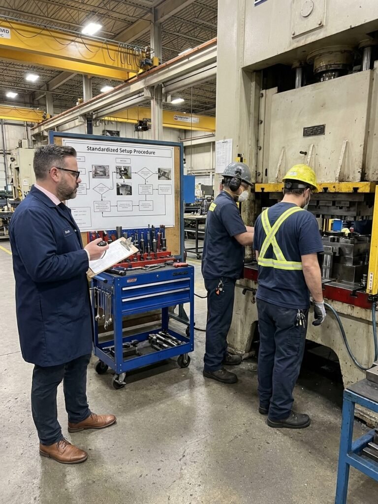
She started her shift by walking to the central tool crib at the far end of the hall to retrieve her gauges. Twenty minutes later, she needed a specific component and had to walk to the raw materials warehouse in the opposite corner. On the way back, she was stopped by a supervisor, requiring a trip to the upstairs office. By lunchtime, she had walked over 2.3 kilometres. The part she was assembling had a planned cycle time of 90 seconds.
Then we tracked the material. Raw stock arrived at the receiving dock and was moved to Warehouse A. From there, it was transported to pre-production inspection in the opposite wing, then back to Warehouse B, before finally reaching the line. After processing, it went to an inspection station, an intermediary buffer, and finally packaging. The total travel distance for a single finished part was 487 metres. The plant manager stared at the completed diagram and insisted the numbers could not be real. They were.
Why Visualisation Drives Action
Reporting wasted motion as a metric — say, 340 minutes of non-value-added transport per shift — fails to trigger urgency. Management acknowledges the spreadsheet, but they do not internalise the problem. Hand them a floor plan tangled with red and blue lines, and the reaction is immediate. The visual scale of the waste makes it undeniable.
The diagram strips away assumption and opinion. You are not asking an engineer how they think the process flows; you are recording what actually happens on the shop floor. This objective record is what forces structural change.
Standard Targets for Lean Flow
Because the tool requires no capital expenditure to execute, the barrier to entry is simply a willingness to observe. However, that simplicity can also be a trap. If the drawing does not lead directly to a revised layout, it is merely art.
Building the Diagram: Methodology and Scope
Do not attempt to map an entire multi-building facility at once. The resulting chart will be unreadable. Define a tight scope: track one specific product family from goods-in to dispatch, or track one operator across one complete shift. Mapping the route of a single calibration record from generation to archival works equally well for administrative processes.
Draw the boundaries, workstations, storage areas, and aisles on a large sheet. You need relative positioning, not an architectural blueprint. Once the base map is ready, select your subject and follow them. Draw a solid line for every movement from point A to point B, and mark every stop with a dot. Use different colours to separate person, material, and information flows.
Timing is critical. Use a stopwatch to record how long each transit takes. Observe for at least one full shift, or across three complete production cycles. A single observation hour will not capture shift-change routines, material shortages, or shift-handover anomalies.
Analysing the Data and Eliminating Transport
Once the observation period concludes, calculate the total distance travelled using a measuring wheel or scaled ruler. The analysis phase requires you to categorise every line. Direct routes between operations add value. Loops, backtracks, and crossings represent pure waste that inflates lead time and drains OEE through availability and performance losses.
A drawing without a layout change is decoration. The value lies in the rearrangement of the floor, not the complexity of the chart.
In the case of the Slovak supplier, the Friday evening analysis session produced brutal but actionable data. Operators were walking over 2.1 kilometres per shift, of which only a fraction constituted productive work. Material travelled nearly half a kilometre per part, with the vast majority of that distance consisting of unnecessary back-and-forth loops. Tools were stored 67 meters away from the line, and every quality check required a 14-minute round trip to the opposite wing of the building.
The intervention was structural. We relocated the raw material storage from the back corner to a point immediately adjacent to the line entry. Quality control moved from a centralised laboratory to an in-line station. We installed shadow boards for tools directly at the point of use, and we reconfigured the linear workstations into a U-shaped cell to eliminate return trips. By Monday morning, the physical flow of the plant was entirely different.
The Layout Reconfiguration Process
- 01Observe and TraceFollow the actual process for one full shift and draw every movement without filtering.
- 02Quantify WasteMeasure the total physical distance and calculate non-value-added transit time.
- 03Redesign LayoutEliminate backtracks by creating U-cells and moving storage to the point of use.
- 04Implement and RemapExecute the physical changes over a weekend and draw a new diagram to verify the improvement.
Integration with Quality and Lean Systems
A spaghetti diagram does not exist in a vacuum. It is a diagnostic tool that informs other lean and quality mechanisms. It works hand-in-glove with Value Stream Mapping (VSM). While VSM captures the high-level information and material flow, the spaghetti diagram provides the granular detail of physical motion that VSM misses.
When you conduct a SMED (Single-Minute Exchange of Die) analysis, a flow map will frequently reveal that half of the changeover time is consumed by operators walking to retrieve tooling and fixtures. The diagram acts as the foundational data for your 5S implementation, specifically for the 'Set in Order' phase, dictating exactly where tools and materials must be positioned.
Digital tracking systems — RFID tags, Bluetooth beacons, and computer vision — can automate this data collection today. They provide objective, continuous tracking without manual observation. However, the principle remains unchanged. The goal is not a beautiful dashboard; the goal is the elimination of wasted motion. The most sophisticated tracking system is useless if management lacks the mandate to physically move the racks.
It is equally important to recognise the tool's limitations. Do not use a spaghetti diagram to diagnose the root cause of a dimensional defect — that requires an 8D or Ishikawa analysis. Use it specifically when you see high operator movement, material delays despite sufficient machine capacity, or when validating a new process layout before a major capital investment.
Sustaining the Gains
At the Slovak supplier, the results materialised within 30 days. Operator walking distance dropped from 2.1 kilometres to under 600 metres per shift. Lead time per part fell from 22 minutes to 14. Line productivity increased by 18%, and delivery delays dropped by 40%. All of this was achieved by moving racks, tables, and inspection stations. There was zero investment in new technology.
The most common failure mode I see is teams observing a process only once. A single shift is not statistically representative. You must map across multiple days to account for supply chain variability and different operator behaviours. If you ignore informal micro-movements — the quick trips to grab an extension cord or a missing label — you will miss the kilometres of waste that accumulate over a month.
The discipline of drawing the flow is what separates effective quality engineering from theoretical reporting. When the physical layout is optimised, process capability stabilises. You cannot sustain a Cpk of 1.33 if your operators are spending their shifts running marathons.