Quality Visualization: When Your Data Stops Living in Spreadsheets and Starts Living on Your Walls — and Every Person in Your Factory Finally Sees What’s Actually Happening
You cannot manage what you cannot see. And in most factories, quality data is invisible to the very people who create it.
The Invisible Factory
Walk through any manufacturing facility and you’ll see machines running, operators working, forklifts moving. What you won’t see — in most factories — is quality. Not the real quality. Not the quality that’s happening right now, at this exact moment, on every station, across every shift.
What you’ll see instead are operators following procedures they memorized during onboarding. Supervisors checking dashboards on their office computers. Quality engineers buried in spreadsheets that nobody else can read. Managers reviewing weekly reports that describe what happened seven days ago — a lifetime in production terms.
The quality system is there. The data is there. The procedures, the checks, the records — they’re all there. But they’re invisible. Locked in databases, buried in email attachments, trapped in the heads of experienced operators who won’t be there forever. The factory is producing quality, or it’s producing defects, and the people who could make a difference can’t see either one until it’s too late.
This is the invisible factory. And it’s where most organizations live, whether they realize it or not.
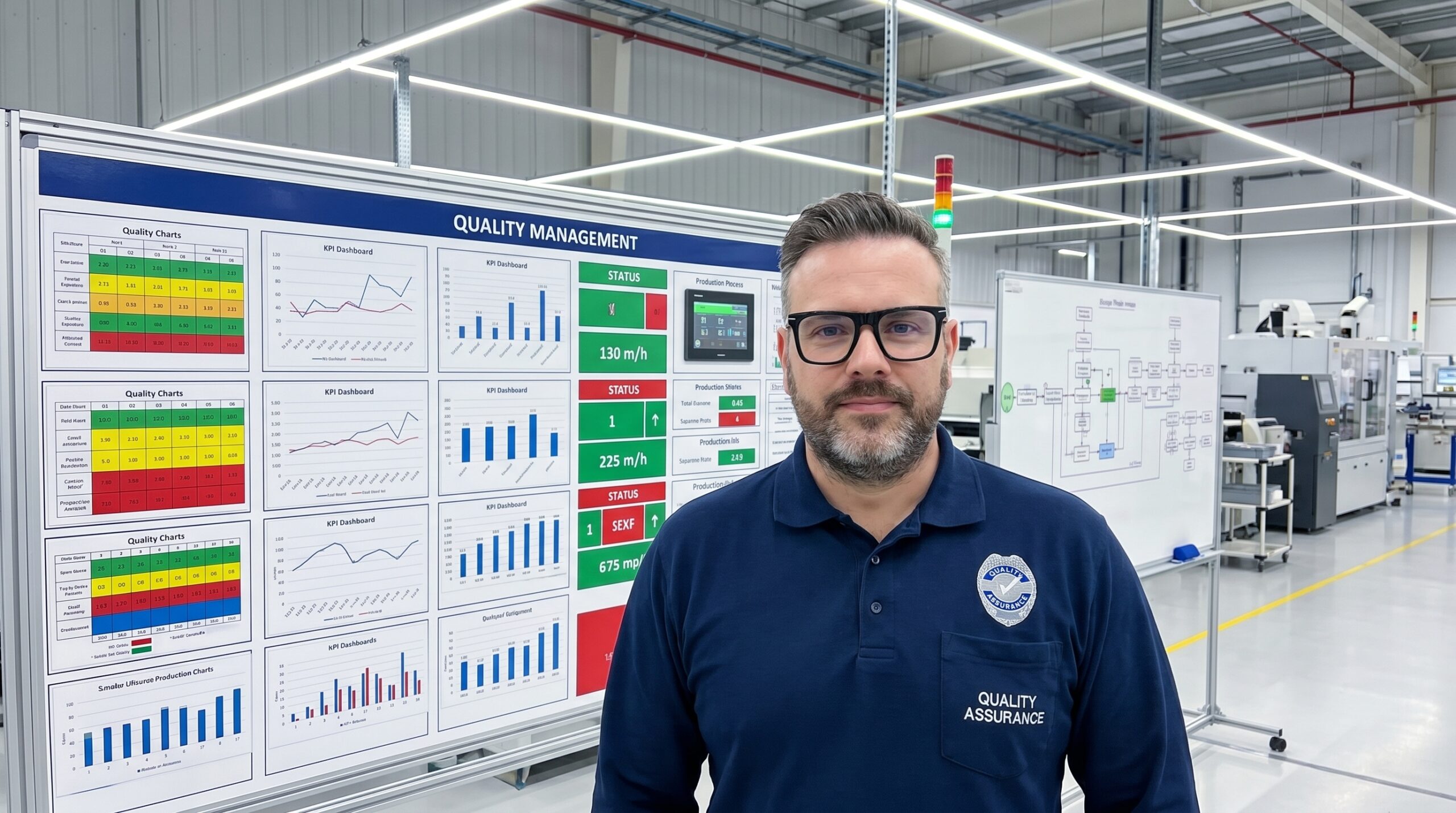
What Quality Visualization Actually Means
Quality visualization isn’t about making pretty charts. It’s not about mounting flat-screen TVs on the wall and cycling through KPI dashboards that nobody reads. It’s not about decorating your conference room with infographics for customer visits.
Quality visualization is the discipline of making quality information physically, immediately, and intuitively available to the people who need it, at the exact moment they need it, in a format they can act on without translation.
It’s the difference between a control chart sitting in a quality engineer’s inbox and a control chart taped to the workstation where the operator can see it while they’re running the process. It’s the difference between a defect rate reported in a Monday morning meeting and a red light that turns on the moment a defect trend crosses the threshold — on Wednesday afternoon, at 2:17 PM, while there’s still time to do something about it.
It’s the practice of designing your information environment so that the right quality signals are impossible to miss and impossible to misinterpret.
The Psychology Behind the Wall
There’s a reason visualization works, and it has nothing to do with technology. It has to do with how human beings process information.
Cognitive psychology tells us that the human brain processes visual information approximately 60,000 times faster than text. We don’t read a stop sign — we react to its shape and color before we’ve processed a single letter. We don’t calculate the position of a car in our rearview mirror — we sense it, instantly, through spatial visualization.
Now apply this to a factory floor. An operator running a CNC machine has a cognitive load that’s already near capacity. They’re monitoring tool wear, managing cycle times, loading and unloading parts, responding to machine signals. In that environment, asking them to remember quality criteria from a training session three months ago, or to mentally track the last ten parts they measured, is asking for failure.
But put a color-coded go/no-go gauge on the workstation, a trend chart showing the last 50 measurements at eye level, a green-yellow-red status light connected to the SPC system, and a shadow board where every gauge has exactly one place to be — and you’ve changed the game entirely. Now the operator doesn’t have to remember. They just have to see.
Visualization offloads quality management from working memory to environmental perception. It moves the burden from the brain to the wall. And that’s a trade worth making every single time.
The Seven Layers of Quality Visualization
Effective quality visualization isn’t one thing. It’s a system, built in layers, each one serving a different purpose and audience. Here are the seven layers that every manufacturing organization should consider:
Layer 1: The Signal Layer
This is the most basic and most powerful layer. Signals are binary, immediate, and impossible to ignore. Red and green lights at workstations. Andon cords that anyone can pull. Alarms that sound when a parameter drifts out of tolerance. A signal doesn’t explain — it alerts. It says “look here, now.”
The best signals are ambient — they exist in your peripheral awareness until they change state. You don’t stare at a traffic light continuously; you notice when it turns red. The same principle applies to a quality signal light on a production line. When it’s green, the operator focuses on their work. When it turns yellow, their attention shifts. When it turns red, they stop.
Most factories have some version of this for machine faults. Far fewer have it for quality conditions. That’s a missed opportunity.
Layer 2: The Status Layer
Status boards answer the question “where do we stand right now?” They show current quality metrics — today’s defect rate, this hour’s first-pass yield, the current Cpk value for a critical dimension — in a format that updates frequently enough to be relevant.
The key design principle for status displays is: one number, one meaning, one action. If an operator sees “FPY: 94.2%,” they should know instantly whether that’s good or bad, and what they should do about it. Color coding helps. So does showing the target alongside the actual. So does showing the trend — not just where we are, but which direction we’re moving.
Status displays should be positioned where the relevant people naturally look. For operators, that means at the workstation. For supervisors, that means at the line entrance. For plant managers, that means at the central information board — not behind a login screen.
Layer 3: The Trend Layer
Trends are where quality visualization becomes predictive. A single data point tells you where you are. A trend tells you where you’re going. And in quality management, knowing where you’re going is infinitely more valuable than knowing where you’ve been.
Trend charts should be simple — time on the X-axis, the quality metric on the Y-axis, control limits clearly marked, and the most recent data point highlighted. They should cover a time horizon that’s relevant to the process: hours for fast cycles, days for daily management, weeks for strategic review.
The most powerful trend displays aren’t the ones in the quality engineer’s office. They’re the ones at the point of production, where the operator can see their own process drifting before it produces a defect. That’s the moment when visualization prevents problems instead of just documenting them.
Layer 4: The Standard Layer
Visualization of standards is the layer most organizations skip — and it’s one of the most impactful. This means posting the correct procedure, the correct setup, the correct product configuration directly at the point of use, in a visual format that makes compliance easy and deviation obvious.
Think of shadow boards for tools — every tool has an outline, and a missing tool is immediately visible. Apply the same principle to quality: photographs of acceptable and defective parts, color-coded inspection sheets, visual work instructions with pictures instead of paragraphs, one-point lessons mounted at the workstation where the specific issue occurs.
When the standard is visual, checking compliance takes zero extra time. You don’t read a procedure — you glance at a picture. You don’t look up a specification — you compare your part to a physical sample mounted on the bench. Compliance stops being a memory test and starts being a visual comparison.
Layer 5: The Problem Layer
This is where visualization supports problem-solving. Problem boards, A3 reports mounted on the wall, fishbone diagrams that teams build together and leave visible for the duration of the investigation, countermeasure tracking boards that show what’s been tried and what’s worked.
The purpose of visualizing problems isn’t to shame anyone — it’s to engage collective intelligence. When a problem is visible, anyone walking past can contribute. A maintenance technician might notice something the quality team missed. An operator from a different shift might recognize a pattern. A visiting customer might offer an insight from their own experience.
Invisible problems get solved by whoever discovers them. Visible problems get solved by whoever can solve them. That’s the difference.
Layer 6: The Improvement Layer
Improvement tracking boards show what’s being improved, who’s responsible, what’s been done, and what results have been achieved. They’re the visual backbone of a continuous improvement culture because they make improvement itself visible — and that changes everything.
When improvement is invisible, it doesn’t feel like it’s happening. Teams solve problems, implement countermeasures, and move on. There’s no accumulation, no momentum, no sense of collective progress. But when every improvement is posted on a board — with a before photo, an after photo, and the measurable result — the organization starts to believe in its own ability to change.
Improvement boards also create healthy competition. When Team A can see that Team B completed five kaizen activities this month, they’re motivated to match or exceed. Not because someone told them to, but because the visualization made the comparison natural and public.
Layer 7: The Strategic Layer
The highest layer connects quality visualization to business strategy. This is the tier of Hoshin Kanri boards, policy deployment matrices, and executive dashboards that show how shop-floor quality metrics connect to customer satisfaction, warranty costs, market share, and profitability.
Most organizations have this data — somewhere in a monthly report that nobody reads. The strategic layer makes it visible, and more importantly, makes the connection visible. When a plant manager can stand in front of a board and trace a line from “Cpk on bore diameter at Station 7” through “field failure rate on Product Family C” to “warranty cost trend” to “customer satisfaction score,” quality stops being a department concern and becomes a business concern.
This layer exists to answer one question that executives ask constantly but rarely get answered well: “Is our quality system actually working?” Visualization gives them the answer — not in a meeting, not in a report, but standing in front of a board where the truth is impossible to hide.
The Design Principles That Separate Signal from Noise
Not all visualization is created equal. Bad visualization is worse than no visualization — it adds clutter, creates confusion, and trains people to ignore the walls entirely. Here are the principles that separate effective quality visualization from wallpaper:
Proximity over portability. Information should be displayed as close to the point of action as possible. A control chart on the quality engineer’s laptop helps the quality engineer. A control chart at the workstation helps the operator. Guess which one prevents more defects.
Simplicity over comprehensiveness. Every additional element on a visual display competes for attention. The best displays show the minimum information needed to make the right decision. If you need a legend, a footnote, or a five-minute explanation, the display is too complex.
Actionability over information. If seeing the display doesn’t change someone’s behavior, it’s not visualization — it’s decoration. Every visual element should answer the question “so what should I do?” If it doesn’t, remove it.
Ownership over imposition. The most effective visual management systems are maintained by the people who use them. When a quality team designs and installs boards without operator input, the boards become someone else’s responsibility. When operators build and update their own boards, the boards become their system.
Freshness over permanence. Stale visual management is invisible visual management. If the board hasn’t been updated this week, people stop looking at it this week. Build updating into the daily routine — not as a separate task, but as part of the normal workflow.
The Implementation Journey: From Nothing to Everywhere
Implementing quality visualization isn’t a project — it’s a transformation. And like any transformation, it fails when organizations try to do everything at once. Here’s a practical roadmap:
Week 1-2: The Gemba Audit. Walk the floor. Every station, every aisle, every office. Ask: What quality information exists here? Where is it? Who can see it? How old is it? Document the gaps. You’ll be shocked at how much quality data is produced and how little of it is visible.
Week 3-4: The Signal Layer. Start with the simplest, most impactful layer. Install status lights at critical stations. Set up a simple quality signal system — even if it’s manual at first. Get people used to the idea that quality conditions are visible in real time.
Month 2: The Status and Standard Layers. Post current quality metrics at every production line. Mount visual standards — photos, samples, gauges — at every inspection point. This is where most organizations see their first measurable improvement, simply because people can now see what “good” looks like.
Month 3: The Trend Layer. Connect your SPC system to displays at the point of production. Start with the most critical processes — the ones with the highest defect impact. Let operators see their own process data in real time.
Month 4-6: The Problem and Improvement Layers. Establish problem-solving boards on every line. Start tracking improvements visually. Create the habits of daily updates, weekly reviews, and monthly reflection.
Month 6-12: The Strategic Layer. Connect shop-floor visualization to management review. Make the board room look more like the shop floor — with real data on the walls — and less like a conference room.
What Changes When Quality Becomes Visible
Organizations that implement quality visualization consistently report the same set of changes:
Faster response to quality events. When quality information is visible in real time, the time between a quality event and a response drops from hours to minutes. Not because people work faster, but because they see the signal sooner.
Higher operator engagement. Operators who can see their own quality performance — personally, in real time, without asking anyone — take more ownership. The data stops being something management tracks and becomes something they manage.
Fewer escalation failures. When problems are visible, they don’t need to be escalated through layers of management. The right person sees the right information and acts on it directly.
More effective audits. Auditors love visual management — not because it looks good, but because it demonstrates that the quality system is alive, not just documented. A board that was updated this morning tells a different story than a binder that was printed last quarter.
Cultural transformation. This is the deepest change. When quality becomes visible, it becomes part of the environment. It stops being a separate activity — something you do after production — and becomes embedded in the daily experience of everyone in the factory. Quality stops being a program and starts being a condition of the workplace.
The Cost of Staying Invisible
Let me be direct about what happens when quality remains invisible:
Operators produce defects they could have prevented — if they’d known the process was drifting. Supervisors manage by exception — responding to crises instead of preventing them. Quality engineers spend their time creating reports that nobody reads instead of solving problems that everyone encounters. Managers make decisions based on yesterday’s data about problems that are already today’s crises. And executives wonder why their quality metrics aren’t improving despite investing in training, equipment, and certification.
The cost of invisible quality isn’t measured in defects — it’s measured in missed opportunities. Every defect that could have been prevented by a timely visual signal. Every improvement that could have been accelerated by shared visibility. Every person who could have been engaged by seeing their own impact.
Visualization doesn’t cost money. Invisibility costs money. The display boards, the signal lights, the printed standards — these are among the cheapest quality investments you can make. The return, measured in prevented defects and accelerated improvement, is consistently among the highest.
A Final Thought
There’s a principle in lean manufacturing that’s often quoted but rarely followed: “Make problems visible.” It sounds simple — almost too simple to be worth discussing. But in practice, it’s one of the most profound changes an organization can make.
Because when problems are visible, they get solved. Not perfectly, not always immediately, but reliably. The human mind is wired to resolve visual inconsistencies. When something on the wall doesn’t match what we expect, we notice. We investigate. We act.
Quality visualization harnesses that wiring. It takes the vast, invisible ocean of quality data that every factory produces and makes it physical, present, and impossible to ignore. It transforms quality from something that happens in reports and meetings into something that happens on the floor, in real time, in front of everyone.
You cannot manage what you cannot see. So make it visible.
Peter Stasko is a Quality Architect with 25+ years of experience transforming manufacturing organizations from reactive defect detection to proactive quality excellence. He has implemented visual management systems across automotive, electronics, and industrial manufacturing — and has seen firsthand what changes when quality stops being invisible and starts being something everyone can see, understand, and act on.