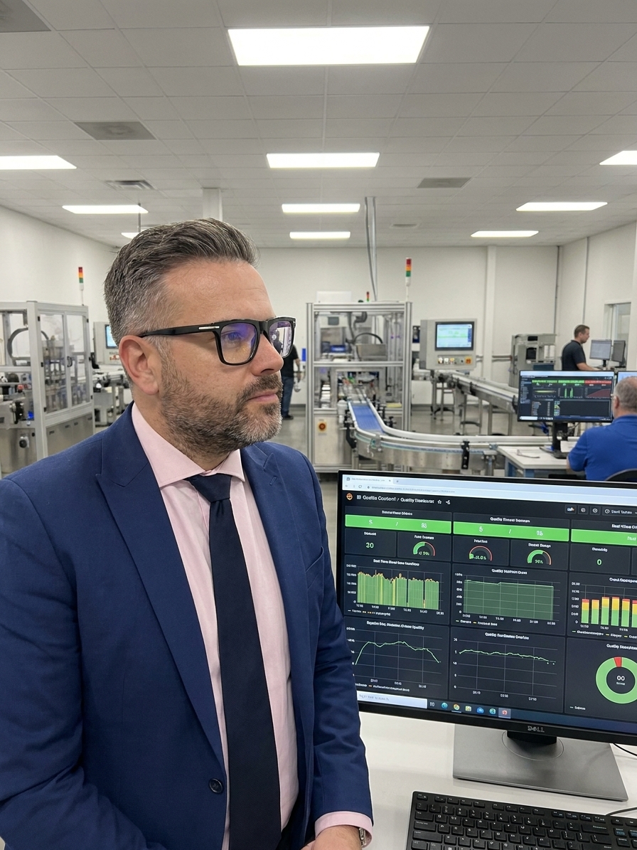
An automotive supplier consistently presented green quality indicators across their boardroom dashboard. Their defect rate trended downward for eleven consecutive months and their overall equipment effectiveness (OEE) held strong at 94%. By every visible measure, the plant was operating successfully.
Then their largest customer audited the facility and issued seventeen major nonconformances in a single two-day visit. The dashboard had not malfunctioned. Every figure was technically accurate. The failure occurred because the data was easy to digest, leading management to assume it was telling them everything they needed to know.
The dashboard concealed critical operational shifts. Six months prior, the defect classification system had been quietly redefined, moving recurring failures from major to minor. The OEE calculation had been adjusted to exclude changeover time. Three critical process parameters were operating near their control limits, but because the limits themselves had not been recalculated in two years, no alerts were triggered.
The Mechanism of Cognitive Fluency
Cognitive fluency describes the ease with which the human brain processes information. When data is presented as a clean chart or a familiar single metric, we unconsciously judge that data as more truthful and reliable than information that requires mental effort to decode.
This is a metabolic feature of human cognition. Our brains conserve energy whenever possible. Information that flows smoothly through neural circuits feels inherently correct. Conversely, information that demands effort—such as multi-variable relationships or contradictory signals—feels suspicious or simply registers as background noise.
The quality implications are severe. A metric that fits neatly onto a dashboard tile feels like actionable knowledge. A metric that requires a five-page explanatory brief feels like an obstruction. The preference for cognitive ease means the simple metric wins budget and strategic attention, even when the complex analysis is what actually prevents field failures.
Aggregation and the Illusion of Insight

Rolling data up into composite scores and overall indices is highly fluent. An overall quality score of 87% feels comprehensive. Twenty-three individual process capability indices, each requiring contextual interpretation, feel like information overload. Leadership naturally gravitates toward the single score.
However, that single score is an abstraction that routinely hides critical failures behind compensating successes. If Process A runs at a Cpk of 1.67 and Process B runs at a Cpk of 0.89, the aggregated average looks perfectly acceptable while the customer receives defective parts from Process B daily.
Asking leadership to hold twenty-three capability indices in working memory is cognitively expensive, so the quality system simplifies. In simplifying, it obscures the exact details that distinguish between a quality system that prevents defects and one that merely documents them after the fact.
The Fluency Trap in Quality Reporting
What the dashboard shows
- Average Cpk across all stations meets the 1.33 target
- Monthly PPM rate trending downward consistently
- Overall OEE calculated above the 90% threshold
- Every process parameter displaying in green
What the process hides
- Process B operates at Cpk 0.89 and is shipping defects
- Defect classifications were quietly downgraded last quarter
- Changeover time was removed from the OEE calculation
- Parameters sit near their limits, which were never recalculated
Familiar Frameworks vs. Actual Risk
Standardised frameworks like ISO 9001 feel inherently correct because they are familiar. The structure is known, the language is rehearsed, and the audit checklist is predictable. The brain processes this familiarity fluently and concludes that the system is managing risk effectively.
I have audited plants where the documented procedures were immaculate but disconnected from the physical reality of the shop floor. One organisation maintained an extensive, perfectly structured ISO 9001 quality manual. Their actual quality challenges were centred on tool wear prediction, thermal compensation, and operator skill transfer. The standard framework addressed almost none of their real engineering risks.
They were maintaining a highly fluent management system while their actual quality variables went unmanaged. Familiarity was mistaken for operational adequacy. The framework consumed resources without mitigating the specific failure modes the plant faced daily.
Interaction Effects and Dashboard Blindness
Modern quality dashboards are fluency optimisation engines. They flatten multidimensional manufacturing reality into binary colours. Green means operational; red means investigate. This rapid comprehension enables quick response times, but it simultaneously imposes a binary judgement on a continuous physical reality.
Every colour-coded threshold hides information. A dashboard displays individual parameters beautifully, but it cannot map the relationships between them. When a failure is an interaction effect, the dashboard provides a dangerous illusion of control.
Parameter A was fine, Parameter B was fine, but A and B together produced a product that failed final validation.
I reviewed a pharmaceutical plant that had invested heavily in real-time parameter tracking. The display was flawless. However, the critical quality failures they experienced were almost entirely interaction effects. Parameters operating independently within their green bands combined to produce out-of-specification product. The dashboard showed nothing but green until the batch failed.
Building Deliberate Disfluency
The most effective quality systems do not eliminate simple metrics; they supplement them with structured practices that force engagement with complexity. Pre-mortem exercises, multi-variate investigations, and narrative reporting introduce necessary friction into the analytical process.
A pre-mortem requires the team to construct scenarios where a new process has failed catastrophically before it launches. This is cognitively disfluent by design. It forces the brain to trace causal chains that do not appear on a standard dashboard and confront vulnerabilities that fluent metrics mask.
When a defect does occur, the 8D investigation must not stop at the first assignable cause. Require the team to map at least three contributing factors and their interactions before proposing a corrective action. Real quality failures are rarely caused by a single isolated variable operating independently.
The Disfluent Investigation Sequence
- 01Fluent BaselineReview the standard dashboard metrics and identify the initial deviation.
- 02Forced Pre-MortemConstruct a scenario where the current process controls have completely failed.
- 03Multi-Variate MappingIdentify at least three interacting contributing factors before proposing an action.
- 04Narrative SynthesisPublish a written analysis detailing the context the metrics cannot capture.
The Cost of Comfortable Data
Optimising for internal fluency creates specific, predictable failure patterns. Delayed detection occurs because no one investigates parameters trending toward their limits until a breach happens. The failure arrives as a surprise despite the predictive data existing within the system all along.
Misallocated resources follow. The quality problems easiest to measure and display receive the bulk of the investment. Complex issues like supplier quality interactions, long-term material degradation, and operator knowledge transfer gaps are neglected because they resist simple visualisation.
Finally, audit vulnerability increases. External auditors are not constrained by your dashboards. They ask questions that cut across metrics, probe interactions, and chase causal chains. Organisations optimised for internal fluency are shocked by what auditors find, because their measurement systems were designed for comprehension rather than completeness.
Separating Monitoring from Understanding
You do not fix the fluency trap by making dashboards harder to read. You fix it by recognising that ease of understanding is not a proxy for completeness. Layer your metrics so that the dashboard serves only as the top tier for quick, directional monitoring.
Beneath that top layer, build structured data reviews that examine distributions rather than averages. Below that, implement narrative analyses that tell the story the numbers cannot. Each descending layer adds cognitive cost and analytical depth, protecting the organisation from its own bias for simplicity.
Separate monitoring from understanding. Dashboards detect deviations from expected states; they do not explain why those deviations occurred. Your quality system must train people to sit with ambiguous data, hold multiple hypotheses simultaneously, and resist the urge to accept the most fluent explanation. That metric will never be easy to read, but it is the one that prevents the failure your dashboard promised could not happen.