
A team spends three months solving a chronic quality problem. They compile a forty-slide presentation, deliver it once in a management review, and the file disappears into a shared drive. The organizational learning from that effort evaporates immediately. When the same failure mode emerges on a different line, a new team starts from scratch.
This cycle wastes engineering capacity and guarantees repeat defects. I have audited plants where the same root cause was investigated three separate times in a single year because the prior solutions were locked in dead presentation files. Standardising the final 8D or PDCA output is not enough if the format is inherently forgettable.
A Quality Storyboard breaks this cycle. Rooted in Toyota’s A3 thinking, it presents the complete narrative of an improvement project on a single, large-format physical display. It transforms abstract problem-solving data into an accessible, visual record that any operator or engineer can walk up to, read, and replicate.
Why Physical Storyboards Outperform Digital Reports
The human brain processes narrative and visual data far more effectively than bulleted lists. A storyboard forces the problem-solving team to distil months of analysis into a coherent flow. You cannot fit a ten-page root cause analysis onto a single board. The physical constraint demands ruthless prioritisation of information.
A slide deck exists for the duration of a meeting. A storyboard exists on the shop floor wall for months. It becomes part of the visual landscape of the workplace. Operators, shift leaders, and auditors stop, read, and absorb the context without scheduling a single briefing.
When displayed in a high-traffic area, the board signals that structured problem-solving is a visible priority. It exposes the actual work: the failed hypotheses, the validated countermeasures, and the control plans. This public visibility builds accountability. It is far easier to bypass a forgotten PDF than a four-foot board positioned next to the time clock.
Structuring the Narrative: PDCA on a Single Surface
A functional storyboard follows the Plan-Do-Check-Act cycle or 8D structure, broken into ten to fourteen visual panels. The sequence must move logically from the initial pain to the sustained solution. The goal is to make the improvement journey understandable to someone outside the original project team.
Storyboard Panel Sequence
- 01Problem StatementDefine the defect, the business impact, and the baseline data using a Pareto or trend chart.
- 02Root Cause AnalysisDisplay the actual Ishikawa diagram or 5-Why chain, showing the verified causal mechanism.
- 03CountermeasuresShow the evaluated options and the selected fix, backed by an implementation timeline.
- 04ResultsPlot the before-and-after data on a control chart with the shift clearly marked.
- 05StandardisationDetail the updated standard work, training records, and horizontal deployment plans.
Visual Authenticity Over Corporate Polish
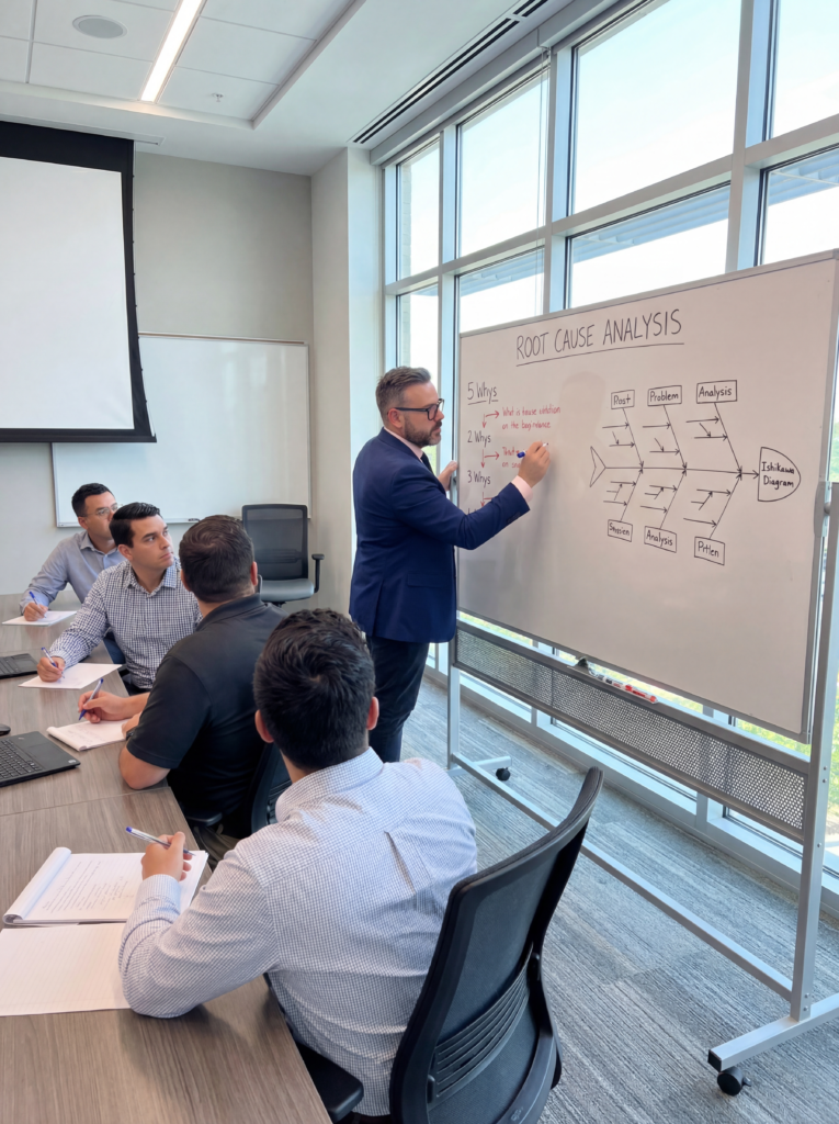
The most effective storyboards look like they were made by the engineers and operators who solved the problem, because they were. Hand-drawn fishbone diagrams, annotated photographs of modified fixtures, and circled data points carry authority. They signal that real investigation happened on the shop floor.
I have reviewed highly polished, marketing-designed boards that operators simply ignored. When a board looks like a corporate directive, people disengage. When it features crossed-out branches and actual photographs of the team, it invites interaction. Authenticity builds trust in the countermeasure.
If a panel requires more than three sentences, it is a report, not a storyboard. Cut the text. Replace it with a photograph of the defect, a process flow diagram, or a bar chart. Limit the word count to force visual communication. The board must be readable from two meters away.
Standardisation and Horizontal Deployment
Solving the problem on one machine is only half the job. The storyboard must document the updated standard work documents, training completion records, and control plans. This satisfies the 'Act' phase of PDCA. Without documented control limits and audit frequencies, the process will drift back to its baseline state within months.
Yokoten, or horizontal deployment, is where storyboards deliver compounded returns. When a storyboard documenting a bearing failure fix at Facility A is physically shipped or shared with Facility B, the receiving team bypasses the investigation phase. They can implement the validated countermeasures directly onto their own equipment.
Slide Deck vs. Storyboard Retention
Standard Slide Deck
- Accessed only via shared drive by the presenter
- Forgotten immediately after the management review
- Hides failed hypotheses; shows a linear, sanitised path
- Isolates knowledge within the original project team
Quality Storyboard
- Displayed permanently in the production area
- Absorbed passively by operators during daily shifts
- Shows the actual struggle and validated root cause
- Triggers immediate yokoten to parallel processes
Avoiding the Trophy Case Trap
A common failure mode is displaying only the projects that achieved their targets. If your storyboard wall only documents uninterrupted successes, you have built a trophy case, not a learning environment. This breeds scepticism on the floor. Operators know that real problem-solving involves dead ends.
A storyboard that presents a linear path from problem to solution is a fairy tale, and everyone on the floor knows it.
Document the struggle. Show the initial hypotheses that were disproven by the data. Show the scrapped parts. A board that honestly details a team investigating a machining tolerance issue, hitting a wall, and pivoting to a coolant flow analysis teaches far more than a prettified success summary.
Display the projects that generated crucial insights but failed to hit the Cpk target. Celebrate the verified root causes and the eliminated variables. When teams see that the organisation values rigorous investigation over perfect metrics, they engage more deeply with the problem-solving process.
Measuring the Return on Storyboards
Implementation requires tracking. The clearest indicator of success is the reuse rate. When a new team tackling a similar defect actively references an existing storyboard, your organisational knowledge is compounding. This directly reduces the time-to-solution for recurring issues.
A healthy storyboard culture should drive the repeat problem rate toward zero for documented failure modes. Track how long it takes teams to close 8D reports for issues that already have storyboards on the wall. The time reduction is your quantitative proof that the system works.
Cross-facility adoption is the ultimate validation. When a plant manager in another country pulls a photograph of your physical board and applies your countermeasures without a formal mandate, the storyboard has fulfilled its purpose. It has made local problem-solving globally transferable.