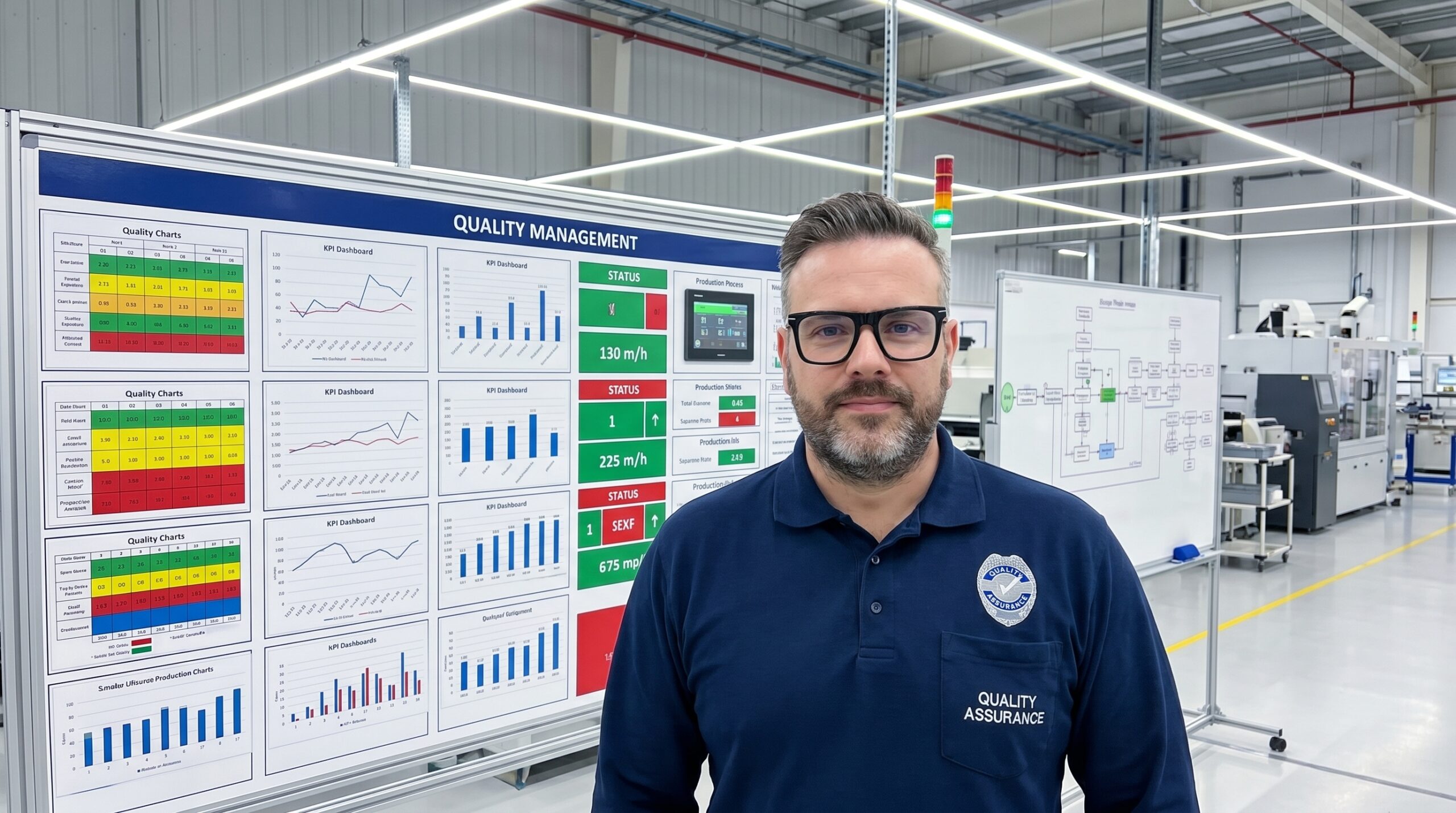
Most manufacturing facilities run their quality management systems entirely blind. Quality data exists, but it is trapped in management databases, buried in quality engineer inboxes, and confined to weekly reports that arrive days after the defects were produced. The operators running the processes never see this information until long after the window for correction has closed.
I have audited plants where the entire quality system is technically compliant to IATF 16949, yet the operators have zero visibility of daily first-pass yield, current Cpk values, or active non-conformances. The standards exist in procedure manuals, but the real-time status of the process is completely invisible on the floor. This disconnect renders the QMS ineffective at the point of production.
Quality visualisation is the discipline of moving critical information out of protected systems and placing it physically at the point of action. It requires shifting from data reporting to environmental design. When you build a visual quality system, you give operators the context needed to correct processes before they generate scrap, rather than waiting for an inspector to catch the failure downstream.
Why Working Memory Fails on the Shop Floor
Relying on an operator's memory for quality criteria is a guaranteed failure mode. A CNC operator monitoring tool wear, cycle times, and machine signals is already operating near cognitive capacity. Expecting them to accurately recall the exact dimensional tolerances from a training session three months prior is an untenable operational risk.
Visual management bypasses this cognitive overload by shifting the burden from working memory to environmental perception. Instead of recalling abstract numbers, the operator performs a rapid visual comparison. The goal is to make the correct choice the obvious choice. When the standard is visual, verifying compliance requires zero extra cognitive effort.
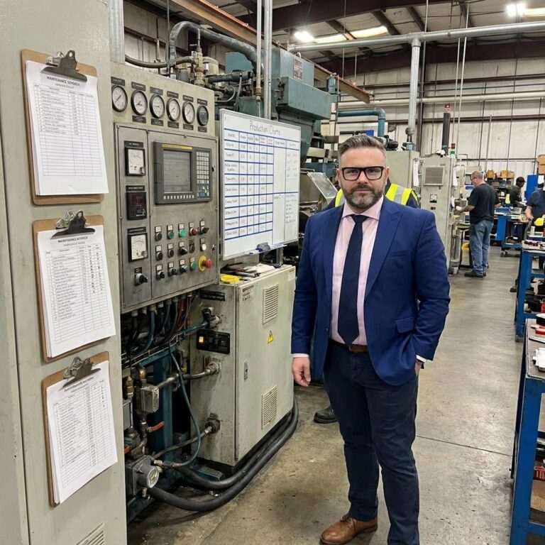
Consider the difference between a PFMEA document sitting in a binder and a physical go/no-go gauge bolted directly to the workstation. The binder requires the operator to stop, read, and interpret. The gauge provides an immediate, binary answer. The visual control converts complex quality requirements into instinctive physical actions that prevent defects at the source.
The Signal and Status Layers
Effective visualisation requires distinct layers, each serving a specific operational purpose. The foundational layer is the signal. Signals are binary, immediate, and demand a reaction. An SPC system tied to a green-yellow-red indicator light alerts an operator to process drift the moment a parameter shifts, eliminating the delay of manual data review.
The next tier is the status layer. Status boards answer what is happening right now, displaying current metrics like hourly first-pass yield or the active Cpk for a critical dimension. The design principle here is absolute clarity: one number, one meaning, one action. If an operator cannot instantly determine whether the displayed metric requires intervention, the display has failed.
Essential Status Board Metrics
Status displays must reside where the relevant personnel naturally operate. Data locked behind a supervisor's desktop login is useless to the operator on the line. Position the metrics at the workstation, the line entrance, and central information boards so that anyone walking the floor can assess the current quality state within seconds.
Deploying Trend and Standard Visuals
Trend visualisation transitions quality management from reactive to predictive. A single data point tells you where the process is; a trend chart tells you where it is going. Placing simple run charts at the point of production allows operators to spot drift toward control limits before a defect is ever generated, triggering planned adjustment rather than emergency containment.
Equally critical is the visualisation of standards. Most organisations rely on text-heavy work instructions that operators rarely read during active production. Replacing these with visual controls—shadow boards for gauge storage, photographs of acceptable versus defective parts, and one-point lessons mounted at the exact station where the defect occurs—makes deviation immediately obvious to anyone passing by.
When the standard is visualised physically, compliance becomes a matter of rapid pattern matching rather than reading comprehension. A missing tool on a shadow board signals an abnormality instantly. Comparing a freshly machined part against a certified master sample eliminates the ambiguity of interpreting a dimensional specification on a printed page.
Visualising Problem-Solving and Improvement
Quality visualisation extends beyond daily operations into continuous improvement. Problem boards, visible A3 reports, and 8D tracking matrices make structured problem-solving transparent to the entire organisation. When a fishbone diagram is built and displayed on the shop floor, it leverages the collective intelligence of every worker who walks past, not just the quality engineers assigned to the case.
Invisible problems get solved by whoever discovers them. Visible problems get solved by whoever can actually fix them.
Improvement tracking boards serve a different but equally vital function. They document the countermeasures implemented, the responsible owners, and the measurable results achieved. By making continuous improvement physically visible, organisations accumulate momentum. Teams can see the direct impact of their problem-solving efforts, which reinforces a culture of proactive defect prevention.
Without visible improvement tracking, countermeasures are implemented and immediately forgotten. There is no organisational memory of what was fixed, how it was fixed, or whether the solution actually held. Visual management turns isolated fixes into documented standard work, permanently raising the baseline of plant performance.
Design Principles That Prevent Information Overload
Installing flat-screen TVs that cycle through dense KPI dashboards is not visual management; it is digital wallpaper. Bad visualisation is actively harmful because it trains operators to ignore the walls entirely. Effective visualisation requires strict adherence to specific design principles that separate critical signals from background noise.
Effective versus Ineffective Visual Management
What teams usually do
- Dumps all available SPC data onto a wall-mounted screen.
- Keeps the primary metrics dashboard in the manager's office.
- Updates reports weekly based on manual data entry.
- Uses text-heavy procedures to communicate standards.
What actually works
- Displays one critical metric with a clear target and tolerance.
- Mounts visual gauges directly at the operator's workstation.
- Integrates machine data for real-time, automatic status updates.
- Uses physical samples and photos for instant visual verification.
The primary rule is proximity over portability. A control chart on a quality engineer's laptop only helps the engineer. A control chart at the workstation helps the operator and prevents the defect. Information must be displayed as close to the point of action as physically possible. If the operator has to take a single step to see the quality status, the system is compromised.
Simplicity must override comprehensiveness. Every additional element on a visual display competes for limited attention. If a board requires a legend, a footnote, or a five-minute explanation, it is fundamentally too complex. The visual control must immediately answer one question: what action needs to happen right now?
Implementation Sequence and Cultural Shift
Transitioning to a visual quality system fails when organisations attempt to deploy every layer simultaneously. A phased approach builds momentum and establishes the foundational habits required for sustainability. Start with a Gemba audit to document exactly what quality information exists and where it currently hides, then deploy the signal layer to establish immediate awareness.
Phased Rollout of Visual Quality Systems
- 01Gemba AuditWalk the floor to document where quality data currently lives and who can access it.
- 02Signal LayerInstall simple green-yellow-red indicators tied to critical quality parameters.
- 03Status and StandardsPost real-time metrics and physical samples directly at the production workstations.
- 04Trend IntegrationConnect SPC outputs to point-of-use displays to enable predictive process adjustments.
- 05Strategic AlignmentConnect shop-floor visualisation to management review boards and Hoshin Kanri objectives.
Visual management only functions if the displays stay current. Stale data trains people to ignore the boards. Updating the boards must be integrated into the daily workflow, not treated as a secondary administrative task. When operators build and maintain their own boards, the system becomes theirs. When a quality team imposes the system from the outside, it becomes someone else's discarded responsibility.
The final shift is strategic. When a plant manager can stand in front of a board and trace a direct line from a workstation's Cpk value to field failure rates and warranty costs, quality stops being a departmental metric and becomes a business imperative. Making problems visible forces the organisation to solve them, and that visibility is the cheapest, most effective quality investment a plant can make.