
A control chart is a decision tool. It tells your operator when to adjust a machine and when to leave it alone. Choosing the wrong chart type forces operators to either chase ghost signals or miss actual process shifts. The mathematical assumptions built into the chart dictate what type of variation it can actually detect.
When you apply an Individuals and Moving Range (I-MR) chart to binomial data, such as pass/fail counts, you violate the normality assumption. The control limits will be mathematically invalid. The result is predictable: false alarms that destroy operator confidence, or undetected shifts that generate customer rejections and trigger 8D investigations.
I have audited plants where quality engineers proudly displayed Cpk values of 1.67 next to fundamentally mismatched charts. The SPC methodology was not failing. The failure was a technical misunderstanding of the data being fed into the tool. Correct chart selection is a strategic baseline requirement for any IATF 16949 or AS9100 quality management system.
The Functional Divide: Continuous vs Attribute Data
Chart selection starts with one question: what are you measuring? Continuous, or variable, data involves physical characteristics measured on a scale. Length, mass, temperature, and torque yield fractional values like 12.37 mm or 12.384 mm. This data is information-rich. A single data point tells you exactly how far the process sits from the target.
Attribute, or discrete, data involves counts or classifications. This includes the number of failed parts in a batch, percentage yield, or pass/fail go-no-go gauge results. These are whole numbers or distinct categories. Attribute data is information-poor compared to continuous data. If five parts fail a visual inspection, the raw count does not explain the failure mode or the deviation magnitude.
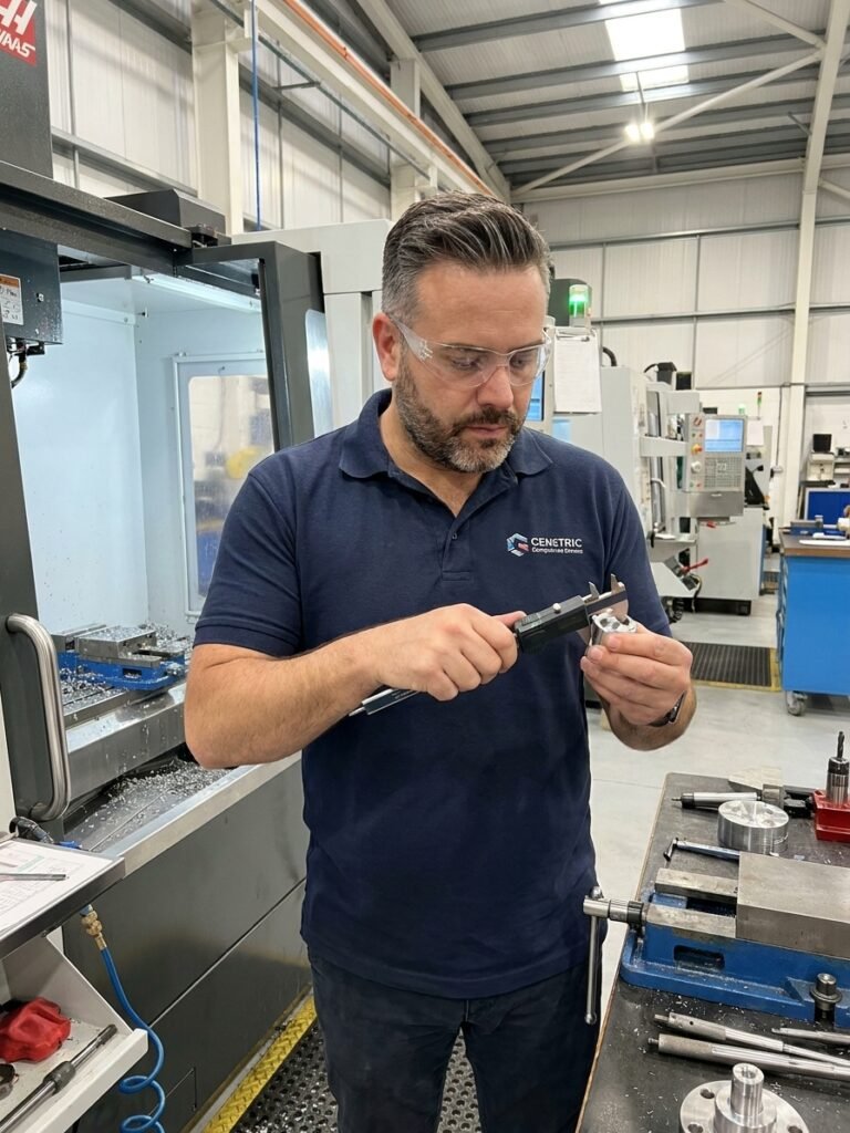
Always default to continuous data when physically possible. Measuring a dimension with a calliper provides exponentially more statistical power than checking a finished part against a gauge. However, end-of-line functional testing and visual inspection often limit you to attribute data, requiring the correct attribute-specific chart.
Continuous Data Charts: Subgroup Size Dictates the Tool
When measuring continuous data, chart selection depends entirely on subgroup size. For subgroups of 2 to 9 units, the X̄-R (Average and Range) chart is the industry standard. The X̄ chart tracks shifts in the process mean, while the R chart monitors variation within the subgroup using the difference between maximum and minimum values.
Use the X̄-S (Average and Standard Deviation) chart when subgroups reach 10 or more. Standard deviation is statistically more robust than range for larger samples. The range calculation becomes overly sensitive to single extreme outliers in large subgroups, distorting the calculated control limits and generating false special-cause signals.
Use the I-MR (Individuals and Moving Range) chart when sampling a single unit per interval. This applies to processes with long cycle times, such as chemical batches or furnace temperatures. I-MR is the most misused chart in the industry. Quality teams apply it to avoid the logistical effort of subgroups. Consequently, they lose statistical power.
An X̄-R chart with a subgroup of 5 is significantly more sensitive to a 1-sigma process shift than an I-MR chart. Operators using I-MR charts on high-volume stamping lines will not detect small, gradual drifts until the process produces scrap. If the process geometry allows for multiple measurements per cycle, use a subgroup and deploy X̄-R.
Attribute Data Charts: Counts vs Proportions
For attribute data, the decision tree branches based on whether you are counting defective units or individual defects, and whether the sample size is constant. The p-chart tracks the proportion of defective units. It is essential when daily sample sizes fluctuate. If you inspect 80 units on Monday and 120 on Tuesday, the p-chart dynamically recalculates control limits for each specific data point.
The np-chart tracks the raw count of defective units, but strictly requires a constant sample size. If you always inspect exactly 100 printed circuit boards per shift, the np-chart is preferable to the p-chart. The control limits remain constant, making the chart immediately readable for operators who simply see '5 rejects out of 100' plotted against a fixed boundary.
Counting individual defects requires a different approach. A single automotive body panel can have zero scratches, three scratches, or twelve paint inclusions. The c-chart tracks the total count of these defects per unit, assuming a constant inspection area. One unit is classified as defective regardless of whether it has one flaw or ten.
When the inspection area or unit size fluctuates, deploy the u-chart. If you inspect 10 metres of extruded cable on one day and 50 metres the next, you must normalise the data. The u-chart calculates defects per unit of measure, such as defects per metre. This normalisation reveals true process capability regardless of the order size.
The Mechanics of Chart Migration
Control Chart Selection Logic
- 01Identify Data TypeDetermine if measurements are continuous (variable) or attribute (discrete counts).
- 02Define Subgroup MethodologyFor continuous data, establish subgroup size: 1 unit (I-MR), 2-9 units (X̄-R), or 10+ units (X̄-S).
- 03Classify Attribute MeasurementFor attribute data, decide if you are tracking defective units or total defects.
- 04Assess Sample ConsistencyDetermine if sample size is constant (use np-chart or c-chart) or variable (use p-chart or u-chart).
Migrating from a mismatched chart to the correct format requires statistical discipline. You cannot simply swap the chart type in your SPC software and retain historical limits. When changing from an I-MR chart to an X̄-R chart, the control limit formulas change entirely. You must establish a new baseline.
Run the new chart configuration for a minimum of 25 subgroups to calculate initial control limits. During this baseline period, operators must not adjust the process based on the old chart logic. Once the new limits are verified, lock them in the system and train operators on the revised reaction plan.
Transitioning from a p-chart to an np-chart, or fixing a sample size to enable this transition, requires recalculating the historical mean and standard deviation. Document this transition in your PPAP or AS9100 quality planning records. Auditors expect to see the mathematical justification behind control limit adjustments.
Common SPC Configuration Failures
Mismatched vs Correct SPC Application
Forcing I-MR on Everything
- Used to avoid the logistical effort of rational subgroups.
- Wide control limits mask gradual process drifts.
- Individual variation hides systemic shifts between cavities or stations.
- Leads to undetected scrap and sudden customer complaints.
Engineering Rational Subgroups
- Subgroups capture variation within a single production cycle.
- X̄-R charts statistically separate within-group and between-group variation.
- Tight control limits immediately flag small mean shifts.
- Drives proactive tooling adjustment before nonconforming product is made.
Applying continuous charts to discrete data is a systemic failure. The number of failed units in a sample of 50 yields integers like 0, 1, or 2. Forcing this data into an I-MR chart ignores the underlying binomial distribution. The calculated control limits will be incorrect, generating false special-cause alarms or masking actual out-of-control conditions.
Ignoring the normality assumption for I-MR charts is another critical error. I-MR charts assume the individual measurements follow a normal distribution. Highly skewed data, such as time-to-failure or chemical purity levels, violates this assumption. Applying a Box-Cox transformation or using a non-normal capability index becomes necessary to generate valid limits.
Control limits must be calculated from the actual data's distribution, not forced into a template that software provides by default.
Operational Impact of Correct Chart Selection
I have transitioned quality systems where implementing correct subgroups immediately uncovered hidden systemic issues. In one facility manufacturing plastic engine covers, the team measured critical wall thickness using an I-MR chart. They reasoned that because they took one measurement per cycle, I-MR was the only option. Their customer rejection rate for dimensional nonconformance sat at 4.2%.
The injection moulding machine produced eight cavities per cycle. By measuring five consecutive cavities per cycle and shifting to an X̄-R chart, the subgroup average immediately isolated the true process variation. The individual variation that masked the drift disappeared. The new chart revealed a persistent, systematic thickness difference between the left and right mould halves.
Tooling maintenance resolved the cavity imbalance. Within three months of implementing the correct X̄-R chart and adjusting the mould, customer rejections dropped from 4.2% to 0.6%. The process had not changed. The measurement capability had simply been blind to the defect mechanism due to a mismatched statistical tool.
Advancing Beyond the Core Seven
| Chart Methodology | Statistical Application | Use Case Example |
|---|---|---|
| CUSUM and EWMA | Detects small, persistent shifts (under 1 sigma) that standard X̄-R charts miss. | High-precision machining where tool wear is gradual and continuous. |
| Short-Run SPC | Normalises data to a target value, allowing multiple part numbers on one chart. | Job shop manufacturing or aerospace low-volume, high-mix production. |
| Hotelling T² (Multivariate) | Monitors multiple correlated characteristics simultaneously on a single chart. | Chemical processing where temperature, pressure, and viscosity are interdependent. |
CUSUM and EWMA charts provide sensitivity for detecting gradual drifts of 1-sigma or less. Standard Shewhart charts like X̄-R are effectively blind to these small, persistent shifts. However, these advanced charts require strict statistical governance. Deploying them without mastering the basic seven charts creates confusion and unreliable capability indices.
Short-run SPC resolves the challenge of low-volume manufacturing. When a CNC machine processes three different part numbers in a single shift, establishing 25 subgroups for a single part is impossible. Short-run charting normalises the deviation from the target value, allowing diverse part numbers to be tracked on a unified control chart.
Multivariate charts like the Hotelling T² monitor correlated characteristics. In aerospace composite curing, temperature, pressure, and vacuum interact. Tracking them on three separate control charts ignores this correlation. A T² chart evaluates the joint probability of these variables, flagging when the entire system shifts out of control simultaneously.