Quality
and the Signal-to-Noise Ratio: When Your Organization Drowns in Data and
the Defects That Matter Die in the Noise
You have 47 control charts on the wall. Your SPC system sends 312
alerts per week. Your quality dashboard has 14 tabs, 89 metrics, and a
refresh rate faster than your team’s ability to think. Your monthly
quality report is 43 pages long. Nobody reads past page six.
And last Tuesday, a critical dimension drifted out of specification
for four hours before anyone noticed.
Not because the data wasn’t there. It was. The signal was screaming.
But it was screaming inside a stadium full of screaming — and your
quality organization had learned to stop listening to everything because
it couldn’t distinguish the one alert that mattered from the three
hundred that didn’t.
This is the signal-to-noise problem in quality management. And it is
quietly killing organizations that think they’re data-driven when
they’re actually data-buried.
The
Origin: From Engineering to Organizational Dysfunction
The concept of signal-to-noise ratio was formalized by engineers at
Bell Labs in the 1920s as a way to measure how much useful information
(signal) was present in a transmission compared to the background
interference (noise) that obscured it. A high SNR means you hear the
music clearly. A low SNR means you hear static with occasional hints of
a melody.
Genichi Taguchi brought this concept into quality engineering with
his robust design methodology, using SNR as a metric to evaluate how
well a process performed relative to variation. But Taguchi was
measuring physical processes. What he didn’t anticipate — what few
quality leaders anticipate — is that the same principle applies to the
information systems that manage quality itself.
Your quality data is a transmission. Your defects, trends, and
emerging failures are the signal. Your noise is everything else: trivial
alerts, redundant metrics, decorative dashboards, over-reported
non-conformances on items that don’t affect function, and the 47 control
charts that your team maintains because someone decided ten years ago
that “more data is always better.”
More data is not always better. More data, without the discipline of
separation, is noise. And noise doesn’t just fail to inform — it
actively degrades your ability to detect the signals that matter.
The Anatomy of Quality Noise
Quality noise manifests in several forms, each one subtle enough to
feel like rigor when it’s actually dysfunction.
Metric Proliferation is the most common form. An
organization starts with five key quality metrics. Someone attends a
conference and comes back with seven more. A customer audit suggests
three additional KPIs. A new quality manager adds their own dashboard.
Within two years, the team is tracking 42 metrics, and nobody can
articulate which five actually drive customer satisfaction. The signal
is there, buried inside the 42. But the cognitive cost of separating it
from the noise exceeds the analytical capacity of the team responsible
for doing so.
Alert Fatigue follows metric proliferation like a
shadow. When your SPC system flags every point outside control limits on
every characteristic for every process, you generate hundreds of alerts
per week. Most are trivial — a tool wear adjustment, a material lot
change, a known and acceptable source of variation. But they all show up
in the same inbox with the same red icon. Your team starts treating
every alert the same way: dismiss. The critical alert — the one where a
heat treatment process is quietly drifting toward the edge of its
capability — arrives in the same queue and receives the same treatment.
Not because your team is incompetent. Because their signal detection has
been destroyed by noise.
Decorative Reporting is the form that leadership is
most responsible for. Monthly quality reports that are 43 pages long
exist not because anyone needs 43 pages of information, but because
producing a thick report feels like thoroughness. The five insights that
should drive action are hidden among 38 pages of charts that confirm
what everyone already knows. The report becomes a ritual, not a tool.
And the signal — the one emerging trend on page 27 that should trigger
an immediate investigation — dies in the gap between production and
consumption.
Duplicate Monitoring occurs when the same process
characteristic is measured, tracked, and reported through multiple
independent systems. The CMM measures it. The SPC system charts it. The
production supervisor logs it. The quality engineer analyzes it. Four
systems, four reports, four different interpretations — all about the
same dimension. The team spends more time reconciling the four versions
of the same data than acting on what the data is telling them. The
signal is real. But it’s been replicated into four copies, each slightly
different, and the energy required to determine which one is correct
exhausts the energy available to respond.
The Cost: What Happens
When Signal Dies
The consequences of poor signal-to-noise ratio in quality systems are
not theoretical. They are operational, financial, and sometimes
catastrophic.
Delayed Response to Emerging Failures. This is the
most direct cost. When a critical process shift occurs, the detection
time is proportional to the noise floor. In a low-noise system, a
1-sigma shift is visible within hours. In a high-noise system, the same
shift can persist for days or weeks because it doesn’t stand out from
the background. Every hour of delayed detection is hours of
nonconforming product, hours of customer exposure, hours of compounding
cost.
Misallocated Resources. When noise dominates,
organizations allocate their quality improvement resources based on
what’s loudest, not what’s most important. The metric that generates the
most alerts gets the most attention, regardless of whether it’s the
metric that has the most impact on customer experience or product
safety. Teams of engineers chase the loudest problems while the most
consequential failures accumulate quietly in the background.
Erosion of Trust in Quality Systems. This is the
slowest but most damaging consequence. When operators, engineers, and
managers experience quality data as noise rather than signal, they stop
trusting the system. They revert to personal experience, intuition, and
informal networks. “I’ll go check the machine myself” becomes the
default quality strategy. The formal quality system — the one you
invested six figures building — becomes theater. It exists to satisfy
auditors, not to inform decisions. And once this perception takes hold,
it’s extraordinarily difficult to reverse.
Catastrophic Miss. The worst-case scenario. The
signal that could have prevented a safety failure, a customer plant
shutdown, or a massive recall was present in the data. It was flagged.
It was documented. It was item number 247 on a list of 312 weekly
alerts, sandwiched between a cosmetic blemish report and a routine
calibration reminder. Nobody saw it. Not because they were negligent.
Because they were overwhelmed.
The
Engineering of Silence: How to Rebuild Your SNR
Improving signal-to-noise ratio in a quality system is not about
adding more signal. It’s about ruthlessly eliminating noise. Here is a
structured approach.
1. Audit Every Metric
for Decision Utility
Go through every metric your organization tracks and ask one
question: What decision does this metric directly inform? If
the answer is “it’s for reference” or “we’ve always tracked it” or “it
might be useful someday,” that metric is noise. Eliminate it or archive
it. Your active dashboards should contain only metrics that trigger
specific, named decisions when they cross specific, defined thresholds.
Everything else belongs in a historical database, not on someone’s daily
screen.
The rule of thumb: if you cannot articulate the action that a metric
triggers, the metric is decorative. Decorative metrics are noise.
2. Tier Your Alert System
Not all alerts are created equal. Implement a three-tier system:
-
Tier 1 — Critical: Alerts that require immediate
production stoppage or containment. These should be rare, loud, and
impossible to ignore. They should reach the responsible person by phone,
not email. Examples: safety-critical dimension out of specification,
process parameter beyond action limit on a validated process. -
Tier 2 — Investigative: Alerts that indicate a
statistically significant shift requiring investigation within one
shift. These generate a formal response requirement with a documented
closeout. Examples: control chart trend rules triggered on key
characteristics, sudden increase in scrap rate on a specific
operation. -
Tier 3 — Informational: Alerts that document
variation but require no immediate action. These are logged, trended,
and reviewed in weekly or monthly meetings. They do not generate
notifications to production. Examples: minor within-specification drift,
routine tool wear patterns.
The critical discipline: Tier 1 alerts should represent no more than
2-5% of all alerts generated. If everything is critical, nothing is.
3. Implement
Exception-Based Reporting
Your default state should be silence. Reports should be generated
when something requires attention, not on a fixed schedule regardless of
conditions. A daily quality report that says “all processes nominal, no
action required” is noise. An alert that fires only when a process
deviates from its expected behavior is signal.
This requires defining what “normal” looks like for every critical
process and building monitoring systems that only speak when normal is
violated. The goal is a quality system that is quiet when things are
going well — because silence, in a well-designed system, is the
strongest signal of all.
4. Consolidate Redundant
Monitoring
If the same characteristic is monitored by four systems, pick one.
Make it the authoritative source. Archive the others. The reconciliation
cost of maintaining duplicate monitoring is pure noise — it consumes
time and attention without adding information.
This requires political will, because every redundant monitoring
system has an owner who will defend its existence. But the cost of not
consolidating is paid daily in wasted analytical effort and conflicting
data interpretations.
5. Design Dashboards for
Cognitive Limits
A human can actively monitor approximately 5-7 information elements
simultaneously. Your dashboards should reflect this constraint. Five
well-chosen metrics on a single screen that everyone understands is
infinitely more effective than 42 metrics across 14 tabs that nobody
comprehprehensively reviews.
The design principle: every element on a dashboard should earn its
position by answering the question, “If this element were removed, would
a critical signal be missed?” If the answer is no, remove it.
The Taguchi Insight
Revisited
Taguchi’s signal-to-noise ratio wasn’t just a mathematical
convenience. It was a philosophy: the measure of a system’s quality is
not just its average performance but its ability to deliver clear,
distinguishable results in the presence of variation. A system with high
noise is low quality — even if its average output is acceptable.
Apply this to your quality information system. The measure of your
quality data system is not how much data it produces. It’s how clearly
it distinguishes the signal — the real quality problems, the emerging
trends, the opportunities for improvement — from the noise of trivial
variation, redundant reporting, and decorative metrics.
Your quality system is itself a process. And like any process, it has
a signal-to-noise ratio. The question is whether you’ve ever measured
it.
The Leadership Discipline
Rebuilding signal-to-noise ratio is fundamentally a leadership
discipline. It requires the courage to remove metrics, to silence
alerts, to produce shorter reports, and to trust that a quiet quality
system is a healthy one. The natural organizational instinct is to add —
more data, more charts, more monitoring, more reporting. The discipline
of subtraction is harder and more valuable.
The best quality leaders I’ve worked with share a common trait: they
are editors, not collectors. They curate the information landscape so
that their teams can see clearly. They understand that every unnecessary
metric they display is a tax on attention, and attention is the scarcest
resource in any quality organization.
The Paradox of More
Here is the deepest irony: the organizations with the best quality
performance are usually the ones with the simplest quality information
systems. Not because they have less data — they often have more — but
because they have invested in the architecture of discernment. They have
built systems that amplify signal and attenuate noise. They have
designed dashboards that speak when there is something to say and stay
silent when there isn’t.
The organizations struggling with quality are frequently the ones
drowning in data. They have 47 control charts and 312 alerts and 43-page
reports and no idea what’s actually happening on their shop floor. They
have confused the presence of information with the presence of
understanding.
Signal-to-noise ratio is not a technical concept. It is an
organizational health metric. And if your quality team feels overwhelmed
by data but underserved by insight, the problem isn’t your data. The
problem is your noise.
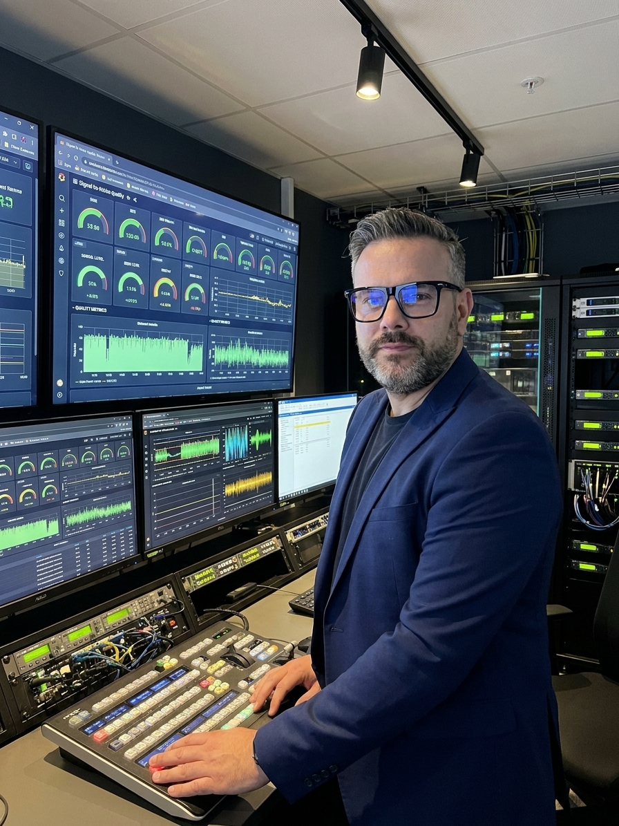
Peter Stasko is a Quality Architect with 25+ years of experience
in automotive, aerospace, and quality transformation. Certified PSCR and
Six Sigma Black Belt.