The Presentation That
Changed Everything
The quarterly quality review was in full swing. Plant managers from
three facilities sat around the conference table, each presenting their
improvement projects with the enthusiasm of a student reading a homework
assignment they finished on the bus. Slide decks flashed across the
screen — charts, tables, before-and-after photos, and the inevitable
“Lessons Learned” bullet point that nobody ever read.
Then Maria stood up.
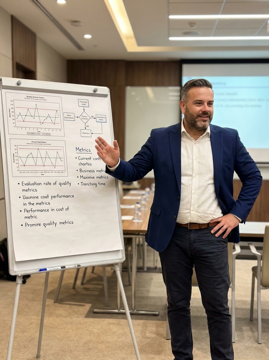
She didn’t open PowerPoint. She walked to the wall where a single
large board had been covered with a cloth. She pulled it away to reveal
a hand-drawn storyboard — twelve panels, each one a chapter in the story
of how her team had solved a chronic bearing noise problem that had
plagued the assembly line for eighteen months.
Panel one: the customer complaint, complete with a photograph of the
returned part and a quote from the frustrated buyer. Panel two: the data
— a Pareto chart showing bearing noise as the number-one warranty claim.
Panel three: the team — real photographs of the six people who tackled
the problem, their roles handwritten beneath each face. Panel four: the
problem statement, written in plain language any operator could
understand.
And so it continued, panel by panel, following the A3 problem-solving
structure but told as a narrative. The root cause analysis led to a
fishbone diagram drawn in color. The countermeasures section showed
three possible solutions, ranked by a decision matrix. The
implementation panel included photographs of the actual changes on the
line. The results panel displayed a control chart with the improvement
clearly marked. The final panel showed the standard work document and
the training plan that ensured the problem would never return.
The room went quiet. Not the kind of quiet that means people are
checking their phones — the kind of quiet that means people are paying
attention.
The plant manager from Facility B leaned forward and said, “I have
the same bearing noise problem on my line. Can I get a copy of that
board?”
Maria smiled. “I’ll do better. I’ll send you the original.”
That’s the power of a Quality Storyboard. It doesn’t just document an
improvement — it makes it transferable.
What Is a Quality Storyboard?
A Quality Storyboard is a visual communication tool that presents the
complete narrative of a quality improvement project on a single,
large-format display. Rooted in Japanese quality management practice and
closely linked to the A3 thinking methodology developed at Toyota, the
storyboard transforms a complex problem-solving journey into a coherent,
accessible story that anyone in the organization can follow, understand,
and replicate.
Think of it as the difference between reading a police report and
watching a documentary. Both contain the same facts, but one changes how
people feel and act on those facts.
The storyboard typically follows the PDCA (Plan-Do-Check-Act) cycle
or the 8D problem-solving structure, but it presents each phase as a
visual panel with concise text, charts, photographs, and annotations.
The result is a single glanceable surface that communicates the entire
improvement journey — from the initial problem to the sustained
results.
Key characteristics:
- Visual-first: Photographs, diagrams, charts, and
handwritten annotations dominate. Text is minimal and purposeful. - Narrative structure: It tells a story with a
beginning (the problem), a middle (the investigation and solution), and
an end (the results and standardization). - Single surface: Everything fits on one board,
typically A1 or A0 size, forcing ruthless prioritization of
information. - Hand-created: The best storyboards are hand-drawn
and hand-assembled, not polished in PowerPoint. The imperfection signals
authenticity. - Public-facing: Storyboards are displayed in common
areas, meeting rooms, or production floors where anyone can study
them.
Why Storyboards Work
When Slide Decks Fail
You’ve seen it a hundred times. A team spends three months solving a
critical quality problem. They compile a forty-slide PowerPoint deck,
present it once in a management review, and then it disappears into a
shared drive folder that nobody will ever open again.
The organizational learning from those three months of effort? Gone.
Evaporated. The next time the same problem appears on a different line —
and it will — a new team will start from scratch, reinvestigating,
reanalyzing, and rediscovering what the first team already knew.
Storyboards break this cycle for several compelling reasons:
Cognitive Accessibility
The human brain is wired for stories, not bullet points. Research in
cognitive psychology consistently shows that narrative structures
improve comprehension, retention, and transfer of information by forty
to sixty percent compared to list-based presentations. When you frame a
problem-solving journey as “we discovered X, which led us to Y, which
revealed Z,” you’re giving the reader’s brain a natural processing
pathway.
Visual Persistence
A slide deck exists for the duration of a meeting. A storyboard
exists for weeks, months, or even years on a wall where hundreds of
people walk past it daily. It becomes part of the visual landscape of
the workplace. People stop, read, point, discuss — informal learning
happens constantly, without scheduling a single meeting.
Knowledge Transfer
When Maria’s bearing noise storyboard was shipped to Facility B, the
receiving team didn’t need a kickoff meeting, a briefing document, or a
conference call. They walked up to the board, read the story from panel
one to panel twelve, and understood exactly what had been done and why.
Within two weeks, they had implemented the same countermeasures on their
own line.
Cultural Impact
Storyboards send a powerful cultural message: problem-solving
matters here. When the walls of your factory are lined with stories
of improvement — real problems solved by real teams with real results —
you create an environment where quality is not a department but a
living, visible practice.
Building
a Quality Storyboard: The Panel-by-Panel Guide
A well-constructed Quality Storyboard typically consists of ten to
fourteen panels arranged in a logical sequence. Here’s a practical
framework you can implement immediately:
Panel 1: Title and Theme
The title panel establishes context. Include: – A clear, descriptive
title (not a project code — a human-readable name) – The team members
with photographs – The project timeframe – The area or process
involved
Pro tip: Use a photograph of the actual production
area or product as the background. Ground the story in physical reality
from the first glance.
Panel 2: Problem
Statement and Background
This panel answers: Why did we start this project? Include:
– A concise problem statement in one to two sentences – The business
impact (cost, customer complaints, warranty claims, scrap rate) – A
timeline showing how long the problem existed – Customer voice — a
direct quote if possible
Example: “Cylinder head gasket leaks have been the
number-one warranty claim for 14 months, costing $340,000 annually and
generating 47 customer complaints per quarter.”
Panel 3: Current State Data
Show the baseline. This panel should include: – Pareto chart or trend
chart establishing the magnitude – Defect rate, scrap rate, or relevant
KPI in its current state – Photographs of the actual defect or problem –
Process flow diagram highlighting where the problem occurs
The goal is to make the reader feel the pain of the current
situation.
Panel 4: Target State
What does success look like? Define: – Specific, measurable target
(not “improve” but “reduce defect rate from 4.2% to below 0.5%”) –
Timeline for achieving the target – Expected business impact (cost
savings, customer satisfaction improvement) – Any constraints or
boundaries
Panel 5: Root Cause Analysis
This is the investigative core. Show: – Fishbone (Ishikawa) diagram
with the team’s analysis – Five-Why analysis tracing the causal chain to
root cause – Data that supports the root cause hypothesis (correlation
analysis, stratification results) – Photographs or evidence from the
investigation
Critical: Don’t show a clean, post-hoc fishbone that
looks like it was drawn by a graphic designer. Show the real one — with
crossed-out branches, circled root causes, and coffee stains.
Authenticity builds trust.
Panel 6: Countermeasures
Present the solution options: – Three to five potential
countermeasures – Evaluation matrix (effectiveness, cost, implementation
time, sustainability) – The selected countermeasure with justification –
Implementation plan with responsibilities and dates
Panel 7: Implementation
Show what actually happened: – Before-and-after photographs of the
process changes – Timeline of implementation activities – Challenges
encountered and how they were overcome – Photographs of the team
implementing changes
This is where visual storytelling shines. A photograph of a modified
fixture, a redesigned jig, or a relocated sensor tells more than a
paragraph of text ever could.
Panel 8: Results
The payoff panel. Present: – Control chart or trend chart showing the
improvement – Before-and-after comparison of the key metric –
Statistical validation (was the improvement real or just noise?) – Cost
savings or other business impact quantified
Essential: Mark the improvement point on the control
chart with an arrow and annotation. Make it visually unmistakable.
Panel 9: Standardization
and Yoko-ten
How do you ensure the improvement sticks and spreads? – New or
revised standard work documents – Training completion records – Audit
checklist updates – Plans for horizontal deployment (yokoten) to other
lines or facilities
Panel 10: Reflections and
Next Steps
Close with honesty: – What went well – What the team would do
differently – Remaining gaps or follow-up actions – Acknowledgments
This panel is often skipped, but it’s the most human part of the
storyboard. It signals that improvement is a learning process, not a
performance.
The Medium Matters:
Paper, Board, or Digital?
Let me be direct about this: the best Quality Storyboards are
physical, not digital.
There’s a reason Toyota’s A3 reports are still done on paper with
pencil. The physical act of writing, drawing, arranging photographs, and
physically placing elements on a board engages a different kind of
thinking than clicking and dragging in PowerPoint. It forces the team to
prioritize — you can’t fit everything on a physical board, so you have
to choose what matters most.
That said, there’s a practical reality to consider. If your
organization has multiple facilities spread across countries, you need a
way to share storyboards digitally. Here’s my recommendation:
Primary format: Physical board displayed in the
production area where the improvement happened.
Secondary format: High-resolution photograph of the
physical board, stored in a shared digital library organized by problem
type, process area, and improvement method.
Never: A PowerPoint version that “cleans up” the
original. The imperfections are features, not bugs.
Some organizations have started using large-format digital displays
(55-inch screens) mounted in production areas that cycle through
storyboards. This can work well if the content retains the visual,
hand-crafted feel of a physical board rather than devolving into
corporate slide templates.
Common Mistakes That Kill
Storyboards
I’ve seen hundreds of Quality Storyboards over twenty-five years, and
the same mistakes show up repeatedly:
Mistake 1: Too Much Text
If a panel has more than three sentences, it’s a report, not a
storyboard. Cut the text. Add a chart, a photograph, or a diagram. The
storyboard is a visual medium — treat it like one.
Mistake 2: Skipping the
Struggle
The most compelling storyboards show the dead ends, the failed
hypotheses, and the moments when the team thought they had it solved
only to discover they’d been chasing the wrong root cause. This struggle
is what makes the story real and the learning transferable. A storyboard
that presents a linear path from problem to solution is a fairy tale —
and everyone knows it.
Mistake 3: Professional
Polish
I once saw a storyboard that had been designed by the company’s
marketing department. Full-color printing, laminated panels, consistent
fonts, perfect alignment — and zero credibility. The operators who
walked past it didn’t engage with it because it didn’t look like
something their colleagues had created. It looked like
something management had produced to tell them what to
think.
The best storyboards look like they were made by engineers and
operators who were more focused on solving the problem than on making it
pretty. Because they were.
Mistake 4: No Follow-Through
A storyboard that shows results but doesn’t include a control plan
with ongoing monitoring is incomplete. Without the “Act” phase of PDCA,
the improvement is temporary at best. I’ve seen organizations proudly
display storyboards showing dramatic improvements, only to have the
metrics revert to their previous state within six months because nobody
established sustained monitoring.
Mistake 5: Displaying Only
Successes
If your storyboard wall only shows projects that achieved their
targets, you’re creating a trophy case, not a learning environment. The
most valuable storyboards often document projects that didn’t
achieve their original targets but generated crucial insights that led
to breakthroughs elsewhere. Celebrate the learning, not just the
results.
Implementation
Roadmap: From Zero to Storyboard Culture
If you’re convinced but wondering how to start, here’s a phased
approach:
Phase 1: Pilot (Weeks 1-4)
Select one recently completed improvement project. Gather the team
and build a single storyboard following the panel structure above.
Display it in a high-traffic area. Watch how people interact with it.
Gather feedback.
Phase 2: Integration (Months
2-3)
Make storyboards a required deliverable for all Tier-2 and above
problem-solving activities. Provide a blank template (a large sheet with
grid lines and panel headers). Train team leaders on visual
communication basics — not graphic design, but how to select the right
chart type, how to annotate photographs, and how to write concise
problem statements.
Phase 3: Library (Months 4-6)
Create a physical library of completed storyboards organized by
category. Establish a yokoten process where teams from different areas
review storyboards monthly and identify transferable improvements. This
is where the real organizational learning begins to compound.
Phase 4: Culture (Months 7-12)
By now, storyboards should be self-sustaining. The wall space becomes
valuable real estate — teams want their best work displayed. Management
reviews shift from slide presentations to storyboard walks, where
leaders physically move through the improvement gallery and discuss the
stories directly with the teams who created them.
The Storyboard as a
Leadership Tool
Here’s something most people miss: the Quality Storyboard is not just
a communication tool. It’s a leadership development tool.
When you ask a team leader to create a storyboard, you’re asking them
to: – Synthesize months of work into a coherent
narrative (strategic thinking) – Prioritize what
matters most from a mountain of data (judgment) –
Communicate complex technical information visually
(influence) – Present their team’s work publicly
(accountability) – Reflect on what went well and what
didn’t (self-awareness)
These are leadership competencies. Every storyboard a team leader
creates is a leadership exercise in disguise.
I’ve watched junior engineers transform into confident leaders
through the storyboard process. The act of telling their improvement
story — standing next to a board they created, answering questions from
peers and managers, defending their analysis and celebrating their
results — builds a kind of professional confidence that no training
course can replicate.
Measuring the Impact
How do you know if your storyboard practice is actually delivering
value? Track these metrics:
- Reuse rate: How often are existing storyboards
referenced by new teams tackling similar problems? This is the direct
measure of knowledge transfer. - Time-to-solution: Compare the time it takes teams
to solve recurring problems before and after storyboard implementation.
A healthy storyboard culture should reduce this by thirty to forty
percent for problem types that have been previously documented. - Repeat problem rate: Are the same problems
recurring on different lines or shifts? A functioning storyboard culture
should drive this toward zero for documented problem types. - Engagement: How many people stop to read
storyboards in common areas? Install a simple tally sheet nearby and
track voluntary engagement over time. - Cross-facility adoption: When a storyboard from
Facility A is adopted by Facility B without a formal mandate, you’ve
achieved genuine organizational learning.
The Wall That Speaks
I’ll leave you with this thought. When I visit a factory for the
first time, I don’t look at the quality manual. I don’t review the KPI
dashboard. I walk to the improvement wall — the place where the
storyboards are displayed — and I spend thirty minutes reading.
That wall tells me more about the organization’s quality culture than
any audit ever could. It tells me what problems they take seriously, how
rigorously they investigate, whether they follow through on
standardization, and whether they’re honest about their struggles.
A factory with a rich, well-maintained storyboard wall is a factory
that learns. A factory with an empty wall — or worse, a wall covered in
outdated storyboards with faded photographs and dusty surfaces — is a
factory that repeats its mistakes.
Your quality improvement projects are stories. They deserve to be
told. Not in a forgotten slide deck on a shared drive, but on a wall
where people can see them, read them, learn from them, and build on
them.
Build the wall. Tell the stories. Watch your organization learn.
Peter Stasko is a Quality Architect with 25+ years
of experience transforming manufacturing operations across automotive,
electronics, and industrial sectors. He specializes in building quality
systems that don’t just comply with standards — they create genuine
competitive advantage through systematic problem-solving and
organizational learning.