The Interrelationship Digraph: When Your Problems Are So Tangled That Listing Them Isn’t Enough — and You Finally Map the Hidden Threads That Connect Everything
You’ve been there. The brainstorming session produced forty-seven problems written on sticky notes plastered across a wall that looks like a crime scene investigation board. Everyone nods solemnly. Someone takes a photo. The meeting ends. Nothing changes.
Because listing problems is easy. Understanding which problem causes which — and which one, if solved, would make five others disappear — that’s the part most teams never get to.
The Problem With Lists
Here’s something that happens in every manufacturing organization, usually right after a quarterly review reveals a disturbing trend: someone convenes a cross-functional team, someone else breaks out the sticky notes, and within an hour you have a beautiful, comprehensive list of everything that’s wrong.
Customer complaints are up. Scrap rates climbed 2.3% in Q3. Supplier delivery performance is below target. Training completion is at 68%. The corrective action backlog has 47 open items. Machine downtime on Line 3 increased. Gauge R&R on the CMM failed last month. And — oh yes — morale is “an area of concern.”
You have the list. It’s thorough. It’s even prioritized by severity, thanks to a quick Pareto exercise. The team feels productive. The manager feels informed.
And then nothing happens.
Or rather, many things happen — but none of them work, because the team attacked the symptoms while the real drivers sat quietly in the background, pulling strings like a puppeteer nobody noticed.
The problem isn’t the list. The problem is that a list implies independence. Item one. Item two. Item three. As if each problem exists in its own little silo, waiting to be solved in sequence.
But in reality, your problems are a web. Customer complaints are connected to scrap, which is connected to machine downtime, which is connected to training, which is connected to morale, which — when it collapses — makes training completion worse, which makes scrap worse, which makes customer complaints worse.
You can’t solve a web with a list. You need a map.
That map has a name: the Interrelationship Digraph. Sometimes called a Relations Diagram. One of the Seven Management and Planning Tools that Japanese quality pioneers developed in the 1970s and that most Western organizations still haven’t fully adopted.
It’s time we changed that.
What Exactly Is an Interrelationship Digraph?
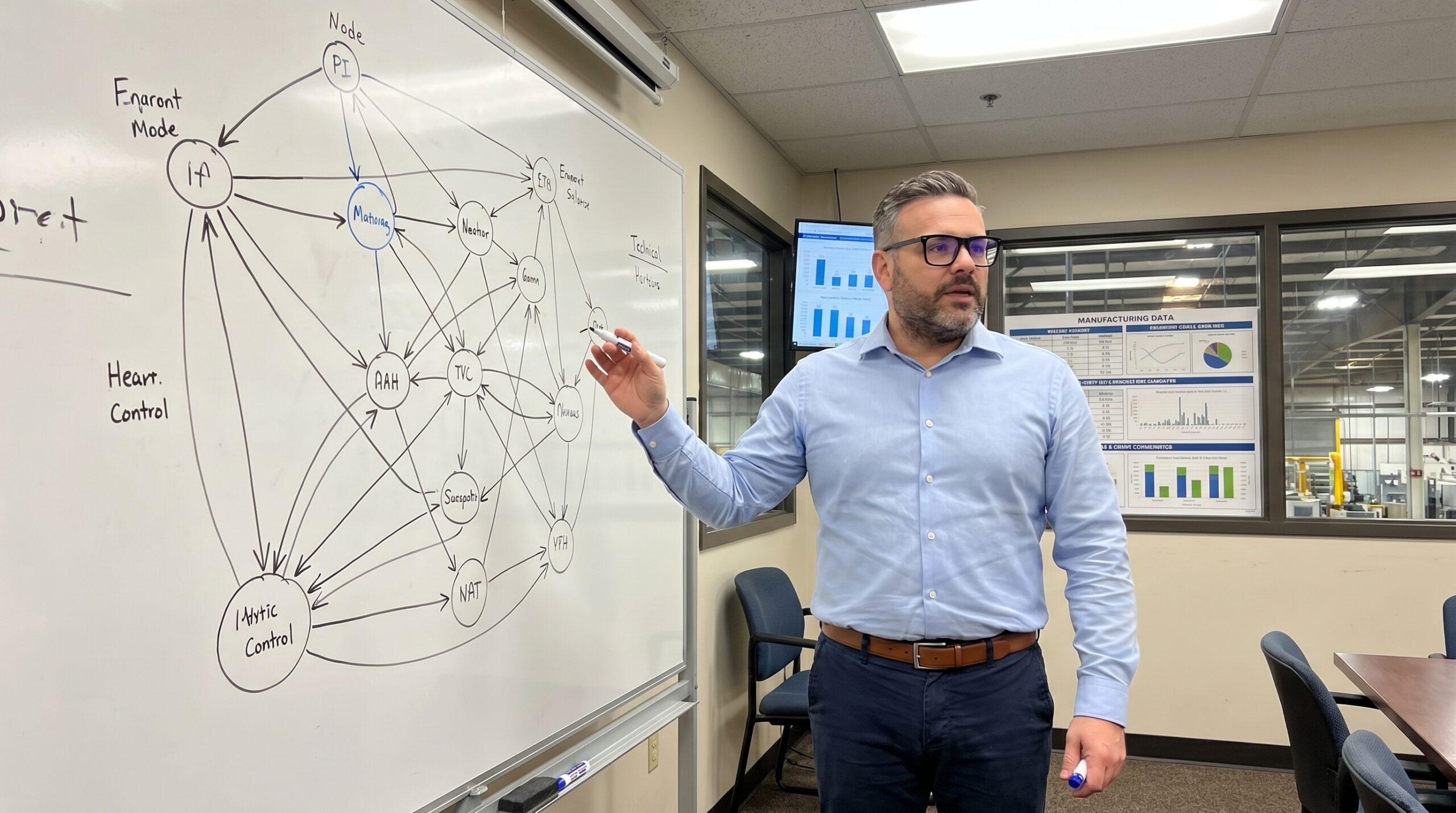
At its core, an Interrelationship Digraph (ID) is a visual tool that maps cause-and-effect relationships among a set of related issues, problems, or factors. The word “digraph” comes from directed graph — a mathematical concept where connections between nodes have direction. In plain English: arrows point from causes to effects.
You start with a set of items — usually generated from an affinity diagram, brainstorming session, or problem statement decomposition. These items become nodes arranged roughly in a circle on a large sheet of paper or whiteboard.
Then the magic happens: the team systematically examines every pair of items and asks a simple question.
“Does item A influence item B? Does item B influence item A?”
If the answer is yes, you draw an arrow from cause to effect. You do this for every pair. Every. Single. Pair.
What emerges is a visual map of your problem space that reveals things no list ever could:
- Root causes disguised as ordinary items — the nodes with arrows pointing outward but almost none pointing inward. These are your drivers. They influence many things but aren’t influenced by much. Solve them, and the ripple effects are massive.
- Effects masquerading as root causes — the nodes with arrows pouring in but barely any going out. These are outcomes. You don’t solve outcomes; you solve what’s driving them. But teams waste enormous energy trying.
- Feedback loops — circular chains where A drives B, B drives C, and C drives A. These are the vicious cycles that keep your problems self-perpetuating. You can’t break them until you can see them.
- Clusters of tightly interconnected issues — groups of problems so linked that they function as a single system. Picking one off in isolation is like pulling one thread from a knot — it just tightens the rest.
This is diagnostic power that a Pareto chart or a priority matrix simply cannot provide.
The Step-by-Step: How to Build One That Actually Works
Let me walk you through a real process. Not the textbook version — the version that works when you’re standing in a conference room with six skeptical engineers and a whiteboard that’s seen better days.
Step 1: Define Your Problem Space
Start with a clear, focused question. Not “What’s wrong with quality?” — that’s too broad. Something like:
- “What factors are driving the increase in customer returns over the past six months?”
- “Why is our First Pass Yield on Assembly Line 2 below 92%?”
- “What’s preventing effective implementation of our corrective action system?”
The question frames the boundary of your analysis. Go too narrow and you’ll miss systemic connections. Go too broad and you’ll drown.
Step 2: Generate Your Items
Use whatever ideation method works for your team. Brainstorming. Affinity diagram. Review of existing data. Process walk observations. Customer complaint analysis. The source matters less than the completeness.
You typically end up with 8 to 20 items. Fewer than 8 and the tool doesn’t add much value beyond common sense. More than 20 and the pairwise comparison becomes exhausting — you’re looking at up to 380 pairs.
Write each item on a card or sticky note. Clear, concise language. “Training gaps” not “we need more training.” “Gauge calibration frequency insufficient” not “metrology issues.” Precision in language matters.
Step 3: Arrange and Connect
Place all items in a rough circle on a large surface — whiteboard, butcher paper, or a digital canvas. Now begins the systematic pairwise analysis.
For each pair of items, the team asks: “Is there a causal relationship between these two?” If yes, draw an arrow from the cause to the effect.
This is where most teams need facilitation discipline. The common mistakes:
- Drawing arrows too freely. Not every pair has a relationship. If you’re not sure, don’t draw. Uncertain arrows are noise.
- Confusing correlation with causation. Two things may rise and fall together without one causing the other. Demand causal logic, not statistical coincidence.
- Allowing influence from authority. The senior manager’s opinion on causality doesn’t override physics. Encourage dissent.
- Rushing. A good ID for 15 items takes 60-90 minutes to construct properly. This is thinking work, not paperwork.
Step 4: Count and Classify
Once all arrows are drawn, count the arrows going into each node (in-arrows) and out of each node (out-arrows). The totals tell you everything.
- High out-arrows, low in-arrows = Driver. This is a root cause or key influencing factor. It pushes the system. Address these first.
- High in-arrows, low out-arrows = Outcome. This is a result, an effect. It’s what you’re measuring and worrying about, but solving it directly is like mopping a floor without turning off the tap.
- High on both = Leverage point. It’s both driven by other factors and drives yet more. This sits in the middle of causal chains and is often the critical junction where intervention has maximum systemic impact.
- Low on both = Isolated. It barely connects to the system. Consider whether it belongs in the analysis at all, or whether it’s a standalone issue better addressed separately.
Step 5: Interpret and Act
The visual pattern tells a story. Follow the arrows from drivers to outcomes. Identify the critical paths — the chains of causation that carry the most influence from root to symptom.
This is where strategy replaces firefighting. Instead of attacking the outcome that’s currently on fire (customer complaints, scrap, downtime), you trace back through the causal web and strike at the driver.
A Real Example: The Mystery of the Escaping Defects
Let me share a story from a Tier 1 automotive supplier I worked with a few years back. They manufactured precision-machined housings for transmission systems. For three consecutive months, their customer had found assembly-interfering defects in received parts — burrs on a critical bore that passed internal inspection but caused failures at the customer’s assembly plant.
The initial reaction was predictable: tighten inspection. Add a second visual check. Increase the audit frequency. The defect escape rate dropped slightly, then plateaued. The customer was unimpressed.
When we convened a cross-functional team and built an Interrelationship Digraph, here’s what emerged:
The items included: burr formation at Operation 30, tool wear monitoring gaps, coolant concentration inconsistency, operator rotation frequency, inspection method limitations (visual only), incoming material hardness variation, setup verification completeness, production pressure to meet output targets, and corrective action timeliness.
After the pairwise analysis, the pattern was striking. “Production pressure to meet output targets” had the highest out-arrow count by far. It drove operator rotation (experienced operators pulled to cover gaps), which drove setup verification shortcuts, which drove burr formation. It drove reduced time for tool wear checks, which drove burr formation. It drove rushing through inspection, which drove escapes.
The root cause wasn’t machining. It wasn’t inspection. It wasn’t even tooling. The root cause was a capacity planning decision made six months earlier that had loaded Line 2 at 97% utilization, leaving zero margin for anything except raw output.
The burrs were a symptom. The escapes were a symptom of a symptom. The driver was a management decision invisible on any process control chart.
The solution wasn’t more inspection. It was rebalancing the production plan — reducing the planned utilization to 85%, accepting slightly lower output per shift, and regaining the time needed for proper setup, tool monitoring, and inspection.
Within six weeks, customer complaints dropped to zero. Scrap actually decreased too, because the same time pressure that was creating burrs was also creating dimensional variation they hadn’t even been tracking yet.
No inspection improvement program would have achieved that. Because you can’t inspect your way out of a capacity planning problem. But you can’t see that without the map.
When to Use It — and When Not To
The Interrelationship Digraph is not a universal tool. It excels in specific situations:
Use it when:
- You’re facing a complex, multi-factor problem where everything seems connected to everything
- Previous improvement efforts have failed or produced only temporary results
- Your team is debating which problem to tackle first, and the debate is going in circles
- You suspect systemic root causes that aren’t visible in process data
- You’re planning a strategic quality initiative and need to understand leverage points
Don’t use it when:
- The problem is simple and the root cause is obvious (use 5 Why or a fishbone diagram instead)
- You have fewer than 6-7 relevant factors (the tool needs complexity to add value)
- Your team doesn’t understand the process well enough to judge causal relationships (go to gemba first)
- You need a quick answer today (proper ID construction takes hours, not minutes)
Digital Tools vs. Physical Reality
The traditional method — cards on a table, hand-drawn arrows — still works beautifully for in-person teams. There’s something about the physical act of drawing arrows and counting them that creates shared understanding in a way that clicking through software doesn’t replicate.
But for distributed teams or larger analyses, digital tools are increasingly capable. Miro, Mural, and similar platforms support the process well. Some dedicated quality management software includes ID functionality.
One word of caution on digital tools: they make it easy to generate beautiful diagrams without deep thinking. The value of an Interrelationship Digraph is not in the visual output — it’s in the conversation that produces it. If you’re not having heated debates about whether A truly causes B, you’re probably not doing it right.
Common Pitfalls I’ve Seen (And Made Myself)
The “Everything Causes Everything” Trap. Some teams draw arrows between almost every pair, creating a diagram that looks like a plate of spaghetti. When everything influences everything, the tool provides no discrimination. Push the team to identify the strongest, most direct causal relationships. Not theoretical possibilities — actual, significant drivers.
The Confirmation Bias Trap. Teams often draw arrows that confirm what they already believe. “Of course training causes quality problems — we’ve been saying that for years.” Challenge assumptions. Ask “How, specifically, does this cause that?” If the causal mechanism can’t be articulated, the arrow doesn’t belong.
The Snapshot Trap. An ID captures causal relationships at a point in time. But systems evolve. The ID you built in January may not reflect reality in July, especially after you’ve implemented changes. Revisit and update periodically, particularly after significant process changes.
The Analysis Paralysis Trap. Some teams get so deep into the causal analysis that they never move to action. The ID is a tool for decision-making, not an academic exercise. Set a time limit. Build the best diagram you can in the time available. Then act on what it tells you.
Connecting to Your Quality System
The Interrelationship Digraph doesn’t exist in isolation. It connects to other tools in your quality toolkit:
- From Affinity Diagram to ID: The affinity diagram groups your brainstormed ideas. The ID maps how those groups relate causally. They’re natural partners.
- From ID to Tree Diagram: Once you’ve identified your key drivers through ID, a tree diagram can break them down into specific actionable countermeasures.
- From ID to FMEA: The causal understanding from an ID can enrich your failure mode analysis, helping you identify failure causes you might otherwise miss.
- From ID to Strategic Planning: In Hoshin Kanri and similar frameworks, an ID can help map the interdependencies among strategic objectives, ensuring your deployment plan addresses root drivers, not just surface-level targets.
The Deeper Lesson
Here’s what I’ve come to believe after years of using this tool: the Interrelationship Digraph is really about humility. It’s about admitting that your problems are more complex than your instincts suggest. That the first answer is rarely the right answer. That the loudest complaint is rarely the most important problem.
It’s about replacing gut feelings with structured thinking. Replacing arguments about what to do first with evidence-based understanding of what actually drives what.
And in a world where the pressure to “just do something” is constant and overwhelming, that kind of disciplined patience is a competitive advantage most organizations haven’t discovered yet.
Your problems are connected. Your solutions should be too.
Peter Stasko is a Quality Architect with 25+ years of experience transforming manufacturing organizations from reactive firefighting to systematic excellence. He specializes in making complex quality tools practical, actionable, and genuinely useful for teams on the shop floor and in the boardroom.